rjwolfe3
Member
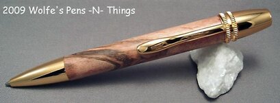
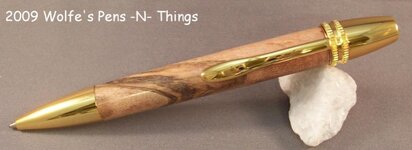
OK so I was playing with lighting a little more and am curious which photo looks better. Camera is a Kodak EasyShare CX7330 (P.O.S.) I am using a WalMart photo booth with their basic lights with original bulbs (don't know wattage) positioned about 3 inches away from sides of tent. Using macro setting, timer and a tripod. The first picture is taken with that setup. The only thing I add in the second photo is a 500watt trouble light held above the photo booth about a foot. Let me know which is better. Eventually I would like to invest into a new camera but must make do with what I have.
1st photo:

2nd Photo:

TIA:wink:
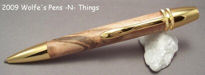
1st photo:
2nd Photo:
TIA:wink:
")