jttheclockman
Member
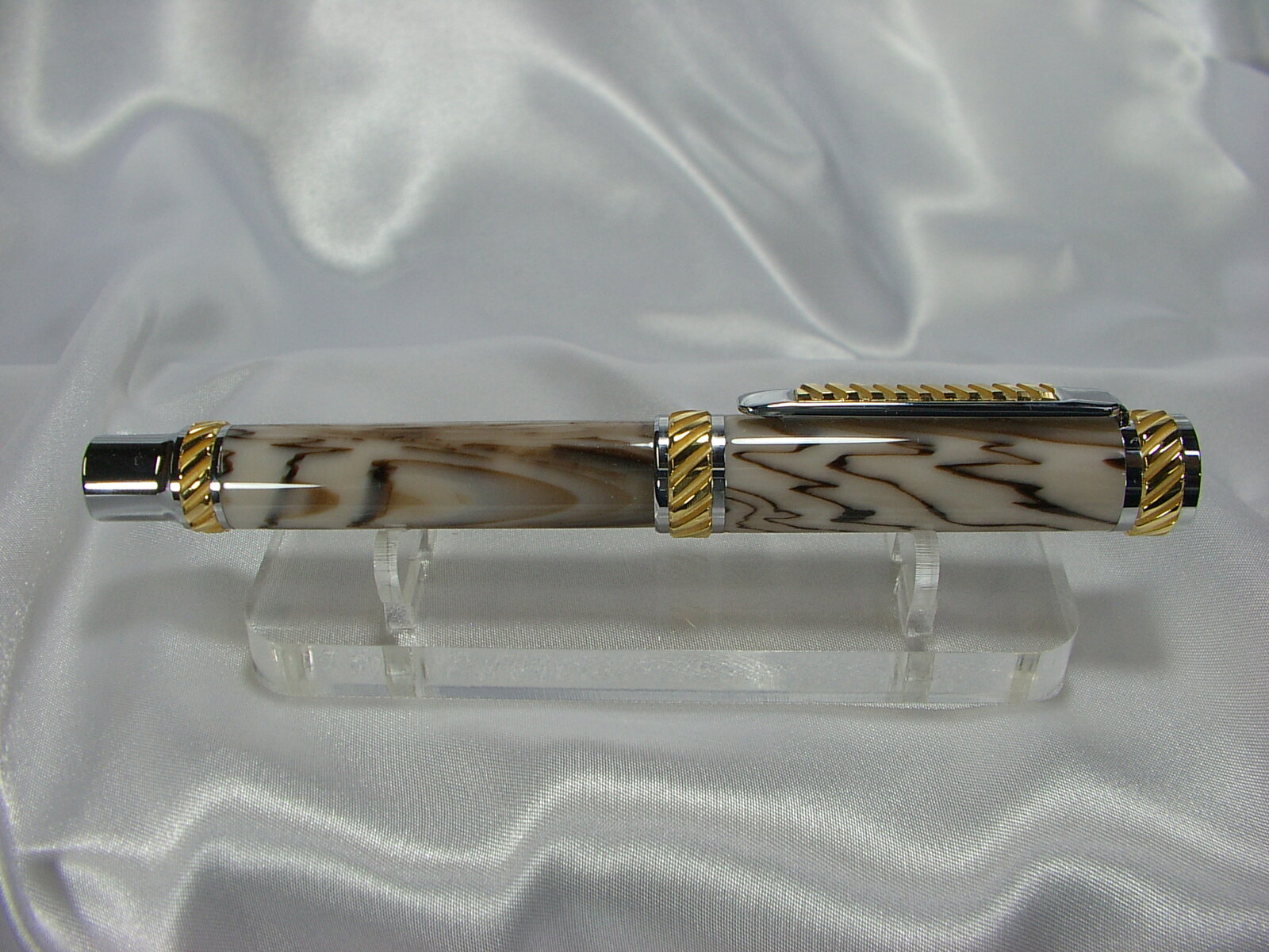
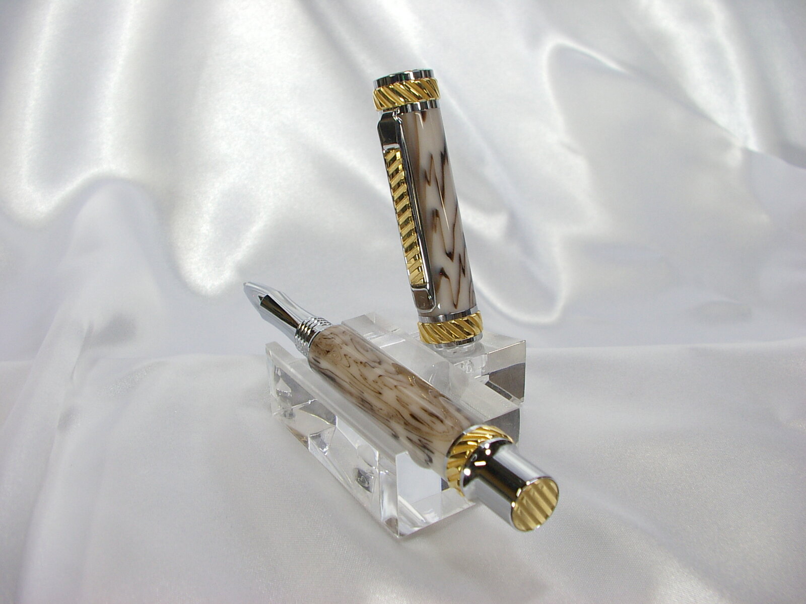
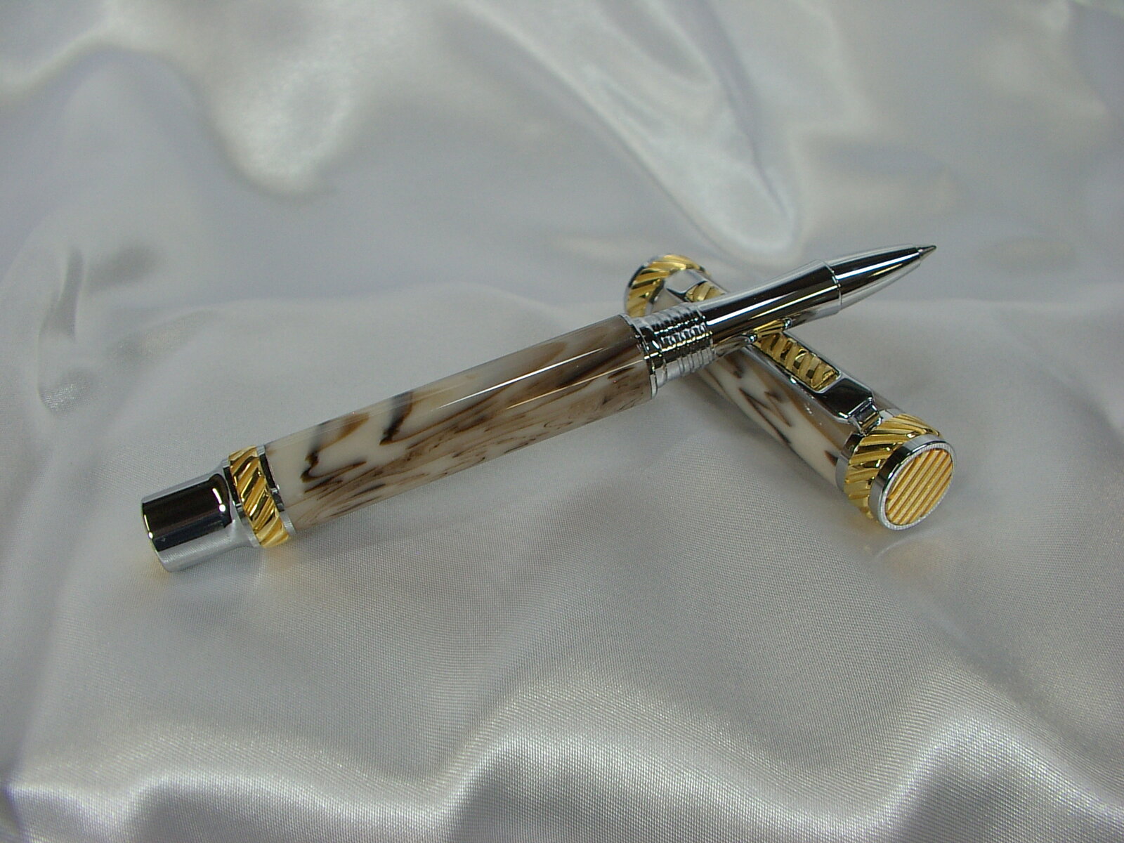
Here is one I recently finished and I love this kit. It is a Jr Abrahms kit with an Italian acrylic blank called Light Horn swirl. Turned and polished. As always any comments or questions always welcomed. Thanks for looking.


Beautiful!
BTW what color did you use for the inside of the blank?
I did paint the blank a light tan inside the blank. To tell you the truth though I do not think it needed it at all because as with most of these Italian rod materials they are very dense and the colors are true throughout. Do not know how they do it but some beautiful materials. I have another one I did that I will post soon as I get some photos. Got a few pens done so I will need to take the photos. Thanks for the kind words.Beautiful! That's a bold kit. Great fit and finish. I would also like to know what color paint you used.
It really doesn't have translucency The color of the blank is the color of the blank. There was no color shift even though I did paint the inside of the blank. Lots of brown shades. I have another one I will be posting that the color is called coffee and it too is a tan shade. I saw someone here make a kitless pen with that blank and wanted to try one out. Unfortunately I did not get any blanks that look as good as his but still liked the blanks. It is the nature of the blank.Beautiful pen, John! That is a heck of a blank...well presented.
IMO, though not having handled the blank myself, there does appear to be a decent amount of translucency in it looking from the outside in. Even if not strictly necessary, I would think a coat of paint on the inside of the hole would just guarantee you don't have any undue color shifts or accidental appearance of brass.
Interesting choice of kit as well. I just picked up a chrome and gunmetal version of this. Well, picked it up maybe a month ago. Haven't been able to figure out which blank to mate with it yet. It is a very interesting kit, though. I like the strong lines, grooves!
I always turn my pens straight if possible especially highend pens. To me it is a classy look. The Sierra style pens I will add a very slight hump to it because that is basically the shape of the kit itself and it lends itself to a slight hump. I will try to keep any humps to a minimum too with the cigar style pens. I believe there is no need for humps and bulges in pens. You look at all top pen makers they never have bulges in their pens. I have heard the excuse many times here about people putting bulges in pens because they are for handicapped people who have arthritis and things like that. That maybe true but have never run into one person asking for a bulging pen. If you go thru my album here you will see that this be the case with all my pens I make. Now I have lately been making many cast on tube blanks with watch parts and other trinkets and to avoid hitting them when turning I may have to ever so slightly put a hump in a pen such as a majestic kit because there is very little room on the components to allow for casting. But many times it takes a keen eye to see this. just the way I have learned and been doing it since I started turning pens. Here is an example of a majestic kit and maybe you can see a slight hump but it is subtle.Beautiful work as always. Can I ask a design question? On both pens you show, the lines of the blank are perfectly straight, no curve. Did you choose that style of turning because of the complexity of the kit design thinking that the straight lines would not compete with it? Or did you try other designs with the blank turning and decided this looks the best? Just curious.
Thank you. Interesting observations. I have nowhere near the experience and expertise that you do, but I have tried to include a sight bulge in all the pens I make. I think it distinguishes a hand-made pen from a mass-produced one. I tried when I first began to put exaggerated curves and multiple "humps" as you say, but I personally don't like the look of those. I wound up just throwing those pens away since I didn't want them and I didn't want to give them away either. Again, thanks for the input. It's always best to learn from the masters.I always turn my pens straight if possible especially highend pens. To me it is a classy look. The Sierra style pens I will add a very slight hump to it because that is basically the shape of the kit itself and it lends itself to a slight hump. I will try to keep any humps to a minimum too with the cigar style pens. I believe there is no need for humps and bulges in pens. You look at all top pen makers they never have bulges in their pens. I have heard the excuse many times here about people putting bulges in pens because they are for handicapped people who have arthritis and things like that. That maybe true but have never run into one person asking for a bulging pen. If you go thru my album here you will see that this be the case with all my pens I make. Now I have lately been making many cast on tube blanks with watch parts and other trinkets and to avoid hitting them when turning I may have to ever so slightly put a hump in a pen such as a majestic kit because there is very little room on the components to allow for casting. But many times it takes a keen eye to see this. just the way I have learned and been doing it since I started turning pens. Here is an example of a majestic kit and maybe you can see a slight hump but it is subtle.
View attachment 359455
