G'day!
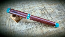
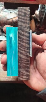
Matched some teal acrylic with this piece of Katalox, aka Mexican royal ebony. Black and white spacers, bees wax finish. The acrylic was hard to focus on!
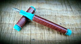
Jowo #6 nib.
Fully sleeved
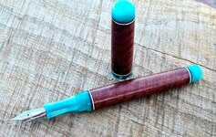
Matched some teal acrylic with this piece of Katalox, aka Mexican royal ebony. Black and white spacers, bees wax finish. The acrylic was hard to focus on!
Jowo #6 nib.
Fully sleeved