Broadwell Art Deco with Deep Burgundy

Signed-In Members Don't See This Ad
See more from Kaspar

Kaspar

Member
Joined
Aug 1, 2006
Messages
1,363
Location
Ahead of the curve. Waaay ahead.
roadwell_Art_Deco_w-Burgundy_Acrylic_-_capped_-med.jpg


Broadwell Art Deco with Dawn's Deep Burgundy. I'll post it open ... sometime. Maybe. :biggrin:

I really like this pen, and that's unusual for me to say where a PSI kit is concerned.

Mini-Review:

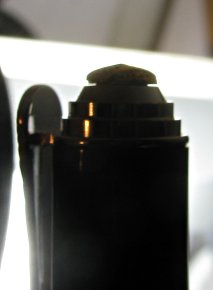
While I like the design very much, I have some complaints about the quality. A close examination of both of the kits I received reveals that the gold center band section is a bit rough around the edges and does not mate up with the silver as perfectly as I'd like to see in a high end kit. Also the gold accent piece in the cap finial has a very noticeable gap between it and the silver base in which it is mounted. Again, this is on both kits.

And the gold plating is rather rough, with visible flaws in the art deco "crown" part of the center band.

Except for the gap at the top, these are things one would notice only on a very close inspection. And hopefully, these are just "start-up" problems that will be rectified in future production runs.

Again, I take issue with PSI's infatuation with "pimp stones" in their kits. I thought maybe the darker stone at the top of the clip would work better than things I've seen on other kits like the Majestic, but now that I have one in my hand, it's not that impressive. I'd rather they just add a bit more accent color there. Or this might be one instance where a clear stone would have perfectly accented the "wings" engraving of these otherwise lovely clips.

Also, the clip ring seems a bit tight at the fitting point, but Dayacom kits often sport that weakness. No one is perfect, I suppose. Use a press block for pushing the clip onto the cap before pressing in the cap assembly, if you encounter this problem.

That said, I LOVE this kit. Good looking, but I especially like how it feels in my hand. The diameters are the same as a Junior Statesman, but the length is close to that of an Imperial. The pen section is actually longer than that of an Imperial. The extra length (without the cap) balances it perfectly for me. The cap does post, but I never use that on any pen. I hope they can clean up those problems I've mentioned because this kit is a winner, even with the pimp stone (I need to find a way to knock that out and put a piece of the barrel material in the hole.) It's a perfect in-betweener for someone who doesn't want the heft of an Imperial or Statesman, yet finds the Juniors without the cap to be too short, but too long with it.

I like these enough I'm going to have JohnnyCNC make me some precision bushings for it. Great kit, despite the problems.
 
Last edited:
Signed-In Members Don't See This Ad

arioux

Member
Joined
Jan 20, 2005
Messages
1,734
Location
Terrebonne, Quebec, Canada.
Hi,

Thank for that nice eview. May i suggest you communicate this info to PSI. They might be interested in reading your observation and coomunicate them to Dayacom.
 

Kaspar

Member
Joined
Aug 1, 2006
Messages
1,363
Location
Ahead of the curve. Waaay ahead.
Hi,

Thank for that nice eview. May i suggest you communicate this info to PSI. They might be interested in reading your observation and coomunicate them to Dayacom.

Last time I reviewed some things for PSI, they kept the good reviews but never posted anything that suggested a product needed improvement (which tended to confirm my somewhat low opinion of them.) But I'd like to see this kit get a little better, so I might try that. If they just fix that little gap in the cap finial, that'll be a big step forward. It's really quite noticeable, and if I weren't so picky, it'd be the only thing I would have mentioned.

Ligget said:
Great pen Kasper, your review is welcomed by many like myself who have yet to try this kit, thank you!

Thanks! If you or anyone else buys some, I'd be interested to know if you see the same problems.
 

bitshird

Member
Joined
Aug 27, 2007
Messages
10,236
Location
Adamsville, TN, USA.
Nice /great looking pen Kasper, I agree I wish they would loose the pimp stones, to me it detracts from a great looking pen and cheapens it, that's what's stopping me from trying this and the Majestic, Your match up with dawns burgundy blank look regal and elegant. I hope they get the QC issues remedied, there is no place for poor fitmsents on kits with that price.
 

Kaspar

Member
Joined
Aug 1, 2006
Messages
1,363
Location
Ahead of the curve. Waaay ahead.
Thanks. I have another deep burgundy that had more iridescence, but I went with the blank that wasn't too busy on purpose.

I really do think a clear stone will work given where the crystal is located. I find it acceptable and even nice in this case. But the brown does not work. I'm gonna find a way to knock that out.

And I will never make a Majestic unless someone orders one. Good looking, nice accents, but that d-mn-d stone ... tacky, tacky, tacky ...

Did I mention it's TACKY?!
 
Last edited:

PR_Princess

Member
Joined
Jun 1, 2007
Messages
2,384
Location
Sturtevant WI, USA.
Eric, you sure do have a wonderful eye!! Lovely combo, and a beautiful pen!

I am glad that you like this kit, as the styling caught my attention too. I agree with on the amber/brown stone. I think that they (PSI) were trying to match the gold in the kit, but missed. So it looks a bit "off". As you said, something more neutral, (or maybe even an interchangeable stone?) might be better. (IMHO)
 
Last edited:

Kaspar

Member
Joined
Aug 1, 2006
Messages
1,363
Location
Ahead of the curve. Waaay ahead.
Thanks, all!

... I agree with on the amber/brown stone. I think that they (PSI) were trying to match the gold in the kit, but missed.

That's my take as well. I've always thought PSI was very ham-handed about this little aspect of woodturning. But I do like that they are trying.

As you said, something more neutral, (or maybe even an interchangeable stone?) might be better. (IMHO)
Yeah. I'm going to see how hard it is to knock that out and do something - anything! - there.

Also, I definitely think it's better to line up the clip with the center of the crown accent. I tried it the other way, and that just doesn't work.
 
Last edited:
Top Bottom