Hi All
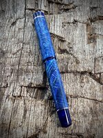
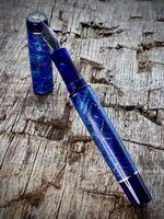
This is a blue maple burr (burl) fountain pen with cellulose acetate accents that just arrived with the customer. These are very popular pens but I try not to make too many. The last picture shows the purple equivalent I offer and I also make a green one.
I fully sleeve both the barrel and the cap, and both are tapered. The tapering adds a degree of complexity as it requires the liners to be stepped and, consequently, the inside of the wooden sleeves are stepped to correspond. Not rocket science by any means, but it does take a little bit of care and precision.
The accent rings are sterling silver that I cut by hand from sheet using a jewellers saw.
The threads are 13mm triple lead and the overall length of the pen when closed is 145mm. Barrel is 15.3mm Ø at the widest point.
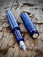
It takes a Jowo No6 nib. I included a close up photo that shows the architect grind I added. All this means is that rather than the line thickness being uniform when laying down ink the cross stroke is wide and the down stroke is narrow. This is the exact opposite to the more common cursive italic grind. I am just waiting to hear if I did a good job...
Fed by c/c.
Cheers
Ash


This is a blue maple burr (burl) fountain pen with cellulose acetate accents that just arrived with the customer. These are very popular pens but I try not to make too many. The last picture shows the purple equivalent I offer and I also make a green one.
I fully sleeve both the barrel and the cap, and both are tapered. The tapering adds a degree of complexity as it requires the liners to be stepped and, consequently, the inside of the wooden sleeves are stepped to correspond. Not rocket science by any means, but it does take a little bit of care and precision.
The accent rings are sterling silver that I cut by hand from sheet using a jewellers saw.
The threads are 13mm triple lead and the overall length of the pen when closed is 145mm. Barrel is 15.3mm Ø at the widest point.
It takes a Jowo No6 nib. I included a close up photo that shows the architect grind I added. All this means is that rather than the line thickness being uniform when laying down ink the cross stroke is wide and the down stroke is narrow. This is the exact opposite to the more common cursive italic grind. I am just waiting to hear if I did a good job...
Fed by c/c.
Cheers
Ash