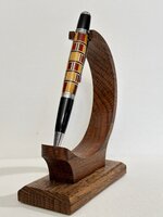
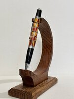
I had high hopes for this one but it sure turned out ugly. The only reason I assembled it was because it wasn't going on a new kit. Just a house pen that I got tired of looking at. The blank was just made from scrap cutoffs, so nothing lost there. They can't all be winners 
You are using an out of date browser. It may not display this or other websites correctly.
You should upgrade or use an alternative browser.
You should upgrade or use an alternative browser.
World’s Ugliest Segmented Pen
- Thread starter KenB259
- Start date
Signed-In Members Don't See This Ad
Signed-In Members Don't See This Ad
SteveJ
Member
I've seen worse -they end up in my trash! Still fun to turn the segments down to see the result.
Woodchipper
Member
I see nothing wrong with it. Segmenting allows wide parameters for design, wood used, etc.
I think it would be okay if some of the colors wouldn't have been split and they were all done the same way.I see nothing wrong with it. Segmenting allows wide parameters for design, wood used, etc.
Dale Parrott
Member
I'm not going to say anything about your pen. I am going to say that your craftsmanship is outstanding. The glue up, fit, and finish are all perfect.
KMCloonan
Member
I think it has an art deco vibe, and looks cool. As Dale said, the craftsmanship makes the pen legit.
mark james
IAP Collection, Curator
What appeals to others is a mystery to us who see the flaws that others don't. I understand your opinion and probably would feel the same way, but as an observant, I also see an excellent pen that is worthy of being valued. Ken, not too shabby!!!
I can agree the fit and finish is fine, still a stinker thoughI'm not going to say anything about your pen. I am going to say that your craftsmanship is outstanding. The glue up, fit, and finish are all perfect.
mnerland
Member
Pen looks great, Ken, We are our worst critic. If that's a clunker.....then all mine are too!
It's all about the lack of symmetry. That's also why I don't care for so called "chaos" blanksPen looks great, Ken, We are our worst critic. If that's a clunker.....then all mine are too!
Lew
Member
I have some pens I've made that are absolutely horrible, but I still carry them around from time to time. When people see them, they don't say, "What an ugly pen!", which is my reaction. Instead they comment on how unique the pen is, how did I make it, can I do others, do I sell pens. Even ugly comes in handy once in a while.
zig314159
Member
I do segmented bowls, segmented bottle stoppers, and segmented pens (from scraps of the 2 precious categories). Your pen is nicely done and inspiring to "scrappers" like myself. Thank you for sharing.
leehljp
Member Liaison
Ken, I will admit it does look a little awkward to me from either a design standpoint and the specific color combination. Designs WITH the specific colors distract from each other rather than compliment each other. Sometimes a design is good but the color combinations are like oil and water. Sometimes there can be a great color combo but the design destroys. Great colors don't "always" match and in some cases may look good in certain designs, but if not perfect, they compete with each other. There is no "one" place to focus the eyes.
You have a good eye and a good mind. You are creative. Along with creativity comes experience that you learn from. At least this is what I do. I still (sometimes) make a particular pen design (segment) that works absolutely well with a one piece/blank pen like the Sierra type, but looks horrible when incorporated into a two piece pen - just way too busy! The top and bottom compete with each other like both are saying: "Look at me, Look at me." And that makes my mind think I am looking at it cross-eyed which I am not.
You have a good eye and a good mind. You are creative. Along with creativity comes experience that you learn from. At least this is what I do. I still (sometimes) make a particular pen design (segment) that works absolutely well with a one piece/blank pen like the Sierra type, but looks horrible when incorporated into a two piece pen - just way too busy! The top and bottom compete with each other like both are saying: "Look at me, Look at me." And that makes my mind think I am looking at it cross-eyed which I am not.
I don't think it's the colors, I've made other pens that had redheart and yellowheart that worked well together. I have another blank that has a subtle difference that I think will look much better. I'll post it when I turn it. Probably this weekend because I'm very curious about the outcome.Ken, I will admit it does look a little awkward to me from either a design standpoint and the specific color combination. Designs WITH the specific colors distract from each other rather than compliment each other. Sometimes a design is good but the color combinations are like oil and water. Sometimes there can be a great color combo but the design destroys. Great colors don't "always" match and in some cases may look good in certain designs, but if not perfect, they compete with each other. There is no "one" place to focus the eyes.
You have a good eye and a good mind. You are creative. Along with creativity comes experience that you learn from. At least this is what I do. I still (sometimes) make a particular pen design (segment) that works absolutely well with a one piece/blank pen like the Sierra type, but looks horrible when incorporated into a two piece pen - just way too busy! The top and bottom compete with each other like both are saying: "Look at me, Look at me." And that makes my mind think I am looking at it cross-eyed which I am not.
Todd in PA
Member
It's nice to see someone post a pen that's not a perfect ten. It lets me know others have oops ideas too.
Did you use the oily glue for the segmenting? I bought some but haven't done any segmenting with it yet.
Did you use the oily glue for the segmenting? I bought some but haven't done any segmenting with it yet.
I just used wood glue on this one.It's nice to see someone post a pen that's not a perfect ten. It lets me know others have oops ideas too.
Did you use the oily glue for the segmenting? I bought some but haven't done any segmenting with it yet.
Alan Morrison
Member
I think that the red and yellow heart work well together, Ken, maybe a bit too much guitar pick guard ( if that what it is )
Its Maple and Zircote cut to match my saw kerf, Each stripe is only .034 for a total of .102. My method pretty much dictates that as a necessity. The thickness of the spacers, to me, look fine.I think that the red and yellow heart work well together, Ken, maybe a bit too much guitar pick guard ( if that what it is )
jttheclockman
Member
I wouldn't say it is ugly. But I am in the like symmetry family so my eye goes to that. I would just call it abstract art look. Really not bad.
I went down and took another look at the similar blank and decided it would pretty much be as horrible as this one. This type of blank looks good in a single color, not so much with differing colors. I'm just pitching the other one and moving on.
wolf creek knives
Member
Don't see any horrible at all. Remember "One man's ugly is another man's beauty" I like the detail and if you ever want to trash it, let me know.
michaelperez
Member
First, congratulations for your work and my curiosity is what bothers you about your pen?I had high hopes for this one but it sure turned out ugly. The only reason I assembled it was because it wasn't going on a new kit. Just a house pen that I got tired of looking at. The blank was just made from scrap cutoffs, so nothing lost there. They can't all be winners
i've worked as a product designer and trends change and what you don't like today tomorrow is trendy.
Sometimes classic, chaotic, industrial, pop, symmetrical, asymmetric, like wine what you like is the best.
It's mainly the end caps. I think if they were solid it would have helped.First, congratulations for your work and my curiosity is what bothers you about your pen?
i've worked as a product designer and trends change and what you don't like today tomorrow is trendy.
Sometimes classic, chaotic, industrial, pop, symmetrical, asymmetric, like wine what you like is the best.
michaelperez
Member
Ok, it's the kit the one you don't like, I mean the way they combine with your work, and maybe something plane and solid will frame better all the beauty of your work now it make sense to me.It's mainly the end caps. I think if they were solid it would have helped.
but any way it's matter of taste and I'm sure many people is going to like it.
greetings
BoonareeBurl
Member
I don't collect segmented pens as I'm more of a wood purist, but that is one heckuva nice segmented pen! I'd bet money that I'm not the only one who thinks it's very nice (and would pay money for it). Definitely will sell.I had high hopes for this one but it sure turned out ugly. The only reason I assembled it was because it wasn't going on a new kit. Just a house pen that I got tired of looking at. The blank was just made from scrap cutoffs, so nothing lost there. They can't all be winners
G
Not the kit, my end caps. They should have both been just non segmented redheart.Ok, it's the kit the one you don't like, I mean the way they combine with your work, and maybe something plane and solid will frame better all the beauty of your work now it make sense to me.
but any way it's matter of taste and I'm sure many people is going to like it.
greetings
michaelperez
Member
Oh I see now what you mean or maybe keep the same design (pattern)from the tip to the end cap.Not the kit, my end caps. They should have both been just non segmented redheart.
thanks for the explanations.


