
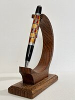
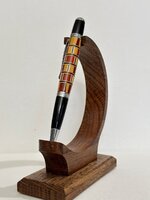
I had high hopes for this one but it sure turned out ugly. The only reason I assembled it was because it wasn't going on a new kit. Just a house pen that I got tired of looking at. The blank was just made from scrap cutoffs, so nothing lost there. They can't all be winners 

")