Working on a new logo

Signed-In Members Don't See This Ad

NT_2112

Member
Joined
Nov 6, 2019
Messages
147
Location
Rochester, NY
Hi all.

Taking some time to work on a new logo.

Here's the current version. I went with a black background as it makes the design stand out better than the white background did with black lines.

Any feedback is welcome.
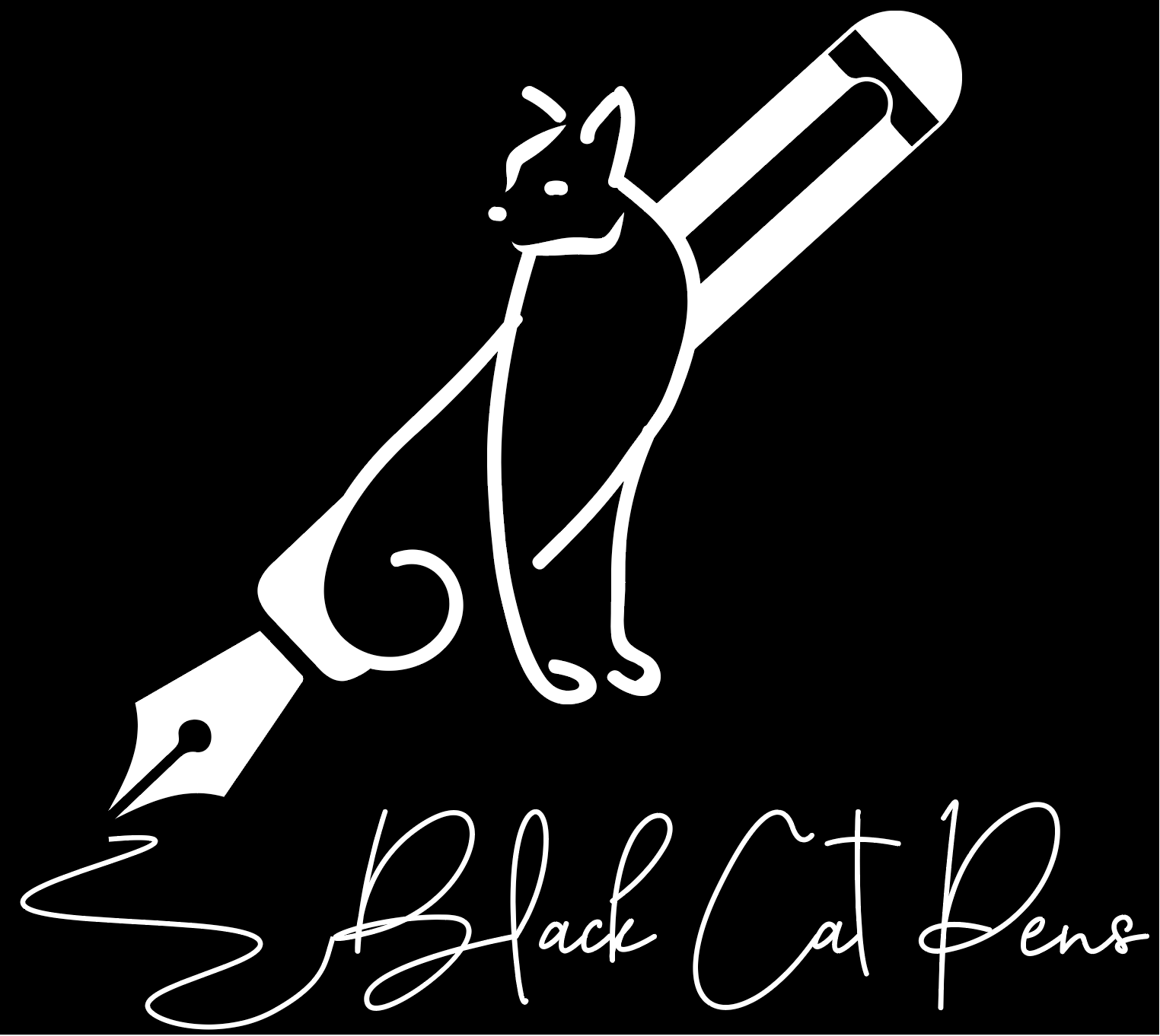
Screen Shot 2020-03-24 at 10.47.03 PM.png
 
Signed-In Members Don't See This Ad

Fred Bruche

Member
Joined
Feb 11, 2018
Messages
977
Location
Philadelphia 19146
Stylish but I don't see a cat. A fox maybe? Fancy lettering is a bit too fancy IMHO, too much effort to read and figure what it says, you might discourage your audience.
What's the purpose of the branding? Web logo? Internet branding? Think that some (most?) displays might end up as round/circle.
 

leehljp

Member Liaison
Joined
Feb 6, 2005
Messages
9,329
Location
Tunica, Mississippi,
Overall I like it. But I do see a potential problem.
How well will it be noticeable/readable at the actual size? What is the actual size that it will be on the website or letterhead? That is two different sizes, so is it readable and recognizable for each size.
 
Top Bottom