Well this was a bust

Signed-In Members Don't See This Ad

Cwalker935

Member
Joined
May 18, 2014
Messages
3,517
Location
Richmond, Va
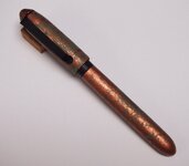
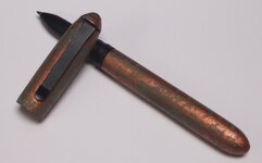
I tried several new things with this pen and despite a lot of effort, I am pretty disappointed. I tried making my own clip. That turned out OK. I tried using metal effects paint on a pen tube, meh. Finally I tried to combine wood and aluminum to make a kitless pen. That resulted in the diameter of the cap being disproportionate to the lower section. It will write when all is said and done. Beyond that well....
5E10915D-12D8-4158-A3A3-192615EB98B5.jpg

79EB1E35-D741-4F31-BDCC-9B1957148A45.jpg
 
Signed-In Members Don't See This Ad
OK, my "Brutal Critique."

The overall profile is nice - I like it. I would prefer a narrower edge between the upper section and the lower.

The colors are awesome - don't change a thing.

The clip and the rustic "feel" I also love. This is not an element seen often, and may not be preferred... but I like it.

The clip is great, the colors are also great. Refine the transition between the upper and lower barrels... That's all I can suggest - great pen in my opinion.
 
I'd say you did remarkably well overall, but I agree things can be improved :) I've been struggling with the same area of my feeble kitless attempts, the transition between the cap and the barrel... I wonder if it's the main problem area overall :confused:
One of my problems could be that I don't take the time to think things through before :rolleyes:
 
I love the color and the clip fits the color. But the band look seems to throw off the continuity between the top and bottom. I would like to know more about the color and how you achieved it.
 
Good pen. I agree with the others. Thinking outside of the box is a great way to go. I have a book that tells how to modify plain ol' Slimline pens. One variation is the larger diameter of the top section. Got it on the list.
 
I love the color and the clip fits the color. But the band look seems to throw off the continuity between the top and bottom. I would like to know more about the color and how you achieved it.

I used modern masters metal effects paint. I used the copper with blue patina.
 
I love the color and the clip fits the color. But the band look seems to throw off the continuity between the top and bottom. I would like to know more about the color and how you achieved it.

I used modern masters metal effects paint. I used the copper with blue patina.

Thanks, I have been looking for something like that to match the paint on a replica 1911 Indian motorcycle I acquired. The Modern Masters Rust looks like it is a match.
 
I think you're being harder on yourself than you should be. To my eye, there are a lot of things about this pen that are attractive - I like the look of it. I hope you didn't lose faith in the ideas you were trying just because they didn't rise to your expectations. I would recommend trying the concepts again and refine the things you don't like about this one. Looks like a fine pen from here.
 
Probably no one in the world owns a pen as unique as this one. I like it's one of a kind look and I'm sure you'll get a lot of feedback from people who see it being used. I like it!
 
The transition between cap and body looks a little wonky, other than that I think it has a nice look. I personally don't like the look of pens that have caps or twist ends that are much larger than body (like the 'designer' style or a lot of the modified slimline styles). Give it another shot and fix the things that you don't like.
 
Back
Top Bottom