Variations on a theme

Signed-In Members Don't See This Ad
See more from Alan Morrison

Alan Morrison

Member
Joined
Jan 15, 2019
Messages
3,079
Location
N Ireland
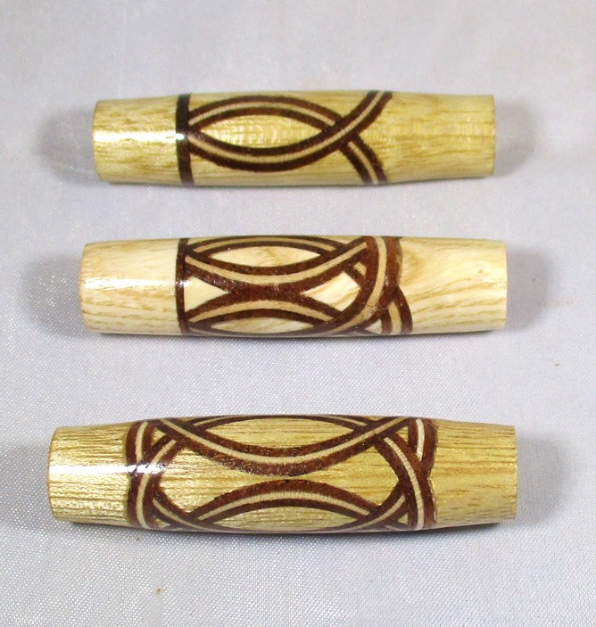
I am interested to know which of these you would make into a pen.
I know that the veneer and glue lines are a bit on the rough side but it is the pattern that I would like the feedback on.
IMG_0674.jpg
 
Signed-In Members Don't See This Ad

Sly Dog

Member
Joined
Nov 16, 2018
Messages
417
Location
Boise, Idaho
I really like the balance and weave of #3 (bottom) - that's a definite yes for me, and so is #1.
At first blush, #2 looks a bit too busy (congested ?) to my eye, but then again in the right kit....

All very cool ideas!
 

jttheclockman

Member
Joined
Feb 22, 2005
Messages
19,132
Location
NJ, USA.
Bottom only I do not like when pattern lines run into each other and there is no distinct pattern. Happened on bottom of #1 and middle of #2. Plus if you are putting 1 ring then put one on each end.
 

mark james

IAP Collection, Curator
Joined
Sep 6, 2012
Messages
12,750
Location
Medina, Ohio
I'll vote for #3 also. If another trim ring were added to the top of #1 that may be nice.

Interesting variations Alan, very nice experiment. đź‘Ť
 

egnald

Member
Joined
Jun 9, 2017
Messages
3,105
Location
Columbus, Nebraska, USA
Greetings from Nebraska - These certainly all exceed my skill level and I think they are all very nice, but my favorite would have to be the bottom one - I'm pretty sure for me it's the symmetry. - Dave
 

Alan Morrison

Member
Joined
Jan 15, 2019
Messages
3,079
Location
N Ireland
I really like the balance and weave of #3 (bottom) - that's a definite yes for me, and so is #1.
At first blush, #2 looks a bit too busy (congested ?) to my eye, but then again in the right kit....

All very cool ideas!
Thanks for the feedback, Russ. I much prefer no. 3 myself. I think that it has a bit of the Art Nouveau border about it.
Alan
 

Alan Morrison

Member
Joined
Jan 15, 2019
Messages
3,079
Location
N Ireland
Bottom only I do not like when pattern lines run into each other and there is no distinct pattern. Happened on bottom of #1 and middle of #2. Plus if you are putting 1 ring then put one on each end.
John, Thanks for your feedback. I take on board what you say and agree that the top one needs another ring for balance. The middle one has too much going on. I will remake the bottom one when I get some transparent glue.
Alan
 

Alan Morrison

Member
Joined
Jan 15, 2019
Messages
3,079
Location
N Ireland
I'll vote for #3 also. If another trim ring were added to the top of #1 that may be nice.
Interesting variations Alan, very nice experiment. đź‘Ť
Hello Mark and thanks for the feedback.
I will try no. 1 with another ring just to see how it looks. I like the idea of the fish pattern.
No. 2 is a non runner.
Stay well.
Alan
 

Alan Morrison

Member
Joined
Jan 15, 2019
Messages
3,079
Location
N Ireland
Greetings from Nebraska - These certainly all exceed my skill level and I think they are all very nice, but my favorite would have to be the bottom one - I'm pretty sure for me it's the symmetry. - Dave
Thanks for the comments, Dave.
I will take others advice and try No.1 with another ring to balance the design.
No great skill needed other than owning a 1 and a half inch hole saw and a drill press.
Alan
 
Top Bottom