SteveG
Member
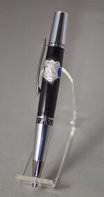
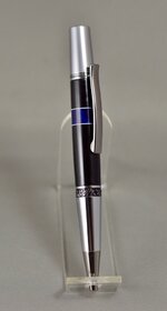
Thin Blue Line pen ideas have been showing up lately...this is one of mine. There are a number of ways to understand the symbolism related to the Thin Blue Line. The one that stuck with me is the idea of the "BAD" on one side (or below) and the "GOOD" on the other (or above). Law enforcement (The BLUE) is the protection, or barrier between the two. I enhanced that representation by the Sterling Silver badge mounted at the Blue Line, and accented the Blue with white to set it off better. My blank materials are just some generic blue and black PR pulled from the stash. The badge is an ebay sourced silver charm.
As far as the design detail, this Thin Blue Line is not so thin. I think it looks good with the badge mounted on it, but would work just as well if it were a little thinner. Does anyone have a comment on the use of the white accents? The badge was bent to conform to the curvature of the pen, and mounted with high strength epoxy. When I do these, it is a challenge to avoid having glue 'squeeze-out' show up, and I unfortunately had some of that with this pen. Comments and suggestions, good or bad, certainly welcome.
I do appreciate our law enforcement force...they live up to the symbolism of the Thin Blue Line.