
You are using an out of date browser. It may not display this or other websites correctly.
You should upgrade or use an alternative browser.
You should upgrade or use an alternative browser.
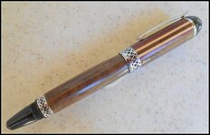
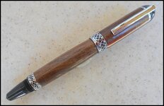
The Apollo is a big pen
- Thread starter Bryguy
- Start date
Signed-In Members Don't See This Ad
See more from Bryguy


Signed-In Members Don't See This Ad
mark james
IAP Collection, Curator
While I understand your comment, it is a very attractive pen. Well done.
Woodchipper
Member
Yes, I agree with the contrast idea but it is an elegant pen. Good work!