Syzygy v2.0

Signed-In Members Don't See This Ad
See more from VisExp

VisExp

Member
Joined
Oct 1, 2007
Messages
2,738
Location
Palm Coast, FL, USA.
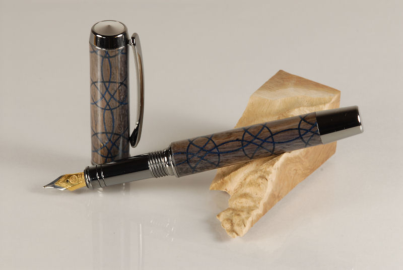
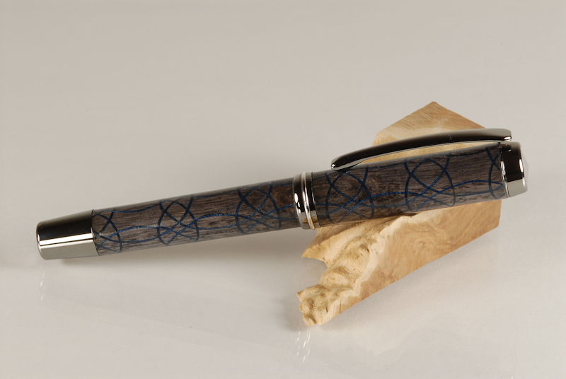
I made some minor changes to the design, paid a bit more attention as to where I made the cut for the CB and used my scrollsaw to make that cut. I was very pleased with the end result.

The main body of the pen is made from Blue Mangrove Driftwood that I got from bruce119 here in Florida a while back. The segments are dyed blue wood veneer.

As always, your comments and critiques are appreciated. Thanks for looking.
1_ACT_678601.jpg


1_ACT_678702.jpg
 
Signed-In Members Don't See This Ad
Nice work on your cuts and lamination like the pen, but I think that your blue colour veneer is lost in the Blue Mangrove ( I would choose some yellow, light green, white, any light colour ) IMO
 
Well, I had to just sit and stare at it for a couple of minutes. It is really incredible!!! Plus you just gotta say it....Syzygy.; The v1 was great but this one you got lined up and I like the color combos. (Kind of like the Dallas Cowboys:bananen_smilies008:) Sorry, moral imperative.

REALLY GREAT JOB!!
 
Last edited:
very nice work!:biggrin: did you cut the circles freehand?:confused: itried to do that pattern on my b.s.,even put on an 1/8" blade &made a jig--:rolleyes:--no such luck!:eek: the blade went all over the place!:eek:---ron.---:)
 
Thanks for all the nice comments everyone :)
very nice work!:biggrin: did you cut the circles freehand?:confused: itried to do that pattern on my b.s.,even put on an 1/8" blade &made a jig--:rolleyes:--no such luck!:eek: the blade went all over the place!:eek:---ron.---:)

Ron, I cut the pattern by hand, but I use a scroll saw not a band saw.
 
Beautiful pen! I really like to subtle colors and your workmanship is outstanding. Now, how do you make yourself part with a pen as special as that?

Jim Smith
 
Ron, I cut the pattern by hand, but I use a scroll saw not a band saw.

I think I'm reading this wrong- you cut all those curves FREEhand? That's simply unbelievable! I mean...I believe you...I just...dang! Is there any tutorial info floating around here about this?

By the way, I love it. Dark, muted colors, very sleek and rich.:)
 
Keith,

Just FAN-TASTIC!!!!

I also did not like the colors on the first view. But, as I went back two or three times, I decided it's just the fact that a Picture will never give the ACTUAL look.

I suspect the pen shows more contrast than we are seeing on the monitor.

In short, I have GROWN to like it!!!

(Not that my opinion really matters, anyhow!!)
 
Dude, you $uck! I mean, nice job. I think the colors work. Its not overbearing, but like was said above, it is a more serious pen. I'd love to try one someday. I guess I need a scroll saw, huh?
 
I would love to see the pen in person as the contrast between the blues is probably greater than what you can see in the photo. Looks very good.

Now for a challenge. Why not try to get two of the tight circles centered on the cap end so there is not partial pattern like you have on the clip end of the cap and on the nib end shrink the patter maybe 10% so you can get three of the tight circles on that end. Oh and did I mention it still has to line up????

Isn't it fun to push each other to go further and further than we thought possible? :biggrin::biggrin:

Mike
 
Keith,

Just FAN-TASTIC!!!!

I also did not like the colors on the first view. But, as I went back two or three times, I decided it's just the fact that a Picture will never give the ACTUAL look.

I suspect the pen shows more contrast than we are seeing on the monitor.

In short, I have GROWN to like it!!!

(Not that my opinion really matters, anyhow!!)

Thanks Ed. It's been quite interesting reading the comments. I was actually trying to achieve a more subtle look compared to the typical high contrast of segmented work. I guess I was looking for complimentary colors rather than contrasting colors.

Although I'm very happy with the pen, it did not come out quite like I had imagined. I thought the main body of the pen would have more of a steel blue tint to it.

Reading through the comments it would seem that most folks prefer the high contrast look. My wife could be included in this category as the pen didn't seem to get her "look of approval" :)
 
Now for a challenge. Why not try to get two of the tight circles centered on the cap end so there is not partial pattern like you have on the clip end of the cap and on the nib end shrink the patter maybe 10% so you can get three of the tight circles on that end. Oh and did I mention it still has to line up????

Isn't it fun to push each other to go further and further than we thought possible? :biggrin::biggrin:

Mike

No problem Mike. The difficult done immediately, the impossible takes just a while longer. :biggrin:

Jokes aside, I think you're right. That would be the next step for this design. I'll start working on v3.0 now.
 
Well, Keith, I think it's all been said.

Handsome Pen! I think all of the colors and lines go together beautifully!
 
Signed-In Members Don't See This Ad
Back
Top Bottom