seeking design opinions

Signed-In Members Don't See This Ad

sorcerertd

Member
Joined
Sep 30, 2019
Messages
2,771
Location
North Carolina, USA
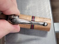
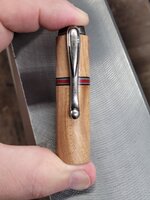
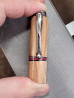
Hello all! I have a little project I'm working on and would like some different opinions on placement of a stripe (or maybe 2). I am settled on the pen barrel design, but am on the fence about the cap barrel. I have a couple ideas and am wanting to keep it relatively simple. If you have done anything like this, please share any pictures you may have.

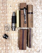
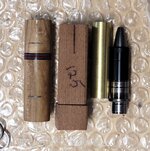
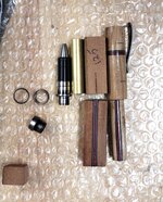
The rounded pieces below are practice pieces. The practice cap barrel is quite a bit longer than the standard tube length, so the tube is in the pictures for size comparison. I only left it longer so I could experiment with the placement of the stripe, but here I am, still undecided.

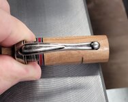
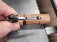
The squared blanks are the actual pieces I will be using. There's a little scrap left that I used to hold the clip in a couple of the pics, which can be used if need be.

Options include:
  1. Leave the wood plain. (This was my original plan, but it seems really boring)
  2. Stick with one stripe
    1. Centered or off center?
    2. If centered, then should it be centered on the barrel length or centered on the length of the clip?
  3. Add a second stripe and, if so, how to space them
    1. Equidistant from the ends (maybe divided evenly, maybe not)?
    2. A set distance apart, but not equally spaced on the barrel
One thought was to use a stripe as a center band, but I feel that's too close to the pen barrel to look balanced.
Lastly, do you have any thoughts on what I should avoid doing?
20230812_170116.jpg 20230812_170048.jpg 20230812_165628.jpg 20230812_125024.jpg 20230812_125035.jpg 20230812_125006.jpg 20230812_125055.jpg 20230812_125132.jpg
 
Signed-In Members Don't See This Ad

Hippie3180

Member
Joined
May 30, 2023
Messages
1,031
Location
Texas
Personally, I like the stripe towards the end of the clip, and I think it adds great interest without being too much.
 

Darios

Member
Joined
Oct 27, 2022
Messages
465
Location
US
Maybe at both the very top and bottom of the cap barrel. But I don't know how that would look with nothing matching on the nib barrel
 

jttheclockman

Member
Joined
Feb 22, 2005
Messages
19,212
Location
NJ, USA.
I am a symmetry type person. My eye has always been tuned to some sort of symmetry within the blank. Yes you are using the same materials in upper and lower. But you are changing the direction of the stripes in each which is fine but you are making the same design. (both stripes. I am making a blank now that has stripes going as your lower half and stripes going like your upper half. But the difference is each part is a design of its own. The cap does not match the design of the lower barrel is what I am trying to say. So you can not zero in on one element which you are doing here. and that being the stripes material. With this said if you want to stick to that design then my suggestion is to make them trim rings and there are many examples of this of different segmented pens. Put that strip down about 1/4" on both the top and bottom of the cap and use 2 rings. I would also divide that lower blank in half again and make it 4 equal stripes. Or the other suggestion would be leave the top solid. I have done this often too. It takes your eye away from the symmetry or lack of in both parts of the pen.

Now with this all said, another approach is to put the stripe on the diagonal in the cap. Now I did that on these pens but again I matched what was happening in the lower half of the rope section. I tried matching the cap colors to the rope and also the stripes. But again 2 different materials. Just my thoughts.

Copy of IMGP0012.JPG
 

sorcerertd

Member
Joined
Sep 30, 2019
Messages
2,771
Location
North Carolina, USA
Would it make any difference in your opinion knowing that...

This is a stadium blank and the stipes are to represent football uniforms. The longitudinal stripe for the pants. On the cap, the sleeve stripe. I still don't think it's necessary to include more than one stipe, but the more I think about it, the more I like the idea of 2. I thought about a decal on the cap barrel, but have not worked with them yet and am not sure that I want to experiment on this one. Then again, a practice blank is a practice blank, right? I think I'll make another couple more practice blanks for placement first.
 

sorcerertd

Member
Joined
Sep 30, 2019
Messages
2,771
Location
North Carolina, USA
OK, so trying to match colors on a printed page to the card stock color appears to be almost impossible. I'm glad I didn't waste any decal paper on this.
 

sorcerertd

Member
Joined
Sep 30, 2019
Messages
2,771
Location
North Carolina, USA
I expect a thin decal would not look any better than this printer paper held on with Scotch tape. There wouldn't be white behind a decal, but the band might show through it. I should really have experimented with the decals before now.

Photoshop
1691974275116.png


Reality
This was after 3 color saturation and brightness adjustments.
1691974438117.png
 
Top Bottom