
You are using an out of date browser. It may not display this or other websites correctly.
You should upgrade or use an alternative browser.
You should upgrade or use an alternative browser.
Pretty In Pink
- Thread starter VirgilJ
- Start date
Signed-In Members Don't See This Ad
See more from VirgilJ


Bob; I don't think your reply is being picky, nor was mine ment to be. Don asked for an opion on the photo and not a judgement on the pen, which is beautiful, so we expressed what we saw at first glance. This first look can make or break a sale if you are not holding the object in your hand. Jim S
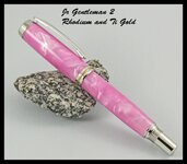
Don; Your headed in the right direction !! First, and only thing I see when looking at this photo, is the pen itself with no visable means of support. To me this makes one stop for a moment and wonder how you did that. Anytime you can make the eye stop, you have someone's undaunted attention, if only for a few seconds. I personaly am not a fan of black bachgrounds. You tend to lose the fine detail and edge of your subject if it is also a darker color. Your pink and chrome would realy stand out on this dark background however!! Those of us who have been makeing pens for quite a while, taking photos, and looking over thousands of them , like yourself, tend to look at them in a different way. I guess a simple way to explain what I am trying to say would be this example. If you show someone a.photo of an apple, some only see the apple, some see what variety the apple is, others see the color of the apple, some look at the background, and than there are those who look at the composition, subject matter, and exposure of the photo. Hopes this helps you in some small way. Jim S
Thank you Don !! Good luck with your website. Jim S
Signed-In Members Don't See This Ad
plantman
Member
Don; Photo is super sharp !! My only consern is the pattern of the black and white quartz taking away from the less suttil pattern of the pen. A dull black would make the pink and chrome stand out even more. That's just my honest thought after looking at the photo, as my eyes were drawn directly to the stone. Beautiful pen !! Jim S
Last edited:
mikespenturningz
Member
It sure is pretty in pink. Nice job.
avbill
Member
Pink is currently is seven place 3.8% of my total sales. Brown tones and Blue tones are currently in first place with 48.7 % split equally. I have so many people especially ladies looking at them.
Jim15
Member
Both the pen and the pictures look good to me.
BSea
Member
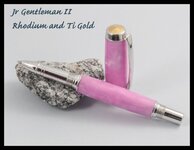
I think both look good. I like the use of highlights in the 1st photo. It makes the pearl show in the pen more than it does in the 2nd photo. Maybe reposition the lights a little on the 2nd photo to pick of more of the pearl in the blank. But that's being picky, and trying to find something.
plantman
Member
I think both look good. I like the use of highlights in the 1st photo. It makes the pearl show in the pen more than it does in the 2nd photo. Maybe reposition the lights a little on the 2nd photo to pick of more of the pearl in the blank. But that's being picky, and trying to find something.
Bob; I don't think your reply is being picky, nor was mine ment to be. Don asked for an opion on the photo and not a judgement on the pen, which is beautiful, so we expressed what we saw at first glance. This first look can make or break a sale if you are not holding the object in your hand. Jim S
Last edited:
VirgilJ
Member
Thank you all for your input.
It's ok to be picky. That's the best way for me to learn. I noticed that one of my problems is I don't really see a photo the way seasoned photographers do. I didn't really pay much attention to the stone until it was mentioned, but taking a second look it could well take someones attention away from the pen. The simple solution to that is to do what was recommended and get something more plain to support the pen.After reading this I took this shot of a different pen today and changed the support system. Let me know if this is moving in the right direction.
It's ok to be picky. That's the best way for me to learn. I noticed that one of my problems is I don't really see a photo the way seasoned photographers do. I didn't really pay much attention to the stone until it was mentioned, but taking a second look it could well take someones attention away from the pen. The simple solution to that is to do what was recommended and get something more plain to support the pen.After reading this I took this shot of a different pen today and changed the support system. Let me know if this is moving in the right direction.
Attachments
plantman
Member
Thank you all for your input.
It's ok to be picky. That's the best way for me to learn. I noticed that one of my problems is I don't really see a photo the way seasoned photographers do. I didn't really pay much attention to the stone until it was mentioned, but taking a second look it could well take someones attention away from the pen. The simple solution to that is to do what was recommended and get something more plain to support the pen.After reading this I took this shot of a different pen today and changed the support system. Let me know if this is moving in the right direction.
Don; Your headed in the right direction !! First, and only thing I see when looking at this photo, is the pen itself with no visable means of support. To me this makes one stop for a moment and wonder how you did that. Anytime you can make the eye stop, you have someone's undaunted attention, if only for a few seconds. I personaly am not a fan of black bachgrounds. You tend to lose the fine detail and edge of your subject if it is also a darker color. Your pink and chrome would realy stand out on this dark background however!! Those of us who have been makeing pens for quite a while, taking photos, and looking over thousands of them , like yourself, tend to look at them in a different way. I guess a simple way to explain what I am trying to say would be this example. If you show someone a.photo of an apple, some only see the apple, some see what variety the apple is, others see the color of the apple, some look at the background, and than there are those who look at the composition, subject matter, and exposure of the photo. Hopes this helps you in some small way. Jim S
Last edited:
VirgilJ
Member
Jim,
Thank you for all your help. Right now I'm only seeing the apple, but I'm learning what to look for. You and a lot of others on this site have helped me a lot. I've been working on my website for about two weeks and I've already improved enough that I'm starting to go back and delete the original product photos and replace them with the new and improved version. I never could have come this far so quickly without people like yourself sharing your knowledge and perspective with me. Thanks again!!
Thank you for all your help. Right now I'm only seeing the apple, but I'm learning what to look for. You and a lot of others on this site have helped me a lot. I've been working on my website for about two weeks and I've already improved enough that I'm starting to go back and delete the original product photos and replace them with the new and improved version. I never could have come this far so quickly without people like yourself sharing your knowledge and perspective with me. Thanks again!!
plantman
Member
Jim,
Thank you for all your help. Right now I'm only seeing the apple, but I'm learning what to look for. You and a lot of others on this site have helped me a lot. I've been working on my website for about two weeks and I've already improved enough that I'm starting to go back and delete the original product photos and replace them with the new and improved version. I never could have come this far so quickly without people like yourself sharing your knowledge and perspective with me. Thanks again!!
Thank you Don !! Good luck with your website. Jim S