
Sylvanite
Member
Composition is probably one of the most difficult aspects of pen photography. It's certainly one of the most inexact. After all, photography as an art form is highly subjective. What appeals to one person does not to another. What one audience (say professional photographers) prefers, another (such as fellow penturners) may not. Composition has to meet your aesthetic objectives while getting your message across.
Compositional Goals
So, what makes a pen photo "good"? What do you want your photo to achieve? Generally speaking, one wants to first capture the viewer's attention. Somehow, it has to snag people's interest. Otherwise, they'll just pass it by. Then, it needs to draw the eye into the photo. Once you've got somebody looking, you don't want them to slip away. Elements in the picture should lead them inward, not out of the frame. Finally, the photo should center attention on the subject. You want people to concentrate on the subject, not extraneous objects.
To me, a simple test of a pen photograph is does it make the pen "look big". I don't know how to quantify that objective, but the best pictures I see on the IAP make the pen stand out. They appear, well, big.
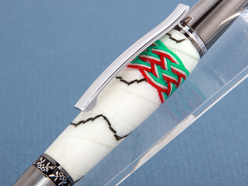
One way (but certainly not the only way) to make a pen look bigger is to zoom in. For example, I've cropped this photo to show only the barrel (which is made from furled sailcloth tied with a turk's head knot).
Pen Presentation
To attract a viewer's attention, you need to present the pen in an attractive position. How often have you seen a picture with the pen laying horizontally? That may be the simplest way to photograph a pen, but it is also the least eye-catching. Horizontal pens look staid and lifeless. Vertical pens appear similarly still. In general, placing a pen diagonally will result in a more dynamic image.
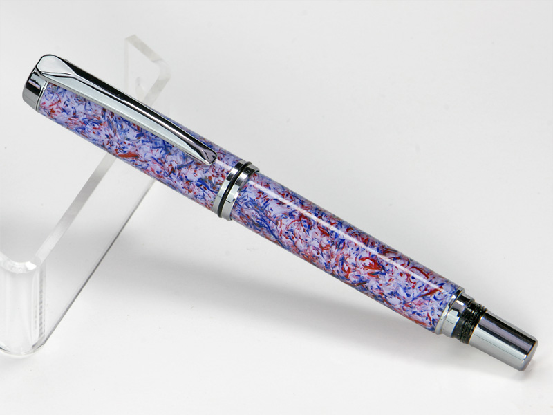
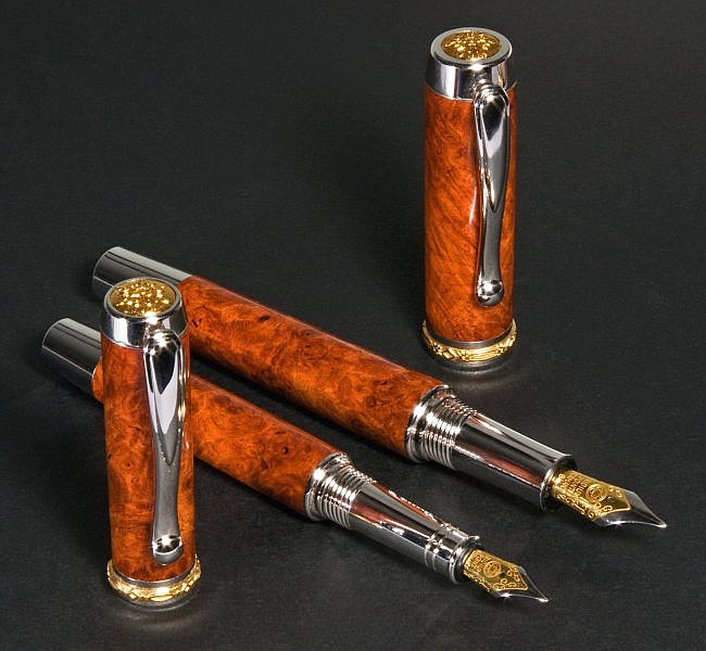
Likewise, angling a pen towards or away from the camera gives a greater sense of depth to the picture. If lends the photo a feeling of direction, making the pen seem more interesting. I frequently see people advising others to shoot a pen straight from the side (to reduce focus issues), but that often makes for a dull image. Don't sacrifice your composition simply to avoid technical concerns.
Here is a picture of a pen placed diagonally in the frame, and turned toward the camera.

Camera Angle
Equally as important as the position of the pen, is the direction from which you photograph it. Most of us will unthinkingly try to take the picture from directly overhead. Again, this is usually the least attractive view. It yields a sense of disuse and lifelessness. The next most common approach, is a 45 degree downward angle. While generally acceptable, it is also rather ordinary.
I often photograph my pens from a lower, but not quite level, angle. That makes the pictures a little unusual, and therefore more eye-catching. Try shooting from a variety of camera locations, and see what stands out for you.
Props
It's perfectly OK to take a pen photo without any props at all. In fact, many penturners like it that way. We want to see the pen, not other stuff. It can be difficult, however, to pose the pen attractively without setting it on something. In that case, I recommend keeping the prop simple. You don't want the prop to distract from the pen. Many of us use clear acrylic pen stands for that purpose.
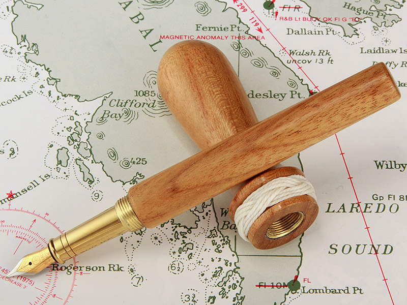
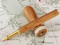
A popular option with capped pens is to lay the cap flat and prop the other half up on it. That often works very well. For an example, see the Belaying Pen photo farther below.
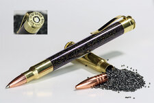
Most professional photographers (and many buyers), however, like to see a pen in some context. They'll recommend adding props such as a bottle of ink, or a letter in progress. There's a lot of merit in such advice, but I'll make two suggestions. First of all, make sure the props fit the theme of the photo. You want them to harmonize with the pen. Second, make them simple or subtle. The goal is to show off the pen. Props that draw the viewer's attention away from the pen don't add to the photo - they detract from it. The picture below incorporates thematic props. The pen is made from rifle brass with a real bullet and actual gunpowder. The props echo the pen's construction and fill in what would otherwise be a large empty space in the photograph.

Backgrounds
A photograph's background should not distract from the pen. There's nothing wrong with a plain, neutral background. A flat white (or light gray) background is very popular. I often photograph pens on a piece of white mat board. A gradient background (one that gets progressively lighter or darker) can also be quite attractive. It adds a feeling of depth to the photograph. You can achieve the effect with lighting, or by using a background material that gets progressively darker. Photo supply stores sell gradient paper printed for that exact purpose. The picture below was taken on lightly textured gray mat board lit to produce a gradient background.
Just as with props, a thematic background can compliment the pen. My advice is the same - make sure it harmonizes with the pen and isn't so busy that the background draws attention to itself. Here's an example photograph of a pen in the shape of a belaying pin. The pen body is propped up on the cap, and to compliment the nautical theme, it's laying on a marine chart. I picked a chart with subtle colors and detail that would not clash with the pen.
Another, and very striking option, is to use a reflective background. Clear glass, black acrylic, and mirror surfaces will produce different amounts of reflection. That can both show off more of a pen (areas visible in the reflection), and fill in the image without props. I'll show a couple of pictures with a reflective background in the next sections.
The "Rule of Thirds"
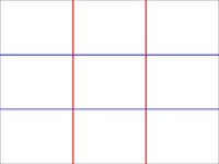
The craft of photography has many (sometimes conflicting) guidelines, and one of them is known as the "rule of thirds". Remember, this guideline is not universal, and there are many times when it is better ignored than followed, but it can be useful. Imagine drawing lines across a photograph, dividing it into thirds horizontally and vertically (like a tic-tac-toe game).
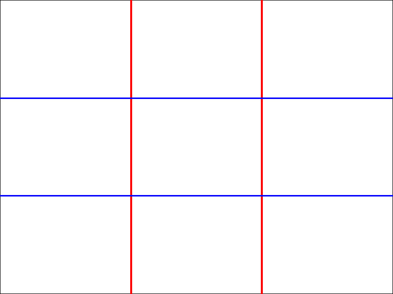
The rule-of-thirds states that a photograph will probably be more interesting if you place the subject on one of the four points where the lines intersect. If your photo has two subjects, then they will likely look best if they are located at diagonally opposite intersections. Here's an obvious example.
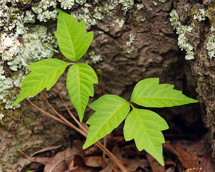
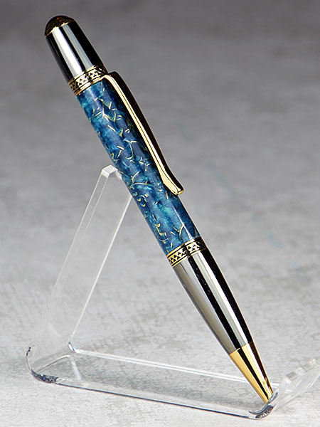
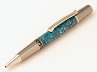
Although this is not a pen picture (actually it's poison ivy - so don't touch), it illustrates the principle. The two plants are located at opposite intersections. One is 1/3 of the way from the top and left. The other is 1/3 of the way from the right and the bottom. Employing this rule in pen pictures is more subtle, but I deliberately used it the photo below. Notice that the blue swirled pen barrel lies on the upper left rule-of-thirds intersection. When looking at the picture, I find that my eye is naturally drawn to that location. This is an effective way to show off the blank I used.
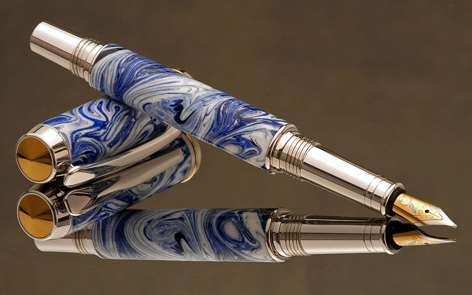
Unrelated to the rule-of-thirds, the nearly horizontal reflection tends to serve as a "floor" to the composition, which helps keep the eye from wandering off the photo. It also shows off the pattern in the underside of the blank. The background is a reflection of a piece of mat board I set far enough behind the mirror that it's printed pattern would be out of focus. That yields a slightly mottled appearance that is unobtrusive without being bland.
A Little Bit of Everything
Finally, here is a pen picture that draws from most of the topics discussed above.
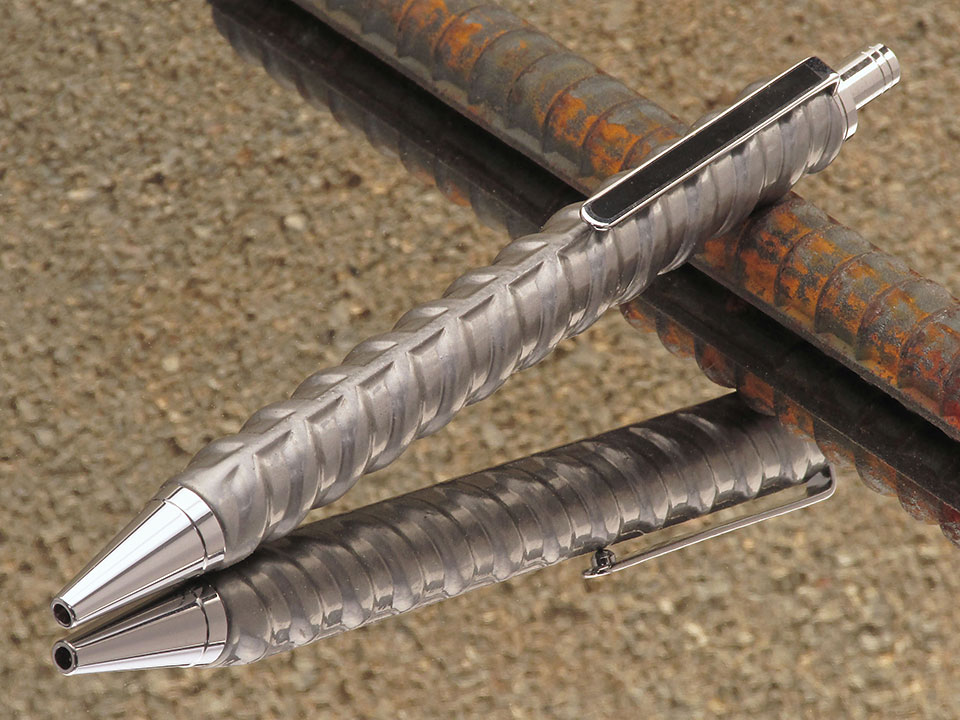
This is a click-pen made from "re-bar" (steel reinforcement rod used in concrete). It is positioned diagonally across the photo, with the nosecone turned slightly towards the camera. It is shot from a fairly low camera angle.
The pen is propped up on a piece of raw (and somewhat rusty) re-bar for a "concrete worker's pen" motif. The rust adds a little bit of color to offset the completely gray pen. They are sitting on a mirror and I was careful to lay the re-bar such that it wouldn't pull the viewer's attention out of the frame. I placed a concrete block where it would reflect off the mirror and carry the construction theme into the background. It's close enough to be recognizable, but far enough away to be slightly blurred -- so as not to distract from the pen. If you imagine rule-of-thirds lines on the picture, you'll notice that the lower-left intersection lies on the bright part of the pen barrel, where the eye is naturally drawn.
The image is perhaps a bit busy, but I feel that it works, and showcases the pen in a way that would appeal to those in the construction industry. What do you think?
I hope that helps,
Eric
Compositional Goals
So, what makes a pen photo "good"? What do you want your photo to achieve? Generally speaking, one wants to first capture the viewer's attention. Somehow, it has to snag people's interest. Otherwise, they'll just pass it by. Then, it needs to draw the eye into the photo. Once you've got somebody looking, you don't want them to slip away. Elements in the picture should lead them inward, not out of the frame. Finally, the photo should center attention on the subject. You want people to concentrate on the subject, not extraneous objects.
To me, a simple test of a pen photograph is does it make the pen "look big". I don't know how to quantify that objective, but the best pictures I see on the IAP make the pen stand out. They appear, well, big.
One way (but certainly not the only way) to make a pen look bigger is to zoom in. For example, I've cropped this photo to show only the barrel (which is made from furled sailcloth tied with a turk's head knot).
Pen Presentation
To attract a viewer's attention, you need to present the pen in an attractive position. How often have you seen a picture with the pen laying horizontally? That may be the simplest way to photograph a pen, but it is also the least eye-catching. Horizontal pens look staid and lifeless. Vertical pens appear similarly still. In general, placing a pen diagonally will result in a more dynamic image.
Likewise, angling a pen towards or away from the camera gives a greater sense of depth to the picture. If lends the photo a feeling of direction, making the pen seem more interesting. I frequently see people advising others to shoot a pen straight from the side (to reduce focus issues), but that often makes for a dull image. Don't sacrifice your composition simply to avoid technical concerns.
Here is a picture of a pen placed diagonally in the frame, and turned toward the camera.
Camera Angle
Equally as important as the position of the pen, is the direction from which you photograph it. Most of us will unthinkingly try to take the picture from directly overhead. Again, this is usually the least attractive view. It yields a sense of disuse and lifelessness. The next most common approach, is a 45 degree downward angle. While generally acceptable, it is also rather ordinary.
I often photograph my pens from a lower, but not quite level, angle. That makes the pictures a little unusual, and therefore more eye-catching. Try shooting from a variety of camera locations, and see what stands out for you.
Props
It's perfectly OK to take a pen photo without any props at all. In fact, many penturners like it that way. We want to see the pen, not other stuff. It can be difficult, however, to pose the pen attractively without setting it on something. In that case, I recommend keeping the prop simple. You don't want the prop to distract from the pen. Many of us use clear acrylic pen stands for that purpose.
A popular option with capped pens is to lay the cap flat and prop the other half up on it. That often works very well. For an example, see the Belaying Pen photo farther below.
Most professional photographers (and many buyers), however, like to see a pen in some context. They'll recommend adding props such as a bottle of ink, or a letter in progress. There's a lot of merit in such advice, but I'll make two suggestions. First of all, make sure the props fit the theme of the photo. You want them to harmonize with the pen. Second, make them simple or subtle. The goal is to show off the pen. Props that draw the viewer's attention away from the pen don't add to the photo - they detract from it. The picture below incorporates thematic props. The pen is made from rifle brass with a real bullet and actual gunpowder. The props echo the pen's construction and fill in what would otherwise be a large empty space in the photograph.
Backgrounds
A photograph's background should not distract from the pen. There's nothing wrong with a plain, neutral background. A flat white (or light gray) background is very popular. I often photograph pens on a piece of white mat board. A gradient background (one that gets progressively lighter or darker) can also be quite attractive. It adds a feeling of depth to the photograph. You can achieve the effect with lighting, or by using a background material that gets progressively darker. Photo supply stores sell gradient paper printed for that exact purpose. The picture below was taken on lightly textured gray mat board lit to produce a gradient background.
Just as with props, a thematic background can compliment the pen. My advice is the same - make sure it harmonizes with the pen and isn't so busy that the background draws attention to itself. Here's an example photograph of a pen in the shape of a belaying pin. The pen body is propped up on the cap, and to compliment the nautical theme, it's laying on a marine chart. I picked a chart with subtle colors and detail that would not clash with the pen.
Another, and very striking option, is to use a reflective background. Clear glass, black acrylic, and mirror surfaces will produce different amounts of reflection. That can both show off more of a pen (areas visible in the reflection), and fill in the image without props. I'll show a couple of pictures with a reflective background in the next sections.
The "Rule of Thirds"
The craft of photography has many (sometimes conflicting) guidelines, and one of them is known as the "rule of thirds". Remember, this guideline is not universal, and there are many times when it is better ignored than followed, but it can be useful. Imagine drawing lines across a photograph, dividing it into thirds horizontally and vertically (like a tic-tac-toe game).
The rule-of-thirds states that a photograph will probably be more interesting if you place the subject on one of the four points where the lines intersect. If your photo has two subjects, then they will likely look best if they are located at diagonally opposite intersections. Here's an obvious example.
Although this is not a pen picture (actually it's poison ivy - so don't touch), it illustrates the principle. The two plants are located at opposite intersections. One is 1/3 of the way from the top and left. The other is 1/3 of the way from the right and the bottom. Employing this rule in pen pictures is more subtle, but I deliberately used it the photo below. Notice that the blue swirled pen barrel lies on the upper left rule-of-thirds intersection. When looking at the picture, I find that my eye is naturally drawn to that location. This is an effective way to show off the blank I used.
Unrelated to the rule-of-thirds, the nearly horizontal reflection tends to serve as a "floor" to the composition, which helps keep the eye from wandering off the photo. It also shows off the pattern in the underside of the blank. The background is a reflection of a piece of mat board I set far enough behind the mirror that it's printed pattern would be out of focus. That yields a slightly mottled appearance that is unobtrusive without being bland.
A Little Bit of Everything
Finally, here is a pen picture that draws from most of the topics discussed above.
This is a click-pen made from "re-bar" (steel reinforcement rod used in concrete). It is positioned diagonally across the photo, with the nosecone turned slightly towards the camera. It is shot from a fairly low camera angle.
The pen is propped up on a piece of raw (and somewhat rusty) re-bar for a "concrete worker's pen" motif. The rust adds a little bit of color to offset the completely gray pen. They are sitting on a mirror and I was careful to lay the re-bar such that it wouldn't pull the viewer's attention out of the frame. I placed a concrete block where it would reflect off the mirror and carry the construction theme into the background. It's close enough to be recognizable, but far enough away to be slightly blurred -- so as not to distract from the pen. If you imagine rule-of-thirds lines on the picture, you'll notice that the lower-left intersection lies on the bright part of the pen barrel, where the eye is naturally drawn.
The image is perhaps a bit busy, but I feel that it works, and showcases the pen in a way that would appeal to those in the construction industry. What do you think?
I hope that helps,
Eric
Attachments
-
 FurledSail2.jpg157.8 KB · Views: 2,321
 -
 AlMillingsPen.jpg95.1 KB · Views: 2,192
 -
 Tickertape1.jpg97.6 KB · Views: 2,496
 -
 GunpowderPen.jpg65 KB · Views: 2,795
 -
 BrassShavingsPen.jpg48.2 KB · Views: 2,077
 -
 BelayingPen2.jpg175.8 KB · Views: 2,201
 -
 PoisonIvy.jpg150.1 KB · Views: 2,141
 -
 BlueSwirl.jpg110.5 KB · Views: 2,122
 -
 RebarPen.jpg148.9 KB · Views: 2,342
 -
 RuleOfThirds.jpg21.8 KB · Views: 2,189
 .
.")