
You are using an out of date browser. It may not display this or other websites correctly.
You should upgrade or use an alternative browser.
You should upgrade or use an alternative browser.
Photo Critique Please
- Thread starter TomW
- Start date
Signed-In Members Don't See This Ad
Signed-In Members Don't See This Ad
GoodTurns
Member
too small for my aging eyes! can't see detail in a 300x300 pix.
OKLAHOMAN
Member
Agree with Jon, try 600x600
bitshird
Member
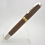
Tom, it's close, but there is just a tiny bit of over exposure on the top of the clip, the detail is starting to wash out, Also I'm not seeing the contrast in the gold trim on the centerband. you might try stopping down a stop or stop and a half.
Or use a faster speed, I have no Idea of the parameters or you cameras capabilities, if you can, just bump the ISO up , any thing that will cut your total exposure, Nice lighting, hardly any shadow except just under the lower part of the finial ring, the tip looks perfect. Perhaps bouncing a light off the bottom of your setup, would accentuate the full round shape, and eliminate the tiny bit of shadow that's there.
This comes from a guy that spent a year and a half at New England School of Photography, but still haven't figured out my Nikon 8700 after having it for about 6 or 7 years. . I can do much better with my Nikon F-2 but film is a hard thing to come by these days.
I would settle for posting a picture like that any day.
TomW
Member
Roy,
600x600 is 1.4MB jpg....about 3x too big... I'm trying to keep Curtis on my side...should I reduce the 320 pixels/inch?
Thanks
Tom
600x600 is 1.4MB jpg....about 3x too big... I'm trying to keep Curtis on my side...should I reduce the 320 pixels/inch?
Thanks
Tom
G1Pens
Member
Roy,
600x600 is 1.4MB jpg....about 3x too big... I'm trying to keep Curtis on my side...should I reduce the 320 pixels/inch?
Thanks
Tom
600x600 should not be that big. I post everything at 800x600 and even at the lowest jpg compression it only comes in around 250k per picture.
Do the math....600 times 600 is 360,000....which is 350K....and that is without any compression. A jpg at 600x600 should be no bigger than 300k
G1Pens
Member
BYW. I think the photo looks pretty good. I'm not a big fan of the stands in the picture but a lot of people do it that way. Heck Brooks made the feature with one.
Lighting looks pretty good. It is a little brighter at the top than at the bottom. Look at the chrome on the finial and clip. It is bright and white. Now look at the "bottom" it is grey.
I agree that tweeking the contrast a little would probably help too.
Lighting looks pretty good. It is a little brighter at the top than at the bottom. Look at the chrome on the finial and clip. It is bright and white. Now look at the "bottom" it is grey.
I agree that tweeking the contrast a little would probably help too.
OKLAHOMAN
Member
Tom, all my photos are at least 600x550 most are 640x600, Look at Brooks feature pen on hius SOYP and it's 550x700 and his close up is 651x700 -
Roy,
600x600 is 1.4MB jpg....about 3x too big... I'm trying to keep Curtis on my side...should I reduce the 320 pixels/inch?
Thanks
Tom
TomW
Member
GoodTurns
Member
It is a little brighter at the top than at the bottom. Look at the chrome on the finial and clip. It is bright and white. Now look at the "bottom" it is grey.
that's what I see as well, plus a black reflection in the centerband. I prefer not using a stand, but it sure does make it easier! I use them for my web pics but not for "art" shots.
Brooks803
Member
I dunno if this will help much Tom, but here's a writeup I did a short while back on how I do my photos: http://www.penturners.org/forum/showthread.php?t=83019
What editing software are you using?
What editing software are you using?
Steve Busey
Member
Something just looks hazy/washed out about the lighting. Are you using a fully closed tent? Perhaps try opening one side so you get some contrast in your reflections.
CGW-WoodWorks
Member
I think it's a solid start and with a few tweaks it could be even better. The pic looks a little washed out to me, probably over exposed a touch, I tend to like high contrast pen shots. I usually don't like stands in pictures either but I think that one is pretty non-obtrusive being it is on white. If you angled your light a little more to one side or the other I think you could add some more dimension to the image.
Dave Turner
Member
76winger
Member
The lighting looks pretty even, but I too think the image is a little fuzzy overall.
One of the things I do in my post processing is to crop the borders tighter to the pen, which reduces file size and lets me use just a little larger image for better clarity. I also use an image "sharpening" feature in the software which takes a little of the softness out of the lines and gives them more distinction. You might see if the software you're using has the function (most do I believe) and give it a try.
One of the things I do in my post processing is to crop the borders tighter to the pen, which reduces file size and lets me use just a little larger image for better clarity. I also use an image "sharpening" feature in the software which takes a little of the softness out of the lines and gives them more distinction. You might see if the software you're using has the function (most do I believe) and give it a try.
terryf
Member
Tom
First off, clean the sensor of your Rebel, its full of dust bunnies")
Second, try not to shoot at 18mm, it distorts terribly, keep it at around 40mm if you can. Shoot on manual and over expose by a half to a full stop.
To get rid of the glare on the clip, use a circular polarising filter.
Download GIMP, its free and you will have a lot more editing options than you currently have with paint.
Good luck
First off, clean the sensor of your Rebel, its full of dust bunnies
Second, try not to shoot at 18mm, it distorts terribly, keep it at around 40mm if you can. Shoot on manual and over expose by a half to a full stop.
To get rid of the glare on the clip, use a circular polarising filter.
Download GIMP, its free and you will have a lot more editing options than you currently have with paint.
Good luck