opinions needed

Signed-In Members Don't See This Ad
See more from jj9ball

jj9ball

Member
Joined
Dec 23, 2008
Messages
140
Location
Norfolk, NE
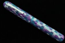
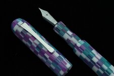
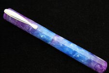
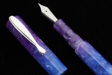
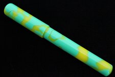
Here are some of the other kitless pens that I have been working on. I would be interested in everyone's opinion both good and bad. Designing these things to look halfway proportional is kind of tricky. Please let me know if you think the body, cap, section is too big or small. I'd love some input.
 

Attachments

  • IMG_2682.jpg
    IMG_2682.jpg
    107.5 KB · Views: 201
  • IMG_2685.jpg
    IMG_2685.jpg
    114.2 KB · Views: 188
  • IMG_2670.jpg
    IMG_2670.jpg
    143.8 KB · Views: 196
  • IMG_2673.jpg
    IMG_2673.jpg
    121.9 KB · Views: 169
  • IMG_2674.jpg
    IMG_2674.jpg
    115.7 KB · Views: 194
Signed-In Members Don't See This Ad
As far as proportion between body and cap I like the green one the best. The other two with the cap and body being equal length just doesn't look right to me. Other than slims I can't think of any other 2 piece pen were the body and cap are the same thickness either. To me it looks better if the body screws up inside the cap a little or at looks like it does. That's my thoughts on them. Likely worth about what you paid for them.
 
Before I comment, it is difficult to tell without some sort of reference to sizes. Maybe posting them with a ruler would help.

The first one I like the best, It appears to be proportional cap with body. I like the clip. I would have tried to make a center band work to break up the appearance when capped. But looks great.

The 2nd one cap and body appear to be same length. May just be photo. Still looks good.

3rd pen and this is just my personal taste seems incomplete. Needs clip. I've seen lots of kitless without clips, but I think it needs one. The body and cap look good where they mate up. Good choice with no centerband.

Again thats just my opinion. They look fantastic and great work. Much better than most of the kitless pens I've done.
 
On the first two I would like them a tad better if the cap was just a little bit shorter with a cap to lower body ratio of about 2 to 3 based on a little over 5 inches capped for the overall pen length. I think the 3rd pen is close to that. Real nice pens over all though.
 
Just my thoughts here, but I really like the 1st one the best. The last/3rd pen like LeRoy commented on looks a tad better but I would think that just an extra 1/4 - 3/8" longer would give it just a bit better proportion. Could even leave the cap maybe an extra .05" bigger in diameter. Over all they look great!
 
Last edited:
I've never done any kitless pens, so you've got my respect for trying them. Anyway, I like the green pen the best, proportionately speaking. The others with the equal length caps just look odd, IMO. I think maybe if the cap stopped at the clip it would be about the correct proportions. There's a specific ratio called the golden mean or golden ratio or phi, that will make the proportions pleasing to the eye. Again, JMO!:biggrin:
 
I like the smoothness of the second one. Ideal proportions all aside (that's all subjective anyhow) I like the balance and equal lengths. Good job on all three.
 
Generally they all look made well. As others have said, im not a big fan of pens where the cap and barrel are the same length and even the same thickness. If they are, they need a little shape to them to break up the evenness of them. I also dont like that the lip on the barrel of the first pen rolls over and isnt flush with the upper barrel. I can dont know the length of the tenons, but the threaded tenons look a little long to me. I make mine .20" long.The front sections also look a little long to me. I prefer mine to be 5/8" long. Proportionally the third pen is the best. Maybe a 1/4" shorter would be perfect to me. How long it is?
 
Three Excellent Pens, Jeff.
For my taste, I prefer the proportions of the third, the Green Pen.
It is the closest to "Phi" the "Golden Mean" as Chris mentioned.
Looks like you are achieving excellent Fit, and Terrific Finish.
I know you were only looking on comments regarding the proportions, but I consider that I should also acknowledge good work, when I see it.
Well done,
Brian.
 
Back
Top Bottom