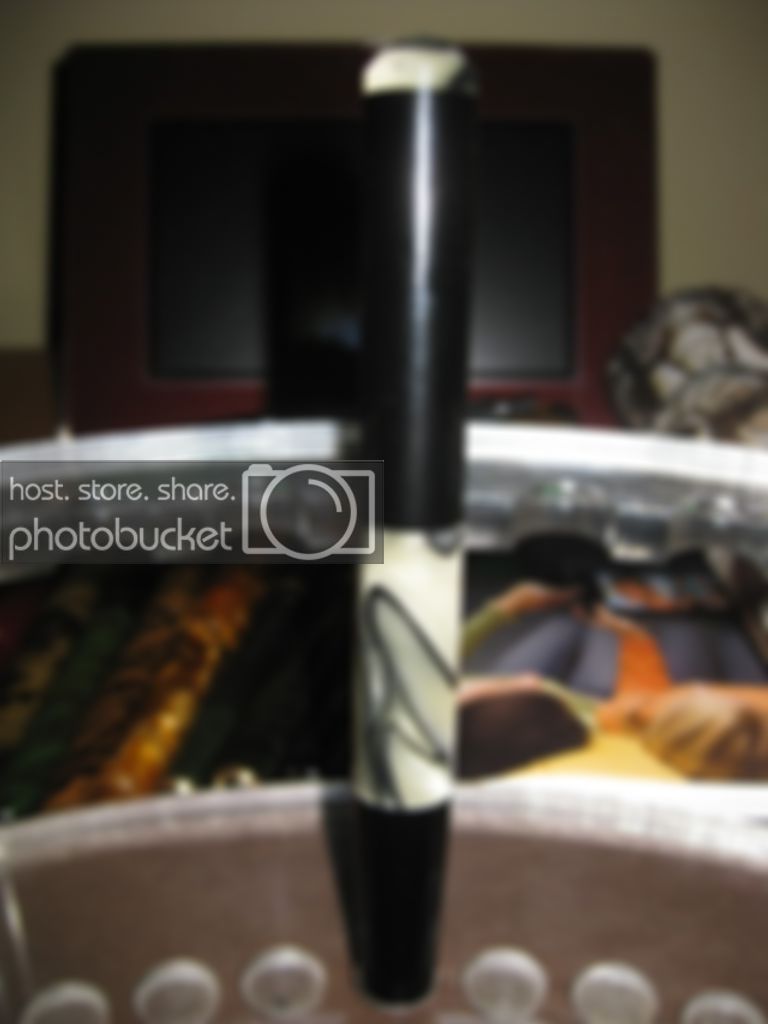
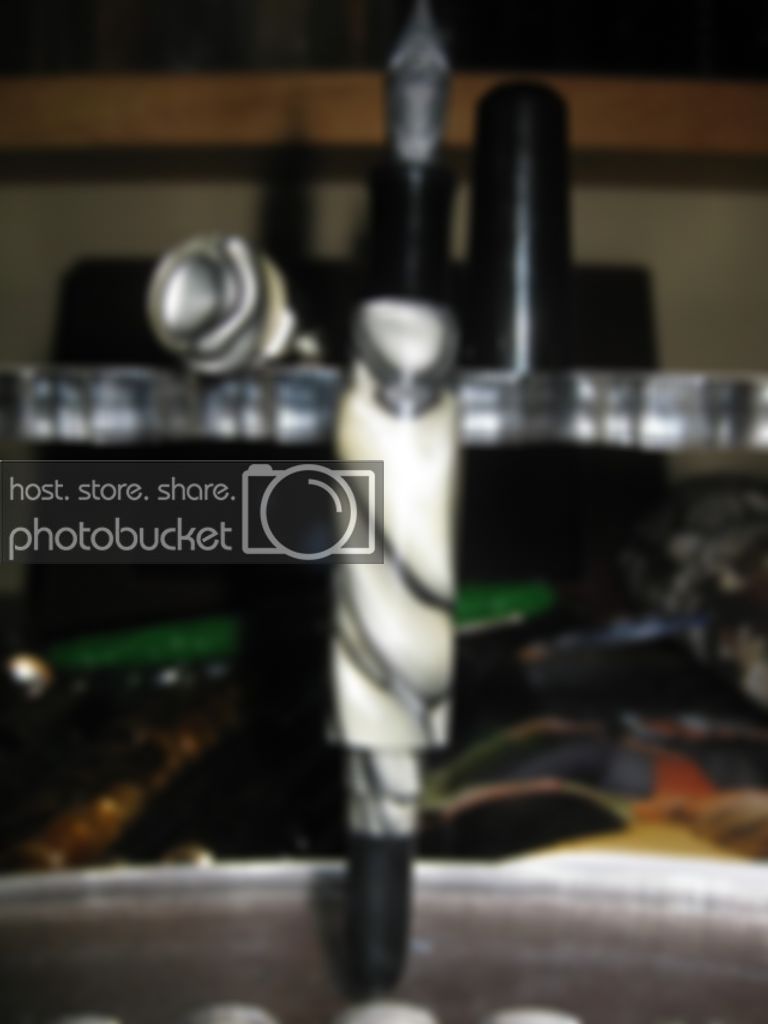
I'd say the cap looks longer than the pen..it might not be, but the pic makes it look at least equal in length..so that's a small turn off, but the biggest turn off for me is all the black in the pen, especially in the cap. I think if the cap was exactly opposite of what it is, it would be quite an improvement...so the cap mostly the white swirl and a small piece of black on top. It's like the black is the focus of the pen, but the white is more interesting, so I'm lost on what I'm looking at if that makes sense. Of course this is all just my opinion, I don't see anyone else saying anything about it..kinda nervous and hate to say anything bad about it myself if you know what I mean, as I hate to criticize.
