
You are using an out of date browser. It may not display this or other websites correctly.
You should upgrade or use an alternative browser.
You should upgrade or use an alternative browser.
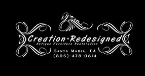
Logo for my Business
- Thread starter Rfturner
- Start date
Signed-In Members Don't See This Ad
Signed-In Members Don't See This Ad
Jim15
Member
I think it looks very nice. The second line "antique furniture restorations needs to go a little further to the right, doesn't seem to lined up correctly to me.
JimB
Member
Ryan - I think it is to busy for my taste. Also, the subtitle is off center (I assume because of the 'g'. It makes the the entire thing look off balance.
Sorry, just my 2 cents.
Sorry, just my 2 cents.
markgum
Member
looks good, as mentioned the 2nd line looks off center, but otherwise very sharp.
G1Pens
Member
I like it. I think it conveys the craftsmanship of good furniture. The only thing I see is a small thing. On the phone number, leave the braces off the area code. No one lists phone numbers like that any more.
IPD_Mrs
Member
It looks good. I like the swan touch at the top. It gives the look of a victorian mirror with appliques surrounding it.
turner.curtis
Member
I agree with the comments above, the embellishments look nice although it seems the text is off balance. Maybe decrease the font size of the text, or stretch the side embellishments so that the apogee of the top arch is level with the eye of your bird and on the bottom arch, level with the bottom of your phone text then lower your tag line to be able to center it a bit better.
Dale Coons
Member
A little too busy
Keep the swan, drop the side flourishes. If you then push the swan to the right a little it will balance the subtitle. The parens on the phone number don't bother me--and in this case I think a little 'retro' fits with the business of refinishing. I like the font, and I really like the swan.
But what do I know:biggrin:
ttpenman
Member
Just my 2 cents -- the reverse (white on black) can limit your uses. For instance, it would make a beautiful addition to a piece of furniture as a black ink on silver foil label, but would be less useful if you wanted to use it in a newspaper ad or a lettterhead. Although you could use the same design as black on white for other purposes. For an ad you want your info such as address/phone more prominent.
Just my opinion -- worth every cent you paid for it.
Jeff in northern Wisconsin
Just my opinion -- worth every cent you paid for it.
Jeff in northern Wisconsin
randyrls
Member
My only suggestion would be to move the "end caps" further apart. It crowds the text.
I would move the embelishments further apart from the main text drop the address and phone number down to the bottom and move the swan up slightly. And as mentioned, center the second line.
ed4copies
Local Chapter Manager
Personally, I would not put a phone number on a logo.
You hope the logo outlives your area code.
Just a FWIW
You hope the logo outlives your area code.
Just a FWIW
Dave Turner
Member
Reverse the colors. Also I think the main title font is a little too modern for the theme you're portraying. One of the many antique style fonts might look better.
This is all nit-picking. I think your basic design is great.
This is all nit-picking. I think your basic design is great.
Rfturner
Member
...Just my opinion -- worth every cent you paid for it.
Jeff in northern Wisconsin
Thankyou I really like the price I paid for it too as it was just about an hours worth of my time
I made the phone number and city easily changable/ deletable for that reason. I hope that it does grow outside my area code too as I can make $ 15-30/hour:biggrin: when people want work done. that is not counting if I have to pick up or deliver.Ed4copies said:Personally, I would not put a phone number on a logo.
You hope the logo outlives your area code.
Just a FWIW
Thank you for all the comments I put a few changes down below, I inverted the colors on the one. I have had alot of comments about the swan or peacock or whatever that they love it. I did not make that portion but I like it
Attachments


Drstrangefart
Member
I prefer the white font on the black background, matter of taste. It looks super old school. Makes me think of Victorian era. Both options look great. I wouldn't be ashamed of handing that out on a wallet-sized card.
ctubbs
Member
For signage the black background is very good but will be hard to read at distance. For letter head the black text is easier to make work from a print shop view.
Charles
Charles
navycop
Member
I wood like to see the white one on a sign and the black one on business cards. I think they would be easier to read that way...Just my Buck-o-Five.For signage the black background is very good but will be hard to read at distance. For letter head the black text is easier to make work from a print shop view.
Charles