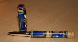
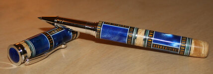
Latest effort

Signed-In Members Don't See This Ad
See more from hebertjo

hebertjo

Member
Joined
Apr 28, 2008
Messages
231
Location
Phoenix, AZ, USA.
Here is my latest effort. I am a bit sad on this one because it broke at the segments about 10 times and I inadvertly glued it back together with the horizontal segments mis-aligned. I did not notice until I pulled it off the lathe. It was a lot of work and I am very bummed out that it turned out this way. I guess we learn from our mistakes.

It is a Jr. Retro closed end and I replaced the stock black finial button with one that matches the blank.
 

Attachments

  • blue_pen.jpg
    blue_pen.jpg
    54.5 KB · Views: 296
  • blue_pen_02.jpg
    blue_pen_02.jpg
    48.8 KB · Views: 249
Signed-In Members Don't See This Ad
Nice job hebertjo, you can always pretend it wa supposed to be like this in the first place!:rolleyes: Frankly if you hadn't said anything I wouldn't have picked up on it. Like the custom finial and good job on the closed end work.:RockOn:
 
That is very nice. The colors and the design go together very well. Don't worry about the alignment, looks just fine from here.
 
Just don't tell the customer.....

When I make special pens, I have a printed list of "Things to watch out for"!:eek:

Don't ask, don't tell!!!!

It is excellent work and well worth showing off!
 
Your design and color choices are very nice. It is disappointing when a segmentation doesn't come out the way you imagined it, but you still have a great looking pen.
 
Very nice-looking pen! Personally, mistake or not, I like the fact that the segmentation is offset. IMHO, if they lined up, the pen would appear too regimented and contrived; this way, it looks sort of patchwork, and I like the effect! Great job.
 
Beautiful pen. I like the offset horizonal elements. Do you mind telling us what materials you used for the segments?
 
Last edited:
I wish my mistakes looked that good, if I were you I wouldn't tell any one else there were errors, I would just let them marvel at your artistry.
 
Thanks for the compliments.

We are always our own worst critic because you know what you were trying to achieve and if you fall short you know it. Others might look at it and say it looks great as is. I must say I learned a couple of good lessons working on this and I will put them to work on furture efforts.

louisbry - The blue is cobalt blue from Woodcraft (I love how easy that stuff turns) The metal is 1/32 aluminum and there are some 1/16 inch bands of blue dyed box elder burl. Also, natual stabilized BEB and the blue and yellow-ish segments are from a bottle stopper blank from Penn State called Oceana.
 
I looked at the pen before reading and was amazed. After reading what you wrote I had to go back and look again. Took me a while before I saw it. I think it looks better this way. Great work.
 
Hebertjo,

ARE you wrapping the blank tight with string and then CA'ing the string solid before drilling?

Eagle taught us to do that, at least for those that noticed. I realize that most people focused on the end product and not so much on his methods.

I drilled a brass segment without breaking (on the lathe) but I wrapped the blank tightly in a solid winding of string and soaked the string in CA until it was almost smooth. I left about 1/2 inch free to load in the chuck for perfect centering.

Doing it on the lathe IMO allows for more precise control of the speed of the depth of cut. It still is touchy.

Hank
 
I did not know that trick. I will try that on the next one. Unfortunately I joined the forum shortly before Eagle passed on so have not read much from him. From what I have read he was a great craftsman and inovator.
 
What an amazing looking pen. I noticed right away that the lines were not lined up and was even more impressed by that. I really think it looks great the way it is.
 
Back
Top Bottom