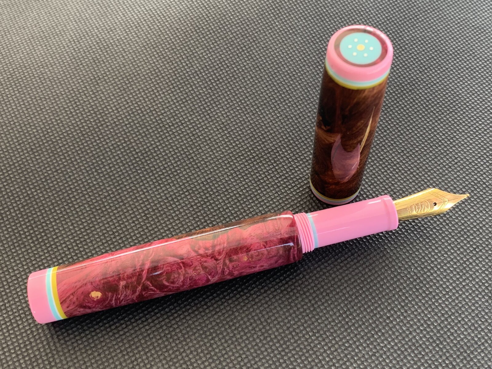
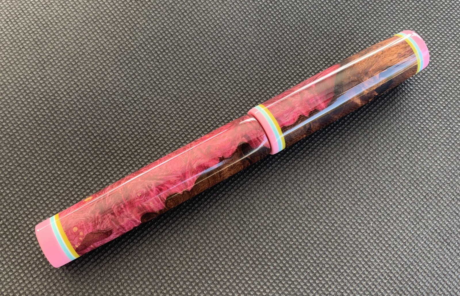
Kitless #5 - HRB dyed pink

Signed-In Members Don't See This Ad
See more from PatrickR

PatrickR

Member
Joined
Apr 8, 2017
Messages
1,433
Location
Rural America
This is the 5th kitless for me. #4 I entered in the bash. I have been making poor choices with color recently so the next few will be much more sedate. C,C & questions welcome.
868D225D-8898-4DE0-ADB0-DB30C649ECDF.jpeg
29749A52-54C2-4937-8B25-AB7CD75CAD48.jpeg
 
Last edited:
Signed-In Members Don't See This Ad

mark james

IAP Collection, Curator
Joined
Sep 6, 2012
Messages
12,752
Location
Medina, Ohio
I agree that the color choices are not well matched. But each element is excellent in their own. Your finial and rings are excellent, but I would favor wood-wood, or plastic-plastic (my terms may be incorrect). But you have a LOT of excellent things going on here - well done.
 

Fred Bruche

Member
Joined
Feb 11, 2018
Messages
977
Location
Philadelphia 19146
Makes me think of a candy bowl 😅 Shape, proportions, fit, finish, details,... you got that down, all spot on! But... ya... spend some time reading the results from Google search with keywords like "color theory harmony" :D
 

TDahl

Member
Joined
Dec 11, 2019
Messages
1,894
Location
Brentwood
I like it a lot! Well done. I think the combination of materials go well together, and the finial is very nice. How did you make it (if you don't mind me asking?)
 

PatrickR

Member
Joined
Apr 8, 2017
Messages
1,433
Location
Rural America
I like it a lot! Well done. I think the combination of materials go well together, and the finial is very nice. How did you make it (if you don't mind me asking?)
Thanks!
I use a rotary tool mounted on the lathe with an indexing wheel to drill for the pins. Drill the cap and set in a button of wood, drill another hole and set in the button with pins (both being slightly lower than the cap edge) then "dome" it with UV clear. It sounds like a lot of work but goes fast once done a few times.
This configuration I have adopted as my makers mark.
 

PatrickR

Member
Joined
Apr 8, 2017
Messages
1,433
Location
Rural America
I agree that the color choices are not well matched. But each element is excellent in their own. Your finial and rings are excellent, but I would favor wood-wood, or plastic-plastic (my terms may be incorrect). But you have a LOT of excellent things going on here - well done.
thanks! I do think that the rings should have been blue/white/blue. The yellow throws off the symmetry.
 

PatrickR

Member
Joined
Apr 8, 2017
Messages
1,433
Location
Rural America
Makes me think of a candy bowl 😅 Shape, proportions, fit, finish, details,... you got that down, all spot on! But... ya... spend some time reading the results from Google search with keywords like "color theory harmony" :D
Thanks Fred! Interestingly enough I did use a color pallet I found online. I would like it much more without the yellow. Live and learn.
 

sorcerertd

Member
Joined
Sep 30, 2019
Messages
2,705
Location
North Carolina, USA
Personally, I think that pen is absolutely amazing! Fit and finish are superb! It's certainly not my color preferences, but it does give off a wonderful tropical vibe. The yellow, though it may seem not to match, really brings out the eyes that did not take the dye. It certainly will look different in person, but the world is full of different tastes and there are no doubt many people that would love to have that pen. Well done!
 
Top Bottom