
You are using an out of date browser. It may not display this or other websites correctly.
You should upgrade or use an alternative browser.
You should upgrade or use an alternative browser.
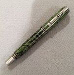
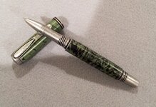
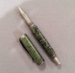
Jr. George - Antique Silver - "M3 Titanium Mokume"
- Thread starter jondavidj
- Start date
Signed-In Members Don't See This Ad
See more from jondavidj


I know it.


try here.
http://www.penturners.org/forum/f212/sale-giveaway-133194/
Ed, I share your general lack of enthusiasm for the M3 blanks. This is just my personal opinion, but those blanks and the resultant pens do not do much for me. On the other hand, I am totally sold on the antiqued finish of these recent component sets, and there are many blanks that will prove to be outstanding matchups. These will allow not only a more diverse offering at my sales table, but will do so on a par with my current pens that are based on existing quality component sets. This is a much appreciated group of pen designs, and BY FAR outperform the "New-novelty-kit-every-3-days (or so)" that keep popping up over at PSI.
Ooops...looks like I wandered off topic in this thread. If I were "old" I could blame it on that, but I am only just "older", so I search for another excuse!
Signed-In Members Don't See This Ad
cschimmel
Member
great combo. That antique silver works really well with that M3
jimm1
Member
Good looking kit and blank. Works together.
edstreet
Member
Would this be a bad time to post and at the matchings goes good but I dislike m3 stuff?
The m3 overall look seems fake, not even close to the real thing and the focus seems to be on the real thing and very little on what it is. Also Jon has sent me a M3 pen that I kinda did like but it was still not even close to Damascus.
The flow of the pen to the blank is good and I do like that. The plating does compliment and augments the blank highlights.
Ironwood
Member
Yep, that's nice.
Brooks803
Member
The antique silver is very interesting. It goes very well with that M3 blank.
jondavidj
Member
Yes. This is the way they come. I had the Jr. George redesigned to handle the new section and 6mm fountain nib section and had it released in Antique Brass and Antique Silver. I think you will like it!!
Yes. This is the way they come. I had the Jr. George redesigned to handle the new section and 6mm fountain nib section and had it released in Antique Brass and Antique Silver. I think you will like it!!
I know it.
ladycop322
Member
Beautiful! Can't wait to get my order! I'm so excited ")
Dale Lynch
Member
Beautiful pen John.How's the wearabiity of the antique silver plating?
edstreet
Member
Beautiful pen John.How's the wearabiity of the antique silver plating?
try here.
http://www.penturners.org/forum/f212/sale-giveaway-133194/
Dale Lynch
Member
Thanks Ed.
SteveG
Member
Would this be a bad time to post and at the matchings goes good but I dislike m3 stuff?
The m3 overall look seems fake, not even close to the real thing...
Ed, I share your general lack of enthusiasm for the M3 blanks. This is just my personal opinion, but those blanks and the resultant pens do not do much for me. On the other hand, I am totally sold on the antiqued finish of these recent component sets, and there are many blanks that will prove to be outstanding matchups. These will allow not only a more diverse offering at my sales table, but will do so on a par with my current pens that are based on existing quality component sets. This is a much appreciated group of pen designs, and BY FAR outperform the "New-novelty-kit-every-3-days (or so)" that keep popping up over at PSI.
Ooops...looks like I wandered off topic in this thread. If I were "old" I could blame it on that, but I am only just "older", so I search for another excuse!
Finally did this one and two things come to mind. To me, the point of the rollerball could stick out just a little further. I don't like the writing feel with it that far in. Maybe if I got brave and open up the inside a little just enough to have the point protrude just a little more? I tried other RB refills and they all protrude only that far.
Second, the loose fit of the upper and lower end can help when lining up the cap when screwed in for posting and lining up the grain of a blank to match the cap and/or posted cap clip lining up with a fountain pen nib for aesthetics and balanced feel. A little to loose fitting for me but I get the point of not fracturing a blank with a real tight press fit. The cap of the one I did was very tight to screw on. All in all this plating color and look is different. Color matching this to your blank is a matter of taste. I decided on Redheart. Ignore the price, I was fooling around with Photoshop and wanted to see what the text looked like. Either way, this component set has its merits and could become quite popular. Thanks to Jon of Signature Pen for this offering. He's a cool dude to talk to also.
Second, the loose fit of the upper and lower end can help when lining up the cap when screwed in for posting and lining up the grain of a blank to match the cap and/or posted cap clip lining up with a fountain pen nib for aesthetics and balanced feel. A little to loose fitting for me but I get the point of not fracturing a blank with a real tight press fit. The cap of the one I did was very tight to screw on. All in all this plating color and look is different. Color matching this to your blank is a matter of taste. I decided on Redheart. Ignore the price, I was fooling around with Photoshop and wanted to see what the text looked like. Either way, this component set has its merits and could become quite popular. Thanks to Jon of Signature Pen for this offering. He's a cool dude to talk to also.
Attachments
![unnamed[1].jpg](/data/attachments/119/119196-56a0f90627ec00d86525387f6ea16c8d.jpg?hash=VqD5BifsAN)
![IMG_0691[1].jpg](/data/attachments/119/119197-53b8ecd6825cdcd3b8191c6ede681dca.jpg?hash=U7js1oJc3N)
Last edited: