Jr Gent with customized abalone blanks

Signed-In Members Don't See This Ad
See more from PatrickR

PatrickR

Member
Joined
Apr 8, 2017
Messages
1,423
Location
Rural America
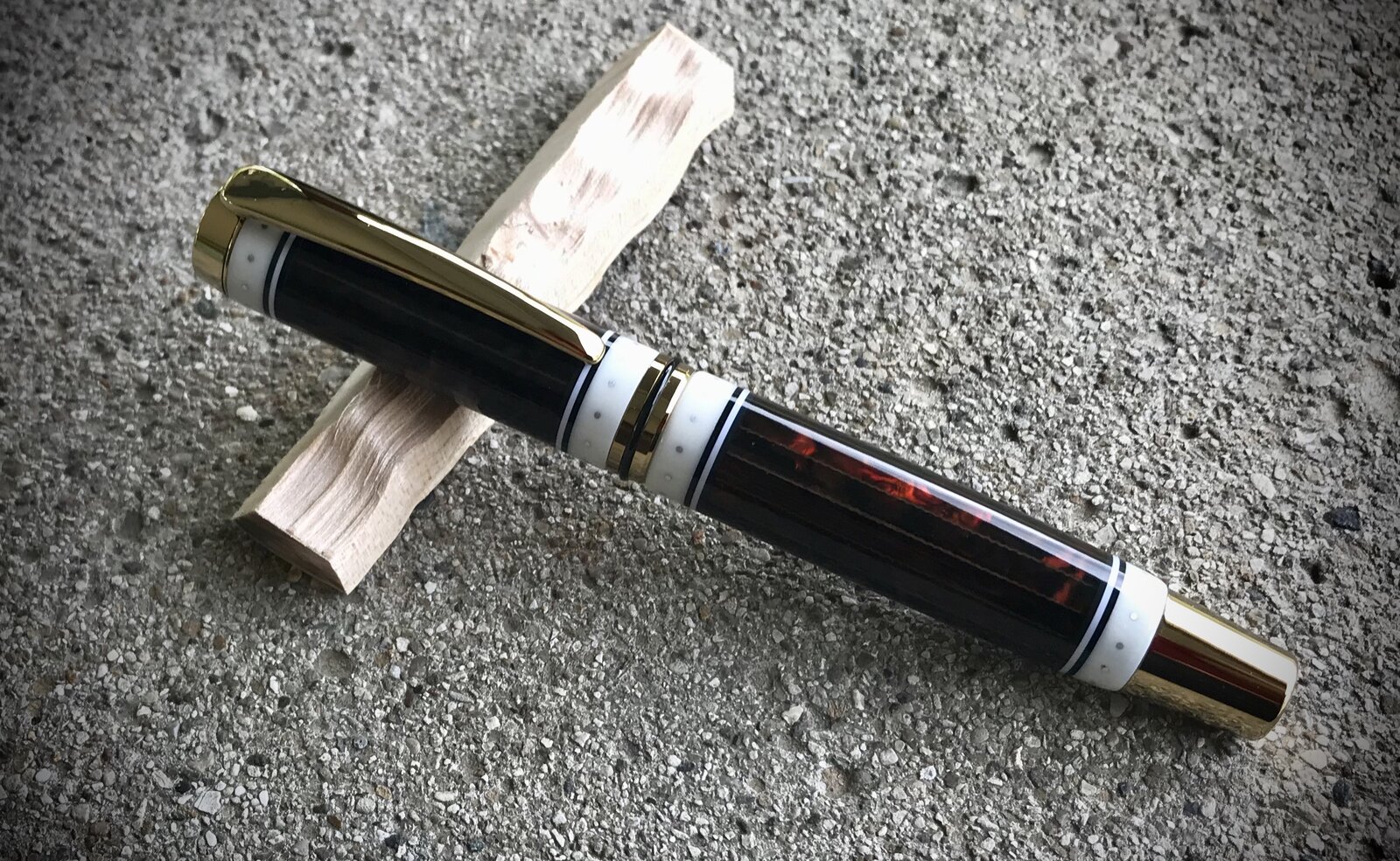
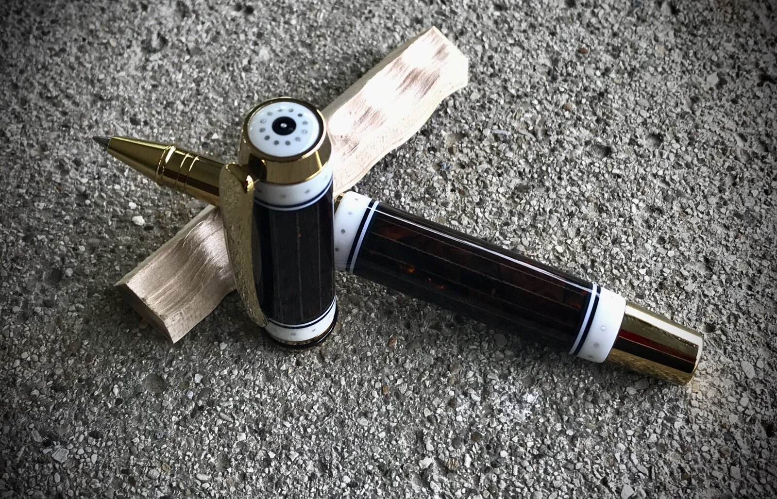
Ive had these blanks for years and decided to customize them for use. I think I may have overdone it though. Shown here to get opinions and because I don't remember seeing any abalone blanks used this way. I may recreate them with tortise acrylic.

I think I should have gone with two rings on the cap (a is) and one on the end of barrel.
What do you think?
D96C5C69-1D53-4794-9696-C398D9235800.jpeg
744A4D14-5D37-45CC-AAF5-C19DC8D0AA67.jpeg
 
Signed-In Members Don't See This Ad

magpens

Member
Joined
Feb 2, 2011
Messages
15,913
Location
Canada
VERY, VERY Nice work !! . . I like the 4 rings as is !!! . . The symmetry is important, in my view !
 

jttheclockman

Member
Joined
Feb 22, 2005
Messages
19,082
Location
NJ, USA.
I love the work you are doing. You are stealing many of my ideas. But that is OK. :) I have a pen made up with the ring design you chose here. Just never got around to taking a photo. Keep them coming.
 

mark james

IAP Collection, Curator
Joined
Sep 6, 2012
Messages
12,720
Location
Medina, Ohio
No, No, No,... don't change a thing!

Well.... My only thought is for the circles/holes to be just a notch larger. I would keep the two rings on top and bottom, the rings are beautiful as is. But, if you have deep inlayed facets and inlays (like another pen thread 🤣) - they are hard to see. Maybe ponder a more apparent appearance.

Awesome work!.

And I love how you are coming up with your OWN ideas!
 

Joebobber

Member
Joined
Sep 24, 2018
Messages
1,172
Location
Erie, North Dakota
Everytime I make 1 like this I think it looks off somewhat. Almost like 2 cap rings is too much. I tried 1 ring centered on the cap and 2 on the body but still didn't care for it. On a ballpoint it looks great, but I can't figure out the best way to space them. Idk... Your pen looks great, don't get me wrong, I am just saying I know what you mean when you ask about the cap rings...
 

jttheclockman

Member
Joined
Feb 22, 2005
Messages
19,082
Location
NJ, USA.
I like the symmetry of the cap rings in that they are balanced in the amount used. They are not too wide for the 1/16" dots so that does not make it imbalanced at all. The one thing I would have changed is the kit plating. to something in the silver family or change the dots to brass to balance the colors. Or maybe a black chrome kit. Love what you are doing. Segmenting is fun. Ideas are limitless. Keep them coming. I think in my opinion when a kit does not have a centerband then one ring on top and one on bottom look cool. The centerband is breaking up the white next to the white and that is why it works well in this case to me.
 

jttheclockman

Member
Joined
Feb 22, 2005
Messages
19,082
Location
NJ, USA.
thanks JT. great minds think alike.
That was exactly what I was thinking.:). Now I have 2 others made or at least the blanks are made and not spun yet but If those designs show up from you then I know you have planted a spy in my shop and we need to talk. :D:D:D:D
 

PatrickR

Member
Joined
Apr 8, 2017
Messages
1,423
Location
Rural America
I like the symmetry of the cap rings in that they are balanced in the amount used. They are not too wide for the 1/16" dots so that does not make it imbalanced at all. The one thing I would have changed is the kit plating. to something in the silver family or change the dots to brass to balance the colors. Or maybe a black chrome kit. Love what you are doing. Segmenting is fun. Ideas are limitless. Keep them coming. I think in my opinion when a kit does not have a centerband then one ring on top and one on bottom look cool. The centerband is breaking up the white next to the white and that is why it works well in this case to me.
I agree about the metals. I thought i had a kit in rhodium. I've got some brass wire in my cart from McMaster.
 

PatrickR

Member
Joined
Apr 8, 2017
Messages
1,423
Location
Rural America
No, No, No,... don't change a thing!

Well.... My only thought is for the circles/holes to be just a notch larger. I would keep the two rings on top and bottom, the rings are beautiful as is. But, if you have deep inlayed facets and inlays (like another pen thread 🤣) - they are hard to see. Maybe ponder a more apparent appearance.

Awesome work!.

And I love how you are coming up with your OWN ideas!
I agree that the dots could have been bigger (AL wire)
this pen has no facets. It started with commercial abalone blanks. I do get what you are saying though and have a few ideas to try on that front.
 

magpens

Member
Joined
Feb 2, 2011
Messages
15,913
Location
Canada
@magpens and @Bayouusaf - i agree about symmetry, i think it may be that it looks center heavy with so much white there.

In my opinion, it DOES NOT look center heavy. . . It is as near to perfect as could be achieved !! . . 😀 😀 😍 😍 😀 😀

That pen has a host of very admirable features . . . . . . . I love it more every time I look at it !!!! . . 😍 😍
 

TDahl

Member
Joined
Dec 11, 2019
Messages
1,889
Location
Brentwood
I definitely like your design. I especially like the four rings and the finial. I do agree with JT about matching the metal accents to the components.
 
Top Bottom