Ivory Baron

Signed-In Members Don't See This Ad
See more from Jim in Oakville

Status
Not open for further replies.
Joined
Aug 9, 2004
Messages
2,195
Location
Oakville, Ontario, Canada.
Hi,

I have been having some fun making up some pens, this is one I am thinking of making a series of. I used a Baron chrome kit.

IMG_9195.jpg


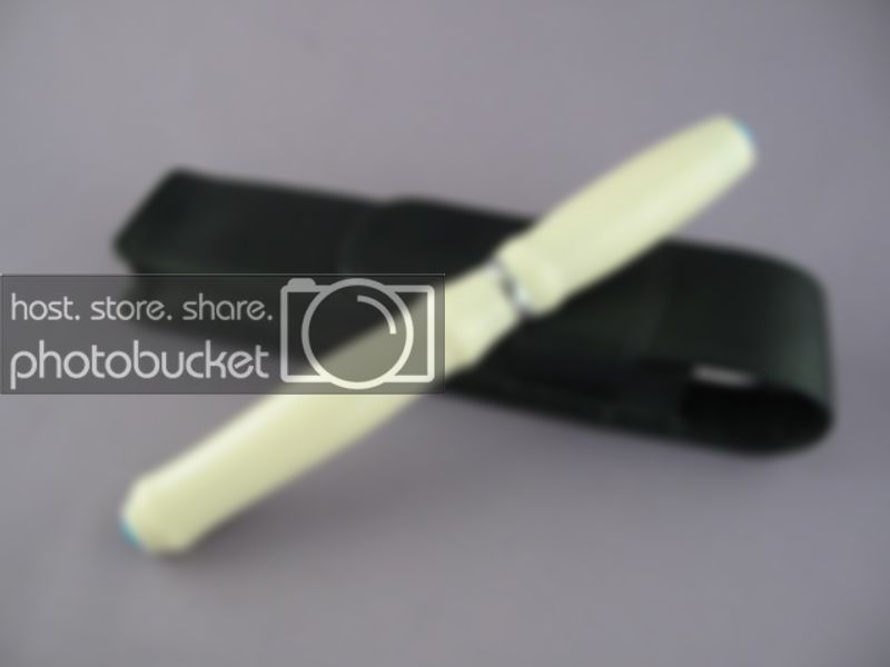
It's alternative ivory with turquoise cabachons
IMG_9197.jpg


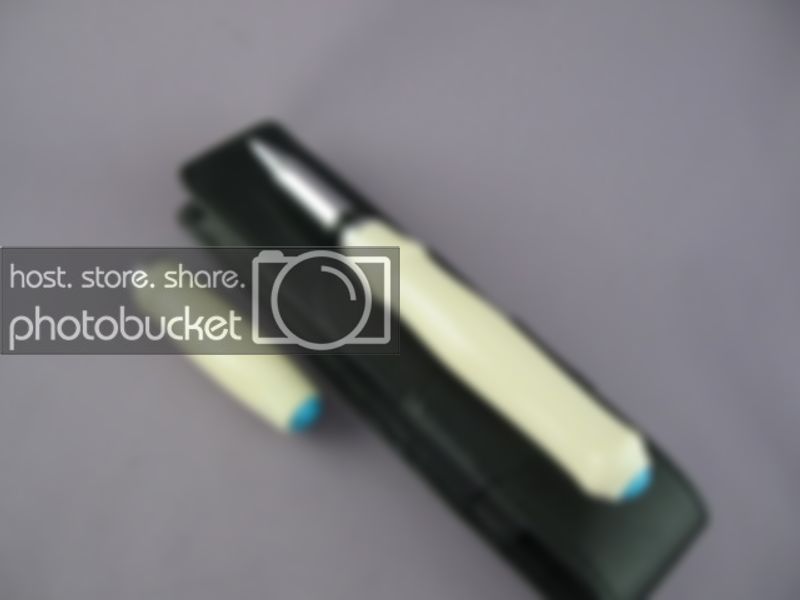
I tried to continue the shape at the band through to the cap
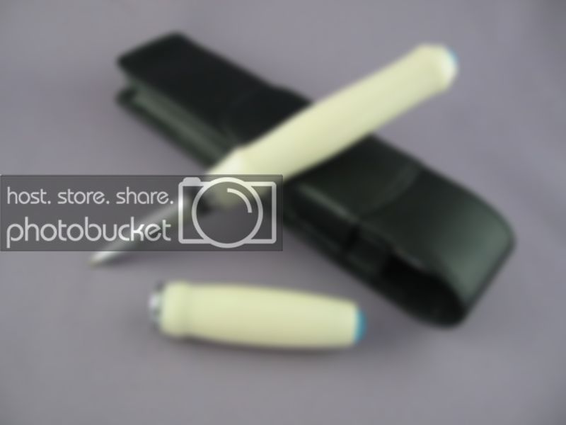
IMG_9196.jpg


All critiques are welcomed ;)
 
Signed-In Members Don't See This Ad
Jim, I like the alternative ivory but feel that the turquoise is 'too' strong as a contrast to the ivory. Nice concept but not my favourite JIM pen so far.

-Peter-[:)]

edited to correct for sp.
 
Jim, I like it a lot. I've had a piece of alt ivory down in the shop for some time trying to decide what to do with it. Maybe I could borrow and idea or two from you?
 
Originally posted by wood-of-1kind
<br />Jim, I like the alternative ivory but feel that the turquoise is 'too' strong as a contrast to the ivory. Nice concept but not my favourite JIM pen so far.

-Peter-[:)]

edited to correct for sp.

Thanks Peter, I appreciate the critique..you have me thinking about an option![:)]
 
Sorry, doesn't do it for me. The turquoise is too startling a color contrast with the normally elegant ivory. Cheapens the look. And, the curves and general shape looks like an attempt to do something that didn't need doing. That's IMHO. We are a cruel bunch here. [}:)][;)]
 
Originally posted by Rifleman1776
<br />Sorry, doesn't do it for me. The turquoise is too startling a color contrast with the normally elegant ivory. Cheapens the look. And, the curves and general shape looks like an attempt to do something that didn't need doing. That's IMHO. We are a cruel bunch here. [}:)][;)]

Thanks Frank....I appreciate the critique[:)]

No wounds here....[;)]
 
jim, once again, you're setting the bar around here. i really like your ideas and think the contrast is perfect. i think it's hard to 'out-contrast' white, that's the beauty of white... but that's just me!

the shape is a little different, but that's what art is all about...

keep up the great work! BTW, i think black with the turquoise would look very nice too!
 
Beautiful pen!! Do you drill the ends with a 10mm bit for the cabachons? The point of the brad point bit is fairly deep, so do you just fill the gap with thick CA or just glue the edges?
 
Originally posted by Tanner
<br />Beautiful pen!! Do you drill the ends with a 10mm bit for the cabachons? The point of the brad point bit is fairly deep, so do you just fill the gap with thick CA or just glue the edges?

I actually drill the ends, with a 10 mm or an 8 mm bit that I have ground down the points on to very small points, I use CA to glue in the Cabs, the ends are solid.
 
That is a really sharp looking pen. I think the the contrast between the ivory and turquoise makes the pen interesting along with the shape. Great job.
 
Thanks Every One for your kind thoughts and honest critiques...
I learn from your opinions so I trust the comments and value the way they are offreed...we are a fine group here at IAP.

This pen is going to be sent to one of my best friends mom (origianlly from Montreal now living in Ottawa), she turned 80 in June. She raised 6 kids alone, her husband walked out on them. Despite the hardships they all graduated from University and are successful in life. When she was 65 she enrolled at McGill in Montreal and after 4 years she graduated with a BA Honours degree. She still studies what pleases her and she is now learning Spanish, taking arts classes and studying about the Nordic peoples. She is a glass half full person, she is an inspiration to me.
 
Status
Not open for further replies.
Back
Top Bottom