Improve

Signed-In Members Don't See This Ad

Cwalker935

Member
Joined
May 18, 2014
Messages
3,517
Location
Richmond, Va
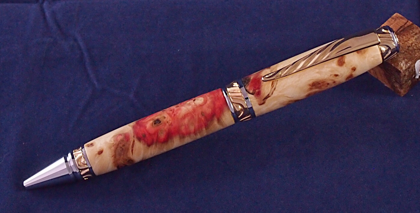
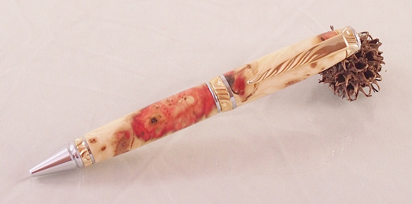
Any suggestions on improving this photo. I feel like the focus and pen color are pretty good. The background is not quite white enough and i am not proficient enough with my editing software to whiten it without causing the pen color to get look washed out. Anyone know of a good primer on photo editing?


View in Gallery
 
Signed-In Members Don't See This Ad
The color of your background is too close to that of the pen. Maybe try a darker background to get better contrast.

The gum ball propping up your pen has too much visual interest...it's trying to steel the viewer's attention. Supports should be visually bland and small unless you're trying to sell supports instead of pens. :smile:

There's an odd reflection in the pen's nib...perhaps it's you holding the camera or taking the photo? It sort of looks like a fun-house mirror which distracts attention from the figure in the wood.

As for primers on photo editing...which editing app are you using? There are primers for likely all of them, but pointing you to a good one on LightRoom won't help if you're using PhotoShop or something completely different.
 
Personally, I like a light gray background. It seems to work well with just about everything. I also agree with Tim on the gum ball. It doesn't fit with the pen. Try making a prop from the same blank (if you have enough). Or use a plexiglass stand.
 
2nd try, I do not have a grey background so I tried blue. Simple prop, used the slot on light tent flap to try to remove the reflection, I know that my background is wrinkled and needs ironed, better? The blank is one that I got as part of my super bowl haul, it was labelled manitoba maple burl which may be the same as flame box elder.


View in Gallery
 
Yes better. Go down to the craft store and pick up a piece of gray, white or black flocked or felt board. They are usually stiff enough that they will hold shape with no wrinkles. If your camera allows you to set the white balance, shoot a piece of white paper under your current lighting to set a reference.
 
Much better with the darker background and other changes!

I'd give the pen more room around the edges though (I'd call it white space but in this case it's blue space). Compare the framing of your first shot with the second one...the first shot was a bit borderline but the second shot, especially on the right hand side, is cropped/composed too tightly.
 
As a "NON PHOTOGRAPHER"...

I like the darker background better, but I'm not sold on the blue... Grey might be a good option. And yes, a bit more room around the edges.

Yup, ditch the gum ball for something else (it was worth a try!!!).

Reflection in the nib... I cannot see it? My eye says it's fine.

Nice comments from the previous posts!

Pen... That I like!
 
I bought a piece of gray foam board at Michaels. I use it for probably 99% of my photos.

Here's an example of the kind of prop I was talking about.

I also think the pen looks better to have the nib elevated rather than the other way around.
 
Thanks for the great advice. All of my grey T-shirts are too ratty to use. I will get something grey and give it a try it. I will also leave more space around the edges. Thanks again.
 
Got a grey background

OK so my wife got me a piece of grey material and I took a new photo. Did not crop it as close. How's this, better?

image.jpg
 
I think it's much better. Don't you?

About the only thing I see now that I think is an issue are the wrinkles. But the color of the pen really POPS with the gray background.
 
Last edited:
Back
Top Bottom