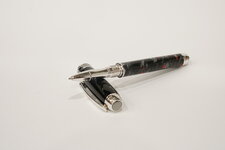
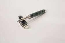
Turned a couple mistrals. One has a vintage cellulose body in silver with red flecks. The cap on that one is Japanese ebonite, and the fittings are rhodium plated with black Ti accents. Only complaint I have is, in retrospect, I wish I'd made a red cabachon to put in the cap to complement the red in the body. Maybe next time. (Or maybe I go with a completely red ebonite cap!) I'm going to keep this one for myself. The other has a vintage cellulose body in green checkerboard. The cap on that one is an Omas pearl grey acrylate and the fittings are rhodium-plated. This one will be a Christmas present for my grandpa.
A couple comments--the mistral is a great kit for those of you who haven't turned one. Pricey? Absolutely. But worth the premium, in my view, over a JR series pen, at least for something special. I like the slimmer design and feel of the mistral. It has a more refined feel in hand. I also like the design of the rollerball nosecone over the JR Gent's. It's sleeker, more modern. (Nosecone design is part of the reason why I prefer the George to the Gent, as well, although the George doesn't come with the nonpostable cap option the way the Gent does. I dislike postable caps.) I also like the plated accents on the Mistral over the black plastic that comes with the JRs' cap finials, and the option to make your own accents for the mistral if you want. Overall, the mistral is just a really great pen.
The thin diameter of the mistral has another benefit too. It allows me to use the vintage acetate that I've used on these two and love so much. A lot of the older rods just aren't thick enough for JR and similar kits. The mistral at least lets you use it on the body. Which leads to my other comment--I was surprised by how much I liked the solid-colored contrasting cap. I was forced into it because the vintage rods weren't large enough for even the mistral cap, but I really like how these turned out. I think the solid cap provides "centering" and makes the pen overall less "busy." I'm going to be making more of these where the body is patterned and the cap is a solid (or mostly solid) color.
Also, the cap on the grey one was my first turn of ebonite. Well, my first successful turn. I'd tried turning some of the vintage becol ebonite and what a mistake that was. The stuff practically disintegrated to dust when I bore the hole and then collapsed. The modern Japanese ebonite that I used for the cap turned much better. I really like working with this stuff. I was able to get a great shine on it, but the shine was more subtle and different than on plastics. It felt deeper, more lustrous. The shine on plastics--particularly the more modern resins like acrylic acetates and what-not--seems more reflective and superficial. I'm definitely going to be working with the ebonite more. I might even try some of the colored rods. And, while I was pleased with the finish I got on this one, it does seem that ebonite is less forgiving than other substances in terms of residual scratches on the surface. You can't see them in the pictures, but if you look closely in person, there are definitely some very faint hair-line scratches that I failed to get out from the sanding. Not enough to ruin the pen, in my view (especially since I'm keeping it for personal use). But definitely some room for improvement on the next one.