
nobdyspecial
Member
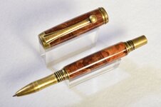
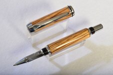
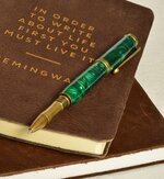
In the spirit of SOYP, here are a few of my early creations.
I had some professional photos taken for the purpose of juried show applications, and since I was accepted, I'd say it was money well spent!
I had some professional photos taken for the purpose of juried show applications, and since I was accepted, I'd say it was money well spent!
Attachments
-
 blue resin.JPG149.3 KB · Views: 325
 -
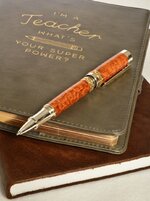
 red maple burl.JPG139.4 KB · Views: 318
 -
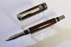
 Afzelia Lay.JPG142.9 KB · Views: 333
 -
 black palm.JPG169.4 KB · Views: 321
 -
 flame box elder burl.JPG170.9 KB · Views: 304
 -
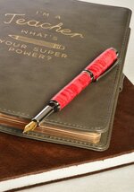
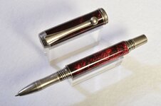 red resin.JPG161.9 KB · Views: 310
 -
 spalted maple burl.JPG168.5 KB · Views: 295
 -
 zebrawood.JPG163.4 KB · Views: 292
 -
 green resin.JPG181.5 KB · Views: 326
")