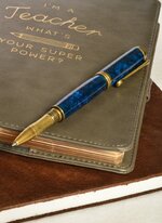
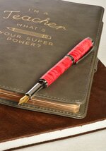
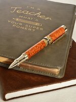
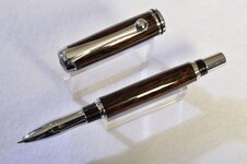
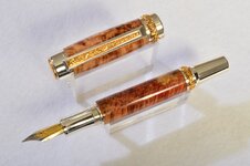
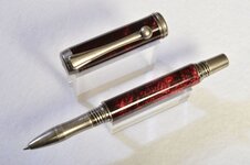
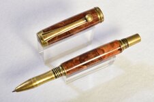
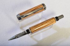
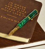
First photos - professionally done.

Signed-In Members Don't See This Ad
See more from nobdyspecial

nobdyspecial

Member
Joined
Feb 10, 2019
Messages
36
Location
Edmonton
In the spirit of SOYP, here are a few of my early creations.
I had some professional photos taken for the purpose of juried show applications, and since I was accepted, I'd say it was money well spent!
 

Attachments

  • blue resin.JPG
    blue resin.JPG
    149.3 KB · Views: 307
  • red maple burl.JPG
    red maple burl.JPG
    139.4 KB · Views: 301
  • Afzelia Lay.JPG
    Afzelia Lay.JPG
    142.9 KB · Views: 319
  • black palm.JPG
    black palm.JPG
    169.4 KB · Views: 310
  • flame box elder burl.JPG
    flame box elder burl.JPG
    170.9 KB · Views: 289
  • red resin.JPG
    red resin.JPG
    161.9 KB · Views: 293
  • spalted maple burl.JPG
    spalted maple burl.JPG
    168.5 KB · Views: 273
  • zebrawood.JPG
    zebrawood.JPG
    163.4 KB · Views: 280
  • green resin.JPG
    green resin.JPG
    181.5 KB · Views: 310
Signed-In Members Don't See This Ad
great looking bunch of pens the 3rd one is my favorite! photos also look great
One advantage of hiring a professional at least once is how much you can learn about their art is a few short hours. I can't justify the cost for every pen I make (as I'd have to have 100+ photographed at a time), but in this first case, it was a great investment.
 
Your pictures are okay but not particularly great. I'm guessing the professional photog you used isn't used to product photography.
Pointers to what I think needs improvement:
- in the first 3 pictures the plane of focus is not on the pens but rather on the book letters (note the difference in sharpness). In #3 it's really sad not to show the decorated clip.
- the light reflexions in some of the pictures, either on the clip (#4 and 6) and/or on the body (#4, 6 and 8), are really distracting and detract attention away from the pen itself (in a picture the eyes are drawn to the brightest spots). The light needs to be much more diffuse.
- (greasy) finger marks on the bright parts don't look very professional (on finials in #4, 5, 7, on the nibs in #4 and 5). Easy to clean with a microfiber cloth.

My 3 cents :)
Thanks for the feedback!
 
Back
Top Bottom