
You are using an out of date browser. It may not display this or other websites correctly.
You should upgrade or use an alternative browser.
You should upgrade or use an alternative browser.
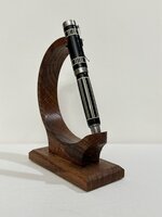
Ebony and Holly Turned
- Thread starter KenB259
- Start date
Signed-In Members Don't See This Ad
Signed-In Members Don't See This Ad
Hippie3180
Member
Wow! That looks awesome! Isn't ebony a challenging turn?
jttheclockman
Member
Ken can you please explain your statement because I like it alot. The concept is great. The bleed over is minimal. The making of the blank in itself was a challenge and then bring it to this stage, Not bad at all. We are our worst critics for sure.I was hoping to like this more than I do.
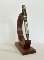
It's not that I hate it, it's just a little blah. Here's one of the same design with more interesting wood.Ken can you please explain your statement because I like it alot. The concept is great. The bleed over is minimal. The making of the blank in itself was a challenge and then bring it to this stage, Not bad at all. We are our worst critics for sure.
Attachments
KMCloonan
Member
Great pen Ken! The segmentation is amazing. Like John, I think the bleed over from the ebony to the Holly was minimal, compared to if I had done it.  Would you ever consider using PVC card stock (credit cards) instead of Holly? The PVC won't absorb sanding dust. The white lines would really pop. Just a thought.
Would you ever consider using PVC card stock (credit cards) instead of Holly? The PVC won't absorb sanding dust. The white lines would really pop. Just a thought.jttheclockman
Member
I guess it is to the eye of the beholder. But I do not know the terms people use for this therory but what happens the eye is focused on the main color and black is a subdued color so that is what it tells the mind. That is why people love color more so when they are buying things like pens and colored acrylics or in your second photo the white is the main focused color which the eye says is a brighter color.
Todd in PA
Member
I like the pen. The segmenting is handsome and precise. Ken has been doing this a long time, which I admire.
mark james
IAP Collection, Curator
You probably suspect this, but I like the design a lot. Both iterations are very attractive to me, but the contrasting wood gives a nicer visual. I also love your assembly technique. Your precision is superb. Thanks for sharing. 
Lew
Member
I like them both. The first one is what I would call an elegant piece, understated and refined. The second is more vibrant. Both are beautiful. (This is my one attempt at being an art critic, or at least trying to sound like one)
I think the picture makes the holly look like it has some bleed over, in person, the holly is as white as can be. I did no sanding and couldn't even touch it with bare hands.Great pen Ken! The segmentation is amazing. Like John, I think the bleed over from the ebony to the Holly was minimal, compared to if I had done it.
Jim15
Member
Great work.
This is probably how my mind is interpreting them both.I like them both. The first one is what I would call an elegant piece, understated and refined. The second is more vibrant. Both are beautiful. (This is my one attempt at being an art critic, or at least trying to sound like one)
GaryMGg
Member
It's superb. A white glove pen!I was hoping to like this more than I do
jttheclockman
Member
Segmenting extreme contrast woods present many challenges. You have no doubt encountered them as you do your projects. Of course sanding is the main one but also gluing can do this too because liquids can absorb color from one wood to the other and cause bleedover. CA can do this more so than titebond or epoxy because it is thinner. also the type of woods used because some woods just have larger open grain than others. But that is what makes designs like yours even more pleasing to look at.I think the picture makes the holly look like it has some bleed over, in person, the holly is as white as can be. I did no sanding and couldn't even touch it with bare hands.
Brandy
Member
Really?! The segmenting is really pretty and the final product is beautiful!I was hoping to like this more than I do

wimkluck
Member
I like the pen. I think the black color of the cap makes it a bit "heavy".
It's not that I hate it, it's just a little blah. Here's one of the same design with more interesting wood.
This one really is nice!! What was the other wood? Was it dyed/stabilized?
FWIW, sometimes, the simplicity of a type of wood (i.e. ebony) allows the contrasts between different woods to take front and center. In the case of your first pen in the OP, I think that is an example of a successful case. Pen looks great, IMO, and probably because the woods themselves don't take away from the segmented design.
Well done, in both cases. I'm looking forward to the rest of them!
The green one had dyed and stabilized maple burl, nothing done to the holly.This one really is nice!! What was the other wood? Was it dyed/stabilized?
FWIW, sometimes, the simplicity of a type of wood (i.e. ebony) allows the contrasts between different woods to take front and center. In the case of your first pen in the OP, I think that is an example of a successful case. Pen looks great, IMO, and probably because the woods themselves don't take away from the segmented design.
Well done, in both cases. I'm looking forward to the rest of them!