Critiques Wanted

Signed-In Members Don't See This Ad

mbroberg

IAP Activities Manager, Emeritus
Joined
Mar 9, 2009
Messages
5,954
Location
Columbus, OH
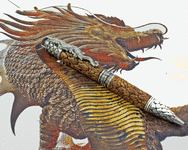
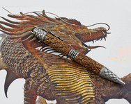
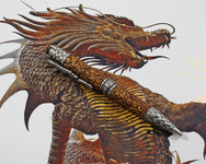
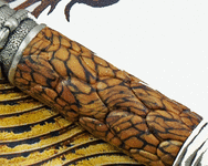
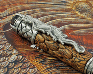
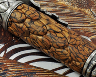
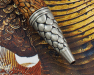
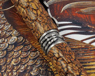
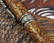
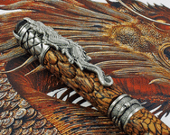
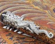
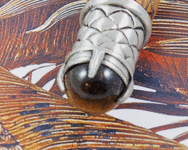
At the MPG we had a presentation that included photography. I have tried to incorporate some of the ideas that were presented into these photos. The pen is pretty straight forward. A PSI Dragon Kit adorned with one of Tina Wisson's Polymer Clay Blanks. I really didn't have to do anything but put it together, so the beauty of the pen belongs to Tina, What do you all think of the overall quality of the photos? Composition and Clarity?

Thanks
 

Attachments

  • BP190522a.gif
    BP190522a.gif
    1 MB · Views: 454
  • BP190522b.gif
    BP190522b.gif
    1 MB · Views: 463
  • BP190522c.gif
    BP190522c.gif
    1.1 MB · Views: 458
  • BP190522d.gif
    BP190522d.gif
    760.5 KB · Views: 476
  • BP190522e.gif
    BP190522e.gif
    1.2 MB · Views: 450
  • BP190522f.gif
    BP190522f.gif
    1.1 MB · Views: 449
  • BP190522g.gif
    BP190522g.gif
    1.1 MB · Views: 437
  • BP190522h.gif
    BP190522h.gif
    1.2 MB · Views: 410
  • BP190522i.gif
    BP190522i.gif
    1.2 MB · Views: 403
  • BP190522j.gif
    BP190522j.gif
    1.3 MB · Views: 452
  • BP190522k.gif
    BP190522k.gif
    1.1 MB · Views: 408
  • BP190522l.gif
    BP190522l.gif
    1 MB · Views: 386
Signed-In Members Don't See This Ad

Buckmark13

Member
Joined
Aug 14, 2018
Messages
169
The photography itself is fantastic. The dragon in the background takes so much away from the subject you're trying to show off. Which by the way, looks fantastic as well!
 

magpens

Member
Joined
Feb 2, 2011
Messages
15,913
Location
Canada
Mike, as mentioned above in Post #2, there is too much competition from the background ... you need to use a plain background, preferrably whitish, IMO.
The quality of the pics is excellent. Good exposure, in most pictures. Good depth of field. There is a tiny bit of fuzziness in some ... but that's probably due to digitization and/or editing (cropping, sizing, etc.)
 

edicehouse

Member
Joined
Jun 8, 2011
Messages
3,515
Location
Suffolk, VA
I would say for the person that is not a pen person, that would be a great draw in.

But as many pictures of pens we all look at, I think the picture in the background of the dragon, devalues the look at such an amazing pen.

However other than a couple of the zoomed/cropped photos, the clarity is very good.

Without a doubt, you do that pen on a standard background or the knight kneeling pen stand 100000 out of 10.


I am jealous anyway of how good the photos are anyways!
 

mmayo

Member
Joined
Jan 12, 2013
Messages
2,958
Location
Tehachapi, CA
The lighting and composition is great. Without the dragon and with some other interesting support would work with your setup.
 

Sylvanite

Member
Joined
Jul 18, 2006
Messages
3,090
Location
Hillsborough, North Carolina, USA.
Mike,
Good for you! Wanting to take better pictures is the most important step to improving. Here are some of my impressions.

Don't save your photos in GIF format. GIF files only support up to 256 simultaneous colors, which isn't enough to accurately render color photographs. Save your pictures in JPG (jpeg) format instead. It supports over 16 million simultaneous colors which will yield much better photos. Your images definitely suffer from insufficient color depth.

After that, your background (as others have noted) is your worst enemy. It's visually distracting, and some of your photos are focused on it rather than on the pen.

Generally, though, your lighting is pretty good (much better than most).

If it were me, I might photograph from a little farther away for a more natural looking (to me) perspective, but that's just my personal preference. I'd also crop most of them a little tighter.

All said and done, your pictures are above average and will undoubtedly get even better.

I hope that helps,
Eric
 

moke

Member
Joined
Dec 30, 2009
Messages
1,215
Location
Cedar Rapids, Iowa
As mentioned the work is very good! And also as mentioned the subject competes with the background for attention. I had an instructor at the Photography institute I attended say the best way to judge a photos composition is to squint your eyes and see what stands out the most. If it is your subject, you have done a good job. Likewise, and I may step on some toes here and I don't mean to, the photos taken on mirrors really compete with the main subject for attention. This was popular in commercial photography briefly in the 80's. Plus we used a first side mirror, not a conventional mirror that gives a secondary ghost image. But this fad quickly faded, as art directors hated it.

To take your image over the top, try an accent light from another direction. Either from above or one side...just one side, above is probably the most popular. I should add it should come also from at least 45 degrees behind the subject. In portraiture it is often called a "garlic" light. Because just like garlic in cooking, you don't want too much. This will add roundness or "depth" to the photo. (Particularly a round form like a pen) Feel free to PM me if you want, and we could talk via phone and I can walk you through it. It's easy, really. I will be gone all weekend though. Not to criticize, but now you have what we call flat lighting. Flat lighting is sometimes requested by clients, because it just shows the product very evenly. But if you set it beside an image with a little form lighting, it looks boring, or static as the art folks call it.
Your camera work though, ie; depth of field, angle, sharpness, and contrast are all very well done. You may want to consider using your zoom lens at about 75 to 100mm though.
Again I don't mean to criticize, as your work is truly in the upper 10 to 15 percentile of what I have seen here. To taken into the top 5% it does take time to do it right and play with the lighting and P/S work. Thus the reason I don't photograph my pens. I photograph people and product for about 50 hours a week. I love to make pens, I love this site, but I am making pens for myself and my friends, I guess I don't want to mess with it in my studio to show it off......and I know that is contrary to a big part of this site, it is just a "bus man's" holiday for me. But if I can help, just PM.
 
Last edited:

mbroberg

IAP Activities Manager, Emeritus
Joined
Mar 9, 2009
Messages
5,954
Location
Columbus, OH
Well, I have been experimenting most of the day, and trading very, very helpful messages with Mike (Moke) and Eric (Sylvanite). There are still quite a bit to improve on, and much to learn but I think I am headed in the right direction. Thanks for all the responses to this post and to Mike & Eric, whom I will be pestering routinely for a while. :D Comments always welcome.

000005.jpg000006.jpg000007.jpg000008.jpg000009.jpg000010.jpg000012.jpg000014.jpg000018.jpg
 

Texas Taco

Member
Joined
Nov 14, 2005
Messages
399
Location
Southeast Texas
I think the second set is better than the originals. I'm no art critic and probably won't recognize the best "art" photo if it jumped up and bit me in the butt.

However, I know what I like and I do like both sets of photos. The background on the second doesn't distract as much as the original set but to me the texture does distract some. But like I said, I like both sets of photos, YMMV.
 

BruceA

Member
Joined
Jan 27, 2008
Messages
245
Location
Fayetteville, TN, USA.
Try a plain white background for comparison. Try the pen with straight horizontal framing for variety. Your white balance is good, and the focus/depth of field is right on. Good testing!
 

Gwoolie

Member
Joined
Aug 9, 2019
Messages
9
Location
Ferndown
As the new boy id like to put my 1/2 pence worth in and say id have placed the backdrop further away and use the DOF of the camera to soften this, no different to a portrait of a face etc. My opinion :)
 

Gwoolie

Member
Joined
Aug 9, 2019
Messages
9
Location
Ferndown
Here's an example taken by me where the foreground and background have dof so it's out of focus and the eyes drawn to the subject

71570439-522E-435C-849D-57C76EE62A6B.jpeg
 

Woodchipper

Member
Joined
Mar 15, 2017
Messages
5,138
Location
Cleveland, TN
I recently spent part of a day with a retired professional photographer. He showed me how to take close-ups of trout flies. This was for a magazne article in the works. His background was a plain piece of copy paper. I bought a set of four macro lenses and a piece of white poster board. Ready to go!
Gwoolie, the nice pen is a tribute to the firefighters all around the world.
 

TomWalton

Member
Joined
Jan 16, 2008
Messages
13
Location
Falls Church, VA, USA.
Manual focus will help; in some of the shots your camera's AF got captured by the background. In those cases you over-sharpened to compensate. It's an impressive pen.

--Tom
 

sorcerertd

Member
Joined
Sep 30, 2019
Messages
2,655
Location
North Carolina, USA
I'm way late to this, but would still like to chime in. The first set of pictures with the dragon background is very distracting. If you are selling online, I would maybe use one of those as a context type picture, but definitely not make it the main focal. If you covered the background with a piece of translucent vellum or tracing paper, laying the pen on top, it would stand out much better. You definitely want to show off the pen, not a background graphic.
 

farmer

Member
Joined
Jun 16, 2012
Messages
807
Location
NV
First and second photo's are the same ( soft lighting )
Dull colors , subject doesn't pop .
To see colors light is required.
I would nail it with hard lighting, white back drop. Do you have a flash that is not made into the camera ?
If you can fire a off shoe flash would be cool.
Use a CPL on your lens and try adjusting it through out 10 or 20 frames.
A piece of white construction paper.
Custom white balance .
Depending on the photography gear photograph in raw and tethered .
 
Top Bottom