Clear cactus Jr. Gent

Signed-In Members Don't See This Ad
See more from MesquiteMan

Status
Not open for further replies.

MesquiteMan

Retired Head Moderator
Joined
Oct 18, 2005
Messages
5,680
Location
San Marcos, TX, USA.
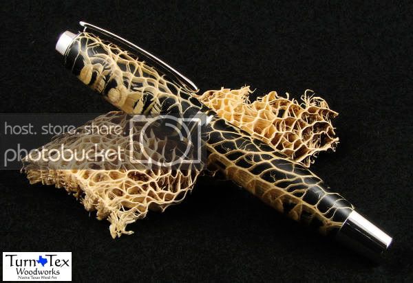
This is the first Jr. Gent pen I have made. It is clear prickly pear cactus with the tubes painted black. I like the Jr. Gent but think I would prefer the posting end piece instead of the taper.

Which picture do you prefer, the white or black background? Thanks.

clearcactusgent6.jpg


clearcactusgent1.jpg
 
Signed-In Members Don't See This Ad
I'll be the odd ball I like the black backgroung with the plat. kit it just seems to show off the contrast better to me. BTW fantastic
 
Nice pen.

Regarding the background, I prefer the white from the 2 pics. Black is nice for Platinum but it is not good for the black blank...maybe a medium like Gray?
 
Fabulous use of material. Great pen. I mean it isn't every day I see one I want for myself.

The white is a more professional display of the pen, the black is a better explanation of where the pen came from. In order to be truly fair, you would have to put the cactus skeleton in the white pic too... that might really be the best shot.

Steve
 
Super nice pen. I'm kind of mixed about which background, they both make distinct statements but I think I favor the white just a little it shows the craftsmanship and detail of the pen just a little clear and with less distraction. I have to side with Steve in that maybe showing both pic with the same cactus skelton and in the same profile would be the best way to judge? IMHO I am sure no expert by any means.
 
Great looking pen. The black background is much more dramatic looking than the white and for this pen, I like it better than the white.
 
That is a really nice pen! The blank has a 3 dimensional look to the cactus, which I either haven't seen or never noticed on other pens, but it is very intriguing!

P.S. I prefer the white background. On the black one, especially towards the bottom of the pen on the left hand side, you almost lose some of the pen b/c it blends in too well with the black.
 
I vote for the black background. Although I would also say that having the pen open with the black background would be a better balance of light and dark in the photo.

I also second the vote for a grey or one of the grey to black transition backgrounds.

The pen looks outstanding in general as well.

As for tapered or threaded, the customer is always right :)
 
I like the white the best. The black is beautiful but the fabric has to show some contrast to the pen. Otherwise it appears to have melted into the black. I like the distinct line created by a contrast. I think it makes the pen pop. Or in your case pop more[:D]
 
Status
Not open for further replies.
Back
Top Bottom