
You are using an out of date browser. It may not display this or other websites correctly.
You should upgrade or use an alternative browser.
You should upgrade or use an alternative browser.
ccoun't think of a catchy title
- Thread starter nappy155
- Start date
Signed-In Members Don't See This Ad
See more from nappy155


Signed-In Members Don't See This Ad
OZturner
Member
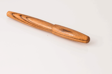
Nice pen, Steven.
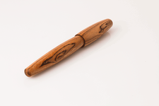
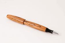
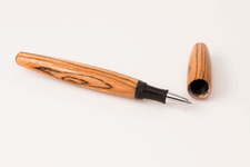
Very attractive Blank, excellent proportions.
I would have preferred more blending between the Base and the Cap, and a more continuous line, as opposed to the two curves, if possible with the Nib Holder etc.
This is just my opinion, and probably differs to many.
Great Fit and Finish.
Brian.
Very attractive Blank, excellent proportions.
I would have preferred more blending between the Base and the Cap, and a more continuous line, as opposed to the two curves, if possible with the Nib Holder etc.
This is just my opinion, and probably differs to many.
Great Fit and Finish.
Brian.
Steven, repost when you have a better title......not really, it a very nice pen. I like the shape. From the photo it looks like you did a really nice job on grain match. Very good fit and finish.
mikespenturningz
Member
Very nice indeed Steven. Great job..
johncrane
Member
Very nice Stev!
nappy155
Member
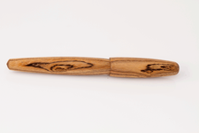
i feel you...my mind always turns more organic...i also study the blank...for bocote this was pretty light in base color with nice dark grain lines...i kept seeing a female form...and i like them curvy...
Nice pen, Steven.
Very attractive Blank, excellent proportions.
I would have preferred more blending between the Base and the Cap, and a more continuous line, as opposed to the two curves, if possible with the Nib Holder etc.
This is just my opinion, and probably differs to many.
Great Fit and Finish.
Brian.