Business cards I'm contemplating

Signed-In Members Don't See This Ad

Which of the business cards shown below do you like best?


  • Total voters
    97

pianomanpj

Member
Joined
Sep 24, 2007
Messages
1,150
Location
Augusta, Maine, USA.
Hey, gang...

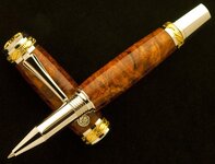
I'm going to be getting some business cards printed up, and I've mocked up four different styles. The first four images are fronts of the cards, while the last image is the back of the card. (This will be the back no matter which card I use.)

The cards will be on high gloss stock. I wanna keep that professional look, ya know! (And, no: "Proof" will not be on the final cards! :wink:)

So which business card do you like best? Please vote! And by all means, if you see something you like or don't, ALL comments are welcome! :biggrin:

Thanks, all!!

UPDATE!!!
I've made some modifications based on feedback I've already received on Business Card #4. The NEW version can be seen at the bottom. Thanks, all, for ALL your feedback!! It is most helpful, and most welcome!!!


bc1.jpg
Business Card #1

bc2.jpg
Business Card #2

bc3.jpg
Business Card #3

bc4.jpg
Business Card #4

bc5.jpg
Back of Business Card

bc4-2.jpg
Business Card #4 - MODIFIED!!!
 
Last edited:
Signed-In Members Don't See This Ad
I liked 4 the best but can not fully read the name of the company. It gets obscured by the pen pic, at least on my high res computer screen. So I choose 1 since it was the cleanest of the rest to me.
 
I like #1, but would personally want to see the image of the pen nib mirrored, so it points inward, toward the content.
 
Personally - no vote on format - here is my thought on the card though....

Email (for web inquiries) and Phone (for local contact) is enough for contact info... the address is overkill IMO.

My vote is for LESS information on the card and add impact:
- Subtract the 3 address lines
- Remove the fountain pen, etc line...
- Make the company name bigger.
- Make the "hand made" line bigger (but smaller than company name)

Again - all just IMO, but thats what I'd do.
 
I like #2. I would keep the address on the card. I generally avoid purchasing from websites, businesses, etc. that won't list the location of there business.

Wade
 
I'll agree with Dean, no need for address, but it always makes me think of some guy making slim lines out of tree branches from his back yard when the words "hand made" are used. Custom Designed, Artisan Crafted,Custom fine writing instruments Designed and crafted by. etc. are in my opinion a better way. My 2 pennies worth.
 
i like 4 and i agree with dropping the address and making some of the text bold.
you might want to consider getting a domain name too so you can use it with an email address like sales@xyz.com vs aol.com and you can easily forward all your email to the aol.com account. cost $20 yr at bulkregister.com. i would be happy to help (its really easy) PM me if you wish.
 
Last edited:
I like #2 because the flow lines move the eye up to the Name. Number 1 and number 4 move the eye off to the left and out of the copy. #4 modified is definitely better than #4 although other than the Name my eye follows the nib off the page. I also agree with the others that there is too much info.
 
I like 4 but like was said you lose your name in the pen so I chose one (second fav). I think no matter what you should have a Pen on your card.
 
I like #3...... simple..... clear..... no pics on it..... i mean....if i was in the biz of making pens..... i dun need a pic of the pen on my card..... just like if i was a butcher, i dun really need the pic of animals on my card right??? anyway..... u will make better pens as time goes.... so what happens to the pic on the card?? do u get it changed??

Just my 2cents
 
im with some of the other guys/girls, ditch the address. phone and email along wuth web site is plenty. i aldo like #1. simple, elegant, and not cluttered. i think the nib vs the wholen oen works better.

just my $.02 worth.

Sent from my Galaxi via forerunner
 
Wow! I gotta admit that I'm surprised by how the masses are split! It's pretty much a dead heat between the second and fourth business cards, while the other two are left in the dust! :eek:

I was secretly hoping that everyone would more or less gravitate to just one to make the final selection easier :rolleyes:, but hey: at least it looks like it's down to two!! :biggrin:

I'm going to leave this poll open for any last-minute stragglers to give their input. Thanks SO MUCH to all that gave their opinion and voted! I have assimilated MUCH of the advice that was given (even if it's not shown in an update), and have taken much more under advisement for future reference and use. You guys ALWAYS make me think. (My head hurts...:bulgy-eyes:)

Thanks, again!! :biggrin::biggrin::biggrin:
 
Last edited:
I think they are all a bit 'busy' for business cards. I like the idea of #4 but it is hard to read so I'll go with #2.

Also, the back of the card has a logo on it that doesn't match what is on the front. You should drop the logo or anything related to company info and just have the pen info. Everything else is on the front.
 
Roger, I can't imagine why, but I voted for #4. Personally, I think you should go ahead and use the whole pen. Hmmmm...Left in the dust....:eek: my foot.:tongue:.
Doc
 

Attachments

  • SVD Majestic.jpg
    SVD Majestic.jpg
    49.3 KB · Views: 120
Roger, I can't imagine why, but I voted for #4. Personally, I think you should go ahead and use the whole pen. Hmmmm...Left in the dust....:eek: my foot.:tongue:.
Doc

LOL! Sheesh, Doc! I can't even tell my second from my third... I fixed my previous posting... now if I could only fix "stupid"... :redface::rolleyes:
 
Back
Top Bottom