
You are using an out of date browser. It may not display this or other websites correctly.
You should upgrade or use an alternative browser.
You should upgrade or use an alternative browser.
BCHR
- Thread starter DCBluesman
- Start date
Signed-In Members Don't See This Ad
See more from DCBluesman


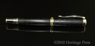
It's pressure etched and this was definitely not my first (or second or third) attempt. I will definitely have to practice more in order to insure more consistency in the chasing.
I will have to give that a try, Fred!
Steven - I never take a critique as an insult. I'm not always thrilled with then end result of my effort. As for pretty wood pens, that's my first and true passion. Thank you for the honest criticism.


Signed-In Members Don't See This Ad
witz1976
Member
What on earth is that material? It looks like resin that has some tearout...
David Keller
Member
Very pretty... Looks like leather to me.
rsmith
Member
did you chase that yourself on ebonite or something, or was it already done? If so, what did you use? Thats not easy to do by hand:wink:
mbroberg
IAP Activities Manager, Emeritus
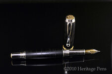
Kinda looks like stitched leather. It definitely looks classy! In no way do I consider myself qualified to give advice on photography, but do you think it might photograph better on a lighter background? Dark on Dark makes it kind of difficult to see. (I do see some fingerprints on the front section, however  )
)
)jimofsanston
Member
Yes fingure prints on the clip. Strike one. Good looking pen though. What is BHCR?
CSue
Local Chapter Leader
According to an online dictionary of Acronyms, one of the 4 definitions is "BCHR Black Chased Hard Rubber (early fountain pens)"
Did you make that pattern? Its an extremely handsome pen - reminding me more of leather.
Did you make that pattern? Its an extremely handsome pen - reminding me more of leather.
el_d
Member
Very nice Lou. How was it to turn?
Yes, this is black, chased, hard-rubber (ebonite). I hand chased it with my design. The turning is easy, but the chasing...not so much. It was quite a challenge for me, since I'm really a wood guy.
rsmith
Member
Lou, if you don't mind me asking, how was the chasing done? did you make a die of some sort and use heat, or did you just use pressure to etch into it? nice throwback to some early design with a modern twist with that kit. well done and very difficult
Fred
Member
Excellent turning and craftsmanship. Great job!
A suggestion: Put this pen on a very clean mirror and carefully light it. Try it and see what you think of the image.
A suggestion: Put this pen on a very clean mirror and carefully light it. Try it and see what you think of the image.
Sorry Lou, I never like to insult someones work but when I look at this and compare to the beautiful one you gave me, I have to say that you need to stick to 'pretty wood pens'. To me, this looks like tool chatter marks.:frown::wink:
PaulDoug
Member
I don't dislike, but not in love with it either. I think part of the problem is it is on such an elegant kit and the blank is so basic looking. They just don't work together to my eye. Great work though. Some will love it.
Lou, if you don't mind me asking, how was the chasing done? did you make a die of some sort and use heat, or did you just use pressure to etch into it? nice throwback to some early design with a modern twist with that kit. well done and very difficult
It's pressure etched and this was definitely not my first (or second or third) attempt. I will definitely have to practice more in order to insure more consistency in the chasing.
Excellent turning and craftsmanship. Great job!
A suggestion: Put this pen on a very clean mirror and carefully light it. Try it and see what you think of the image.
I will have to give that a try, Fred!
Sorry Lou, I never like to insult someones work but when I look at this and compare to the beautiful one you gave me, I have to say that you need to stick to 'pretty wood pens'. To me, this looks like tool chatter marks.:frown::wink:
Steven - I never take a critique as an insult. I'm not always thrilled with then end result of my effort. As for pretty wood pens, that's my first and true passion. Thank you for the honest criticism.
jskeen
Member
Lou; I'm a little undecided on this one. I'm sure that it has a wonderful feel in the hand, and it is a vintage process, so an experienced collector would recognize it, but I'm not sure if it has that "gotta have that" feel to it. Of course, I'm not an experienced collector either As for the kit, I think it's a nice balance to the blank, a little gingerbread, but not overboard. I don't think it would have went as well with one of the Asian flavored kits at all, but that one works for me. Curious if the black ti statesman kit would have complimented it as well, or just looked blah. I really want to know how quick it sells if it makes it to the DC show, versus how many times it is picked up and put back down.
As for the kit, I think it's a nice balance to the blank, a little gingerbread, but not overboard. I don't think it would have went as well with one of the Asian flavored kits at all, but that one works for me. Curious if the black ti statesman kit would have complimented it as well, or just looked blah. I really want to know how quick it sells if it makes it to the DC show, versus how many times it is picked up and put back down.lazyguy
Member
I like it. My first impression was the inside of a tire with a litle of the bias showing thru. A tire salesman might love it. I am impressed
Dalecamino
Local Chapter Leader
Lou , to me , this one looks great . I expect you will be more satisfied with the next one . This is interesting . Thanks for sharing .
Rfturner
Member
I too am not completely sold on this design, it lookis more like tool chatter, however sometimes the picture does not do it justice. I may really like it if I saw it personally. It sounds like a good idea though
beck3906
Member
Looks good to me.
Some will like it, some not. Bottom line though....
Will it sell?
I would almost bet there's a buyer ready for it.
Some will like it, some not. Bottom line though....
Will it sell?
I would almost bet there's a buyer ready for it.
broitblat
Member
I really like the looks of the material (and what you've done with it) and the workmanship of the pen, but I'm not sure I like it on this kit. I don't know what other kit I'd prefer, though. Maybe a higher-end cigar?
Thanks for sharing.
-Barry
Thanks for sharing.
-Barry
Again, thank you for the thoughtful feedback. This one sold to an existing customer, so I will likely make another...hopefully better!
Stevej72
Member
I like this pen a lot!
seamus7227
Member
I think it is interesting to say the least. Thanks for the explanation on how you turned it, my first thoughts were the same as others, chatter.
bitshird
Member
Lou, Until I read the explanation I thought it was made to simulate Braille, but I still thought it was uniquely different Now I appreciate the work that went into it. I think it would be a great technique for a kitless pen, to me it fights with the Statesman, but since it sold, it must have won the battle.