Battle of the bulge!!!

Signed-In Members Don't See This Ad

jttheclockman

Member
Joined
Feb 22, 2005
Messages
20,190
Location
NJ, USA.
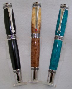
When doing the larger kits such as the Majestics, Cambridges and such and even the jr.s do you put a slight bulge on these or do you prefer straight BtB??? Not sure How I want to go with these. I think on my fiirst couple I will do straight. What does everyone else who makes these kits have to say??? Thanks for the replys.
 
Signed-In Members Don't See This Ad
On the jr's I have done they have mostly be straight. Depending on the grain I have left a couple with a very slight bulge to show off the blank better or a special depect/ knot/ grain in the blank.
 
I think that B2B is preferred for me. If I put a curve on it, it's slight.

Also, if you do add a curve to it, it doesn't have to be symmetrical along the length of the tube. You can weight it towards the nib. It depends on the look/ balance that want.
 
The first has a decent bulge to it, the second has a slight bulge to it, the
last has almost no bulge and is close to bushing to bushing. Personally I prefer the middle (since it's my personal desk pen) and most people prefer the last one over the first which is for a large size hand.
 
IMHO I prefer the middle pen also. (nice desk pen...) If the pen is destined for a lady, I usually trim it down. If for a gentlemen, I leave a little extra. No cut and dry shape, I tend to go until I like the looks..
 
Personally, I find that bushing to bushing lacks character. (No offense meant to those who DO like it! This is MY preference!) And I've even seen some examples where B2B actually APPEARS to be slimmer in the middle of the blank, even if it is perfectly straight! :eek: YMMV :wink:
 
Remember, if you are making the pen for YOU, make it fit YOUR taste.

If you are making it to SELL, find the person who LIKES the shape you MADE!
 
I don't generally like pens with big bulges in them. I think the bushing to bushing (on most pens) looks the best. Sometimes though I do put a bugle in some pens for a variety of reasons, but on the nicer kits like the majestic series, statesman series and the gentleman series, I think bushing to bushing is the best. Just my opinion.
 
A customer ordering a pen from me stated that the pens I made with a slight curve on them separated them from all the mass-produced pens she's looked at but did not purchase.

Try doing a slight curve on the cap portion, but make the cap 2/3 up toward the top and not smack dab in the middle, with a straight bottom. My customers tell me they like this design as long as the cap isn't bulbous... this has been especially true for kits like the Sedona with a curved top.
 
In general terms, I prefer to follow the flow of the visible components. In the case of the Emperor, the visible hardware has very straight lines. Adding a curve to the barrels creates a certain conflict to my eye. With the Statesman, the visible components have suggest a modest swelling and tapering of the barrel. To turn bushing-to-bushing seems to be a conflict in my eye.
 
First time I am doing these larger pens and the 2 majestics I just turned are spectacular. I want to say the best pens I made to date in my opinion. They are acrylic but a great looking acrylic. Not sure if I will be able to get photos. I have to load my truck to go to show tomorrow. I am setting up tonight for some of my scroll work. If i get back in a reasonable hour I will try to take photo. If they do not sell tomorrow I will have plenty of time till next week to photo:smile: Putting a $150 price tag on them so will see. Putting them in high class boxes also which might tip the scale.
 
Whatever

First time I am doing these larger pens and the 2 majestics I just turned are spectacular. I want to say the best pens I made to date in my opinion. They are acrylic but a great looking acrylic. Not sure if I will be able to get photos. I have to load my truck to go to show tomorrow. I am setting up tonight for some of my scroll work. If i get back in a reasonable hour I will try to take photo. If they do not sell tomorrow I will have plenty of time till next week to photo:smile: Putting a $150 price tag on them so will see. Putting them in high class boxes also which might tip the scale.

Well we're discussing "taste" so whatever winds your clock or churns your butter is best.
 
If this is for sale, then I would tend to go B2B. When you get a bulge on the larger pens you may just eliminate ladies as a potential customer.
 
It might just be me but B2B on the larger pens appears slightly hourglass shaped where a slight thickening at the center appears to be straight. Not so much on the kits with a tapered body but on those where B2B leaves a straight body. That said I'm not a fan of a significant bulge though I have had requests for slim lines that were pretty fat on the lower barrell from older folks who find them easier to hold.
 
Another thing to consider, is the kit postable or not. A postable pen has a very straight profile on the hardware at the end, and so tends to look better a little slimmer. A non posting has a definite taper to the hardware, and a b2b body has to make a visually abrupt angle there, so I put more of a curve on them. I agree, emperors tend to look mismatched with too much curve.
 
If you are making it to own or give away, do whatever you like.
If you want to sell it, my experience is that the pens that sell best have bulges ranging from "just a little" to "very slight."
 
I've found that B2B on larger pens can make the barrels appear concave when held in person. I personally prefer the B2B straight lines, but most folks who hold my pens like a slight curve.
 
I personally prefer to have a slight curve in all of my pens. For me, the line looks better.
I can't say that any customers have made a specific comment regarding the lines.
Generally, I don't do a larger bulge.
 
Back
Top Bottom