Another segmented pen

Signed-In Members Don't See This Ad
See more from jttheclockman

jttheclockman

Member
Joined
Feb 22, 2005
Messages
19,132
Location
NJ, USA.
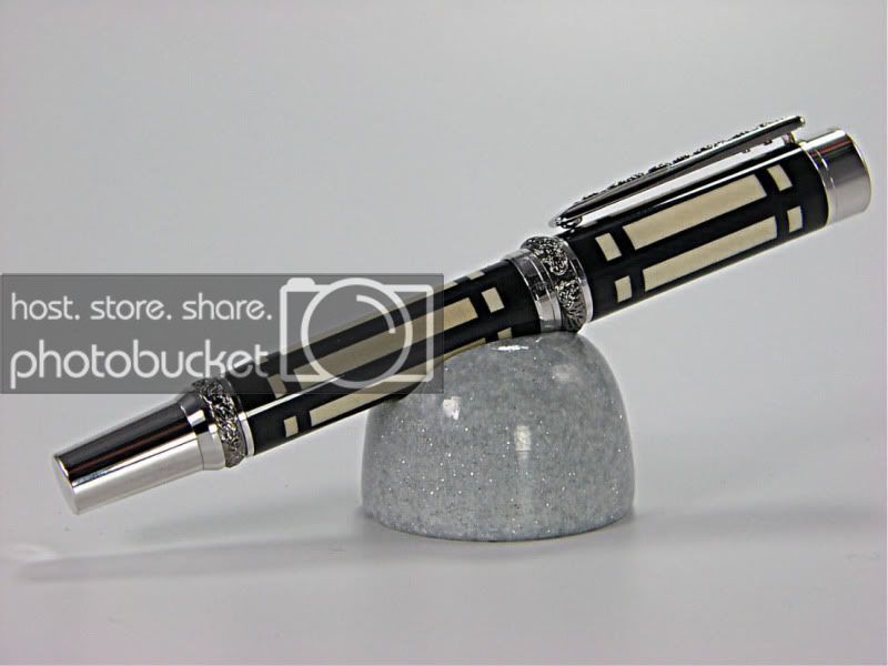
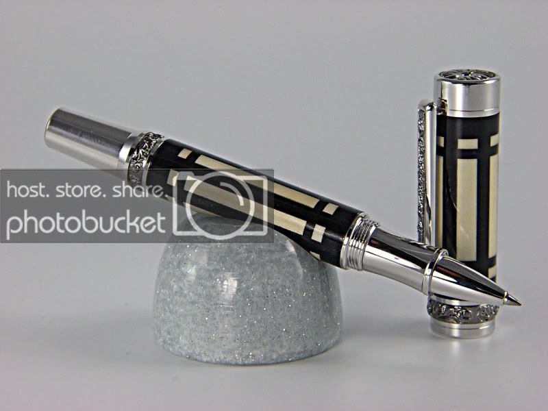
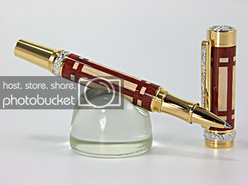
Maybe those that did not like the black and white segmented pen I posted would like this one better or maybe not.

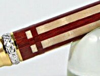
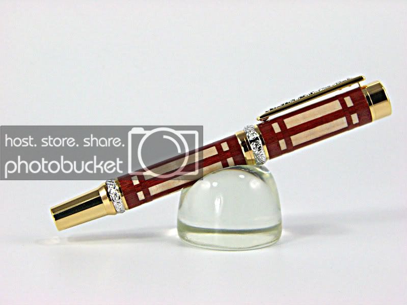
This is Bloodwood and curly maple with 8 coats of med CA on a Roman Harvest kit. Thanks for looking.


CopyofIMGP0897-1.jpg


CopyofIMGP0899-1.jpg
 
Signed-In Members Don't See This Ad

skiprat

Passed Away Mar 22, 2022
In Memoriam
Joined
Oct 19, 2006
Messages
7,812
Location
In a Skip in Wales
Yowzer !! That one has serious bling factor for sure!!. :eek:

LOL, still doesn't beat the classic lines and style of that stunning Panache though !!!:biggrin::tongue:
 

jttheclockman

Member
Joined
Feb 22, 2005
Messages
19,132
Location
NJ, USA.
Yowzer !! That one has serious bling factor for sure!!. :eek:

LOL, still doesn't beat the classic lines and style of that stunning Panache though !!!:biggrin::tongue:


Just no pleasing you Skip.:biggrin: Guess I will have to make another Panache with something new.
 

Jim Burr

Banned
Joined
Feb 23, 2010
Messages
3,060
Location
Reno, Nv
This one really is my favorite out of the "series" John, something about the bloodwood sets it off.
 

skiprat

Passed Away Mar 22, 2022
In Memoriam
Joined
Oct 19, 2006
Messages
7,812
Location
In a Skip in Wales
Just no pleasing you Skip.:biggrin: Guess I will have to make another Panache with something new.

:confused:Wadayamean??? I never said anything bad about this pen, I just liked the other one better. Chances are, if you make a new Panache, I'll still prefer your first one. :wink:

Besides, if everyone just said nice stuff about each pen we made then we would just keep making the same old stuff and not be creative.
We don't learn from our successes, only from our mistakes. :wink:
 

jttheclockman

Member
Joined
Feb 22, 2005
Messages
19,132
Location
NJ, USA.
Just no pleasing you Skip.:biggrin: Guess I will have to make another Panache with something new.

:confused:Wadayamean??? I never said anything bad about this pen, I just liked the other one better. Chances are, if you make a new Panache, I'll still prefer your first one. :wink:

Besides, if everyone just said nice stuff about each pen we made then we would just keep making the same old stuff and not be creative.
We don't learn from our successes, only from our mistakes. :wink:


I am just kidding with you Skip. I know exactly what you mean. Each pen I shown had abit different technique needed to complete it. The Panache just happen to be the simpilist of all of them. You do not have to worry about me doing the same thing over and over. I rarely do the same pen twice unless ordered.

I have a bunch other ideas that I want to try. Hopefully will find some shop time.
 

firewhatfire

Member
Joined
Mar 7, 2011
Messages
3,813
Location
Columbiana, Alabama
A masterpiece for sure.

I wanna complain about it to make you better, but I am having trouble coming up something bad to say.:rolleyes:

What am I saying I am amazed and hope you keep expanding to give me new goals to shoot for.:biggrin:

Phil
 

plantman

Member
Joined
Jan 2, 2012
Messages
3,437
Location
Green Bay, Wi
Just no pleasing you Skip.:biggrin: Guess I will have to make another Panache with something new.

:confused:Wadayamean??? I never said anything bad about this pen, I just liked the other one better. Chances are, if you make a new Panache, I'll still prefer your first one. :wink:

Besides, if everyone just said nice stuff about each pen we made then we would just keep making the same old stuff and not be creative.
We don't learn from our successes, only from our mistakes. :wink:

:cowboy::cowboy: Skiprat; As I remember, the statement I made about saying more than one or two words about someone's project got me in a lot of hot water last month. However, you notice, we have more feedback than before. A little heat was well worth it !!!
:eek::eek: John; Very rich looking pens !! It would be hard to choose between the two. I will give you a "Master Craftsman" rateing on both. Jim S
 
Last edited:

alamocdc

Member
Joined
Apr 26, 2005
Messages
7,970
Location
San Antonio, Texas, USA.
Oh wow, John! They may have been done the same, but they are totally different in how they appear. I have to admit, though, that I too like the black one best... in spite of how stunning this one is.
 

jttheclockman

Member
Joined
Feb 22, 2005
Messages
19,132
Location
NJ, USA.
I guess I should mention that the black and white one took second place in an AAW contest.

Thanks all for the nice words.
 

IPD_Mr

Member
Joined
Jun 27, 2007
Messages
3,707
Location
Zionsville, In
LOL, still doesn't beat the classic lines and style of that stunning Panache though !!!:biggrin::tongue:

When Steven is right you just have to follow behind and nod your head.

Don't get me wrong John, this one and the black one is really nice. They look like they belong in a cathedral for signing important documents. The Panache just screams come touch me, I will electrify your world.

But again I will emphasize that this is a matter of personal taste for me and not a reflection of the quality of the work on this pen or the black one.
 
Joined
Oct 31, 2011
Messages
300
Location
Columbia, SC
John,

I like this one the best, and I have looked at all three. :) You have asked for constructive criticism I believe, so here is my bit, and of course please understand that I am nit picking and as I don't know how you made it I don't know how to tell you to fix it!:rolleyes: That being said, it seems that the segmenting on the top of the cap is off horizontally. It may be a trick of the light or my eyes, but it seems that way in the picture. You have done quite a great job on all these pens and your accuracy is pretty amazing! Maybe if I had the pen in person I would be able to give you a more accurate opinion...:biggrin:

David
 

jttheclockman

Member
Joined
Feb 22, 2005
Messages
19,132
Location
NJ, USA.
John,

I like this one the best, and I have looked at all three. :) You have asked for constructive criticism I believe, so here is my bit, and of course please understand that I am nit picking and as I don't know how you made it I don't know how to tell you to fix it!:rolleyes: That being said, it seems that the segmenting on the top of the cap is off horizontally. It may be a trick of the light or my eyes, but it seems that way in the picture. You have done quite a great job on all these pens and your accuracy is pretty amazing! Maybe if I had the pen in person I would be able to give you a more accurate opinion...:biggrin:

David


Hello David

Thanks for the kind words. As far as your assessment and the misalignment goes, I must tell you that it is not off and probably the angle or lights on the pen that is throwing your eye off. The way I constructed the pen did not allow me to be off. Is it posible??? Yes if you do not take the steps I did in construction. Thanks.
 

switch62

Member
Joined
Jan 26, 2012
Messages
99
Location
Adelaide, Australia
I went back and looked at the black and white one, but I like this one better. I've always been partial to the redder woods and gold hardware.

I like the panache as well, it has a very classic art deco style. All the pens are very artistic and expertly crafted.

Tony O
 
Joined
Oct 31, 2011
Messages
300
Location
Columbia, SC
John,

I like this one the best, and I have looked at all three. :) You have asked for constructive criticism I believe, so here is my bit, and of course please understand that I am nit picking and as I don't know how you made it I don't know how to tell you to fix it!:rolleyes: That being said, it seems that the segmenting on the top of the cap is off horizontally. It may be a trick of the light or my eyes, but it seems that way in the picture. You have done quite a great job on all these pens and your accuracy is pretty amazing! Maybe if I had the pen in person I would be able to give you a more accurate opinion...:biggrin:

David


Hello David

Thanks for the kind words. As far as your assessment and the misalignment goes, I must tell you that it is not off and probably the angle or lights on the pen that is throwing your eye off. The way I constructed the pen did not allow me to be off. Is it posible??? Yes if you do not take the steps I did in construction. Thanks.

Hello John,

Your welcome! If you have a fool proof method, then I have to learn it! Maybe when I have the time and money I can learn it. Experiment money is not in the budget right now! Thanks
 

jttheclockman

Member
Joined
Feb 22, 2005
Messages
19,132
Location
NJ, USA.
Thanks everyone for the kind words. I had fun doing these and it opened alot of possibilities for me for future pens. I have one on the table that I am trying to figure a way of drilling without blowing it up. :biggrin:

Being many who have commented on this pen made a comparison to the black and white and this one I thought I would post both photos in the same thread here. Thanks again for looking and the kind words.


IMGP0881.jpg


IMGP0892.jpg


CopyofIMGP0897-1.jpg


CopyofIMGP0899-1.jpg
 

Gilrock

Member
Joined
Oct 18, 2011
Messages
560
Location
Tucson, AZ
John,

I like this one the best, and I have looked at all three. :) You have asked for constructive criticism I believe, so here is my bit, and of course please understand that I am nit picking and as I don't know how you made it I don't know how to tell you to fix it!:rolleyes: That being said, it seems that the segmenting on the top of the cap is off horizontally. It may be a trick of the light or my eyes, but it seems that way in the picture. You have done quite a great job on all these pens and your accuracy is pretty amazing! Maybe if I had the pen in person I would be able to give you a more accurate opinion...:biggrin:

David


Hello David

Thanks for the kind words. As far as your assessment and the misalignment goes, I must tell you that it is not off and probably the angle or lights on the pen that is throwing your eye off. The way I constructed the pen did not allow me to be off. Is it posible??? Yes if you do not take the steps I did in construction. Thanks.

I think it's an awesome pen and I'd have trouble making one that's as good but I gotta back up David. My eyes were drawn to the same thing in a couple spots. I blew up the image and drew red lines down the segment to show what my eyes are seeing.
 

Attachments

  • Blowup.jpg
    Blowup.jpg
    64.3 KB · Views: 124

jttheclockman

Member
Joined
Feb 22, 2005
Messages
19,132
Location
NJ, USA.
John,

I like this one the best, and I have looked at all three. :) You have asked for constructive criticism I believe, so here is my bit, and of course please understand that I am nit picking and as I don't know how you made it I don't know how to tell you to fix it!:rolleyes: That being said, it seems that the segmenting on the top of the cap is off horizontally. It may be a trick of the light or my eyes, but it seems that way in the picture. You have done quite a great job on all these pens and your accuracy is pretty amazing! Maybe if I had the pen in person I would be able to give you a more accurate opinion...:biggrin:

David


Hello David

Thanks for the kind words. As far as your assessment and the misalignment goes, I must tell you that it is not off and probably the angle or lights on the pen that is throwing your eye off. The way I constructed the pen did not allow me to be off. Is it posible??? Yes if you do not take the steps I did in construction. Thanks.

I think it's an awesome pen and I'd have trouble making one that's as good but I gotta back up David. My eyes were drawn to the same thing in a couple spots. I blew up the image and drew red lines down the segment to show what my eyes are seeing.


I guess I should feel honored. Oh my,,,, :eek:this is the second pen that the lasers have come out to play. I think in all my years here I have not seen this kind of scrutiny with others pens. If this kind of scrutny is any indication of how the Guild examines pen entrys then I better not even try that route.:biggrin:

Let me first say we are talking about using WOOD tools to do these pens on a wood lathe. Not a metal lathe where accuracy is abit more achieved. A router was used to cut the slot where the dark color horizontal material was layed into. When using a router with that thin a bit you will get vibration and being I have to cut in steps to try to combat this the possibility to get a hair more cutting in various parts of the slot is possible. The piece that fills in the spot is pretty much the same thickness when cut on a tablesaw. The small pieces that are sandwiched between the solid pieces are cut from the main body piece with each piece having witness marks to keep the orintation exactly the same when lining back up. If one is off then all are off.

I accept the crtisism with open arms and will strive to do better. I accept your assessment as well as any others that there are flaws in any of the pens I do. I am not a laser or a machine making them nor do I use one. These are hand made to the best of my ability using the tools I have. I will have to say that I think I did a pretty darn good job in achieving my goal. Can I do better?? I guess I can and will strive to do so.

Thanks again for the feedback. Don't be shy if others have things they see in any of my pens that I show let it rip. Good to see people are paying attention.
 
Last edited:

Tom D

Member
Joined
Jul 1, 2009
Messages
455
Location
Columbia, SC
John,
Thank you for posting your pens they are just fantastic. I don't turn a lot of pens and I post even less but when I see your artistry and craftsmanship I want to go to the shop and push my envelope.

Tom
 
Top Bottom