Another failure

Signed-In Members Don't See This Ad
Status
Not open for further replies.

ctEaglesc

Passed Away Jul 4, 2008
In Memoriam
Joined
Jul 5, 2004
Messages
3,238
Location
Camden, S.C., USA.
But I'll keep trying
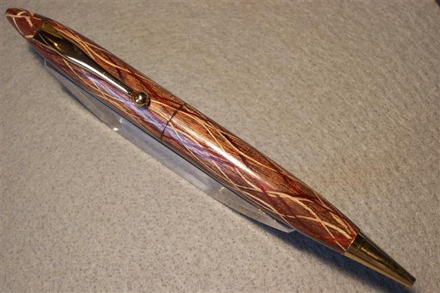

2005924114446_walnut%20red%20white%20lace%20001.jpg


(After thought)
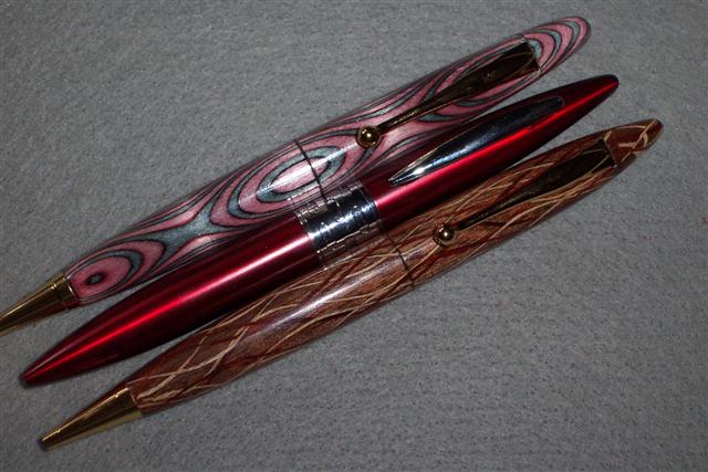
The impetus of the shape of this pen came from a pen I picked up at the Dollar store.
I figured for a buck I had something to take apart and maybe "borrow" some parts.
The pen in the middle(red) is the purchased pen from the dollar store.

2005924135258_walnut%20red%20white%20lace%20003.jpg
 
Signed-In Members Don't See This Ad
Eagle I like the shape you're exploring...as with the red and black pen you posted, it's very pleasing in shape. The only thing that stands out on this on is the more pointed shape you've given the finial. Without going back and looking I think the other pen had a more rounded shape to the finial and I liked that one better. Visually the colors are very complimentary to each other. Failure...I think not!
 
Mark me down as a 'me too' on not understanding your self-put-downs on this and the previous pen. The previous you labeled 'not your best'. Well, there can only be one 'best' so the rest would fall a bit short, doesn't mean not good. Most of us would class it as 'great'. The pointy finial in this is not to my taste, but that's my taste, which, as most here know already, is frequently not in step with many others. Your quest for new, different, innovative has taken pen making into the realm of art in small packages.
 
To tell the truth, I like the shape of your red and black one better than the store bought one. Theirs does have a nice elliptical front section, but the straight kit nosecone prevents that. Ease up on yourself. You have done stronger work, but they will be highly prized by someone. They are nice pens, plain and simple. It's certainly not a failure when you can learn something about the technique and anything you might tweak for a next one and continue higher.
 
I think it's cool. A couple of questions and comments.

1. Is the finial a separate piece like the pink laminate one or is it a closed end with an inserted clip?
2. I like the design but I would like to see it in a more simple blank. The shape makes this pen. Your complicated blank makes it more difficult to appreciate both the intricacies of the blank and the shape of the pen.

Keep up the inovative ideas.
 
The shape and style looks like the fountain pens by Shaeffer in the mid-50's. I liked them then, and I like this one now. Put a white dot on the finial above the clip to complete the illusion.

I am waiting to see the "best".
 
Hey Eagle,

Count me in with the "me too's" on liking these pens. I find these laminations/striations/or whatever they are called more to my personal liking than the more elaborate ones like the "sinew pen." I wish I had a tenth of your patience, not to mention a touch of your talent.
 
The wood-
"Eagleyezed"
The kit
Fancy slimline from Woodturningz
Method.
I did not look at any tutorials though I know there are some available.
using a collet chuck and a Jacobs chuck I recessed the gold finial cap from the kit in the top piece prior to turning it.
After finishing I recessed and nothched the top of the upper blank for the ring of the clip.
The last two steps are not for those with weak hearts.
 
Originally posted by wdcav1952
<br />Hey Eagle,

Count me in with the "me too's" on liking these pens. I find these laminations/striations/or whatever they are called more to my personal liking than the more elaborate ones like the "sinew pen." I wish I had a tenth of your patience, not to mention a touch of your talent.

It does not take patience or talent.
That is why I included this line in my signature:
Ignorance+Curiosity+Perseverence=Originality" Eagle
 
I like the shape. I wish I could see the final a little better in the picture though. I would have been happy alrady, but got luck to you on your experiments.
 
Status
Not open for further replies.
Back
Top Bottom