KiltedGunn
Local Chapter Leader
"from the Scottish Gaelic duine meaning a "man", and "uasal" meaning "gentle, noble, or of good birth"."
"A Highland Gentleman of learning and influence"
I've never been much for "naming" pens but I thought this worked!
After several failed attempts at putting tartan onto a pen, I decided to give labels a whirl and I'd have to say they exceeded my expectations!
I've still got a couple more ideas for trying real tartan but, for now, these are off to the Clan Gunn Society NA where I might drum up a wee bit o' custom!
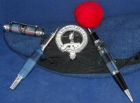
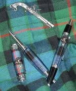
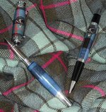
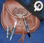
They are a Blk Ti Jr Gent II and a Sierra Click in Gunn Ancient tartan with the Gunn crest. My pics aren't great (or even very good!) but I tried several different backgrounds for marketing. The one with the bonnet needs a different color background, but I'm liking the rest.
Whatcha think?
"A Highland Gentleman of learning and influence"
I've never been much for "naming" pens but I thought this worked!
After several failed attempts at putting tartan onto a pen, I decided to give labels a whirl and I'd have to say they exceeded my expectations!
I've still got a couple more ideas for trying real tartan but, for now, these are off to the Clan Gunn Society NA where I might drum up a wee bit o' custom!
They are a Blk Ti Jr Gent II and a Sierra Click in Gunn Ancient tartan with the Gunn crest. My pics aren't great (or even very good!) but I tried several different backgrounds for marketing. The one with the bonnet needs a different color background, but I'm liking the rest.
Whatcha think?