Rate my logo

Signed-In Members Don't See This Ad

Todd in PA

Member
Joined
Feb 16, 2021
Messages
644
Location
Port Matilda, PA
Friends keep telling me that I need business cards. Being a cheapskate, I tried to make my own logo. I'd appreciate your ruthless comments before I print anything. Thank you.
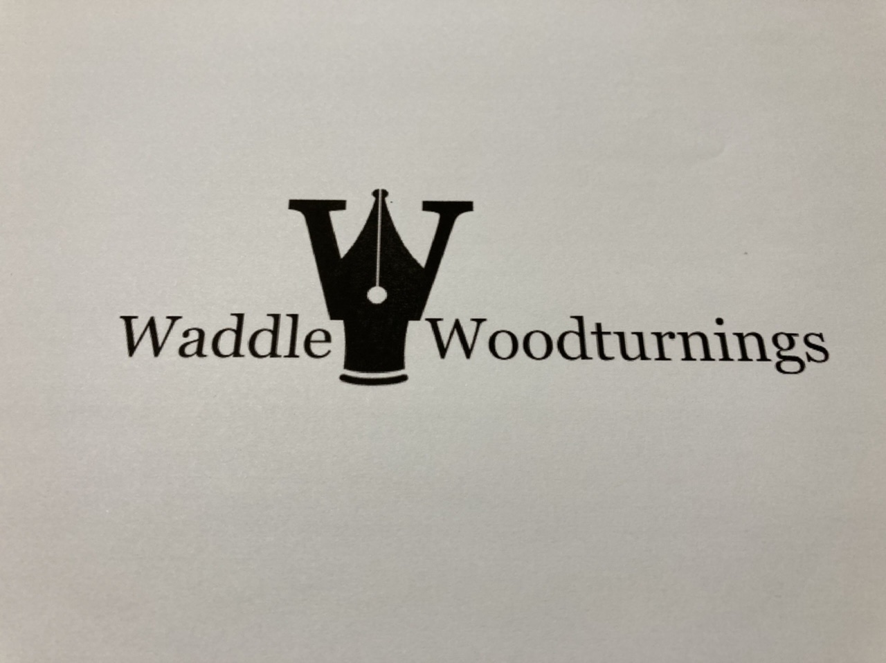
5A6FDFB4-4949-4329-9205-1A8998E67F78.jpeg
 
Signed-In Members Don't See This Ad

Todd in PA

Member
Joined
Feb 16, 2021
Messages
644
Location
Port Matilda, PA
Waddle.jpg

Waddle is the 'town' where I live. There used to be a train stop and a post office here in the 1800s. I live in the old Waddle church. The train has gone long ago, so there is absolutely nothing here but about 9 houses. But we're only about 7 miles from State College and Penn State University.
 
Joined
Jul 1, 2021
Messages
545
Location
Fayetteville, North Carolina
Interesting concept of having the fountain nib in the W. The plain black color isn't making it stand out or pop, consider some color for the logo to help it stand out. Maybe keep the nib black while making the W another color. Finally, the logo being between the words is off center and seems unbalanced. Maybe take that image out of the words and stack the words to the right of the image. It might give more balance to the logo.

It is rough and this concept isn't bad and could be taken to a pro to get it done with zing. I like it overall, but some refinement would really set it apart from others. I get it, no one is excited about spending money to get a logo designed.

Currently I am working a professional company to develop a formal logo for my work. Because of being willing to do that I have a logo that is evolving beyond my initial vision to something far better. That has a lot to do with a professional eye seeing it and helping me develop it farther. Just something to consider, I would encourage you to save up and get it professionally finished because it also includes ALL of the digital formats for social media, letterhead, printing, etc.
 

Todd in PA

Member
Joined
Feb 16, 2021
Messages
644
Location
Port Matilda, PA
...the logo being between the words is off center and seems unbalanced. Maybe take that image out of the words and stack the words to the right of the image. It might give more balance to the logo.
I just posted a revision like this while you were probably typing your reply. Lol.

I've done one with a gradient green color that looks nicer for sure, but I'm probably going to need it to look nice in one solid color for pen boxes.

I was looking on Fiverr to see if I could get a professional to run with the concept for under $50.
 

jrista

Member
Joined
Aug 12, 2021
Messages
2,222
Location
Colorado
View attachment 325383
I amended it a dozen times or more trying to improve it, and I'm not sure if any are an actual improvement.
Any chance you could remove the W on the Woodturnings bit, and try to let the stylized W work for both?

It may be that that just makes readers have a hard time reading it...not sure. It may make things "fit" better in this orientation, though
 

jrista

Member
Joined
Aug 12, 2021
Messages
2,222
Location
Colorado
Oh, maybe another idea...remove the W from the Woodturnings word. Then put a white W in the lower part of the nib.
That might just provide a little bit of balance that is kind of missing with the W in the second line, bing in the text and not in the art.
 

Todd in PA

Member
Joined
Feb 16, 2021
Messages
644
Location
Port Matilda, PA
Thanks! I printed it with and without the 'W' in different ways and it usually looked weird, at least to me.

UPDATE: I submitted an order on Fiverr.com. For a very small fee, a designer will re-envision my concept. I'll post what I get back next week for anyone interested.

Thanks everyone for the comments and likes!

Todd
 

J_B

Member
Joined
Jan 14, 2013
Messages
113
Location
Shelbyville, KY
I am with Jrista on removing both W's and letting the 'nib W' be there for both as it looks a little too big for just the one for Waddle.

2cents
jb
 
Joined
Jul 1, 2021
Messages
545
Location
Fayetteville, North Carolina
I just posted a revision like this while you were probably typing your reply. Lol.

I've done one with a gradient green color that looks nicer for sure, but I'm probably going to need it to look nice in one solid color for pen boxes.

I was looking on Fiverr to see if I could get a professional to run with the concept for under $50.

I used Fiverr for an initial logo concept but had language barrier issues. I would emphasize finding someone in the US who's main language is english. That site is hit or miss, just proceed with caution. That logo I had helped as a template for what I am doing now. So I am not saying not to do it but most of the people there are new and looking to build their resume or not necessarily professionals.
 

PatrickR

Member
Joined
Apr 8, 2017
Messages
1,423
Location
Rural America
I worked in the graphics field for many years. Logo design was not a specialty, but I have been paid to develop them more than a few times.
First - working on it in B/W is the way to go. A saying used in the field is "if it doesn't work in B/W, it doesn't work". Colors can be done later.
The name and the shape don't really go together. A nib is very specific but "woodturnings" is not. Unless you intend on only making pens I would rethink the shape. If you are I would rethink the name. The shape doesn't have to have an immediate intent. Think of some classic logos, do you know what the shape means? Pepsi, Montblanc etc. it should have some meaning to you and be simple and legible at any size.
I would look at sans serif fonts they are more easily read quickly.
Take all of this FWIW.
 

NGLJ

Member
Joined
Sep 15, 2021
Messages
301
Location
Surrey BC, Canada
I have done some logo design work and tend to agree with Patrick. It seems easy but it is not. We see what we want to see but trying to see through other people's eyes is hard. I learned a lot from https://logosbynick.com/ and his Utube channel (excellent videos). He does it as a business but he has some free stuff which gives you some ideas. What software are you using?
 

PatrickR

Member
Joined
Apr 8, 2017
Messages
1,423
Location
Rural America
I would also suggest looking at the other logos being used by those you would consider a competitor. If it is small pen makers I would guess that there are many using some version of a nib in the design.
 

Todd in PA

Member
Joined
Feb 16, 2021
Messages
644
Location
Port Matilda, PA
Thanks for all your great comments!

For $20 I got two logo ideas on Fiverr ($25 with fees and tax), based on my original idea. Quick turn around! Either of these have better balance than mine and look like good improvements to me. I get to keep both. But which do you like better? I think I get to request revisions before he gives me the copies without the water mark.

Fiverr Logo 1.png

Fiverr Logo 2.png


It's a side hobby. I can always revise the name and/or logo down the road if I need to. I really just want to order some pen packaging with my name on it.
 

egnald

Member
Joined
Jun 9, 2017
Messages
3,061
Location
Columbus, Nebraska, USA
Thanks for all your great comments!

For $20 I got two logo ideas on Fiverr ($25 with fees and tax), based on my original idea. Quick turn around! Either of these have better balance than mine and look like good improvements to me. I get to keep both. But which do you like better? I think I get to request revisions before he gives me the copies without the water mark.

View attachment 325495
View attachment 325496

It's a side hobby. I can always revise the name and/or logo down the road if I need to. I really just want to order some pen packaging with my name on it.
For what it's worth, my favorite is the top one in this post - the one with the Nib in white in the bottom of the W with ADDLE and OODTURNINGS aligned with the W. I think it's pretty cool! - Dave
 

NGLJ

Member
Joined
Sep 15, 2021
Messages
301
Location
Surrey BC, Canada
Sorry to be difficult but if I saw either of these I would think pens. If that is what you want fine but to me Woodturnings conveys a wider meaning. I might have gone for something like Waddle, Custom Pen Turning if that is what you intend. Of the 2 proposed I prefer the lower one. It gives more weight to your name and I assume that is what you want people to remember. Not sure I like the pen nib though. My 2c. Go with what you gut tells you!
 

magpens

Member
Joined
Feb 2, 2011
Messages
15,913
Location
Canada
I like the upper design best.

The BIG W has two V's that could also be turned into Ftn. Pen nibs if you wanted to strongly emphasize that aspect of your work.
 

PatrickR

Member
Joined
Apr 8, 2017
Messages
1,423
Location
Rural America
It is common to think that you can just change it later, but from a marketing perspective it's not what you want to do. Maybe alter or refine it but consistency over time is important. Don't rush the process.
 
Joined
Jul 1, 2021
Messages
545
Location
Fayetteville, North Carolina
Thanks for all your great comments!

For $20 I got two logo ideas on Fiverr ($25 with fees and tax), based on my original idea. Quick turn around! Either of these have better balance than mine and look like good improvements to me. I get to keep both. But which do you like better? I think I get to request revisions before he gives me the copies without the water mark.

View attachment 325495
View attachment 325496

It's a side hobby. I can always revise the name and/or logo down the road if I need to. I really just want to order some pen packaging with my name on it.


Of the 2, I like the top one. Both look really good and either would work.
 

fpokatu

Member
Joined
May 18, 2021
Messages
18
Location
Boston
View attachment 325383
I amended it a dozen times or more trying to improve it, and I'm not sure if any are an actual improvement.
I like this one better.
The spacing in the one above, I find, a little awkward. There's more space between the e and logo and the top of the W and logo which I think could be tweaked. This one does that. That said, I like these probably better.

All that said, the logo is really pen specific so the connection to woodturning is not enitrely clear. The downplayed logos work better of me. They are also less blocky then the logo with the grip section. You might consider adding a bowl or something else you turn.
Just my 2 cents.
1642519136508.png
 

Todd in PA

Member
Joined
Feb 16, 2021
Messages
644
Location
Port Matilda, PA
Thanks to everyone who replied and gave me feedback. I agree that the $25 on Fiverr was worth the money and I like the improved designs. I can't disagree with the fact that woodturnings isn't very well aligned with the pen nib. I mostly do pens, but I aspire to do things besides pens. I think 'woodturnings' gives me room to expand and maybe sell some bowls, tops, and birds...I just watched a video on making yo-yos. I do like the alliteration of Waddle Woodturnings.

I preferred the top logo over the bottom and asked the Fiverr person to swap out the W logo on the bottom one, giving me one more block square and one more horizontal version. I think this is the one I'm going with.

Waddle Woodturnings 4.png
 
Joined
Jul 1, 2021
Messages
545
Location
Fayetteville, North Carolina
Thanks to everyone who replied and gave me feedback. I agree that the $25 on Fiverr was worth the money and I like the improved designs. I can't disagree with the fact that woodturnings isn't very well aligned with the pen nib. I mostly do pens, but I aspire to do things besides pens. I think 'woodturnings' gives me room to expand and maybe sell some bowls, tops, and birds...I just watched a video on making yo-yos. I do like the alliteration of Waddle Woodturnings.

I preferred the top logo over the bottom and asked the Fiverr person to swap out the W logo on the bottom one, giving me one more block square and one more horizontal version. I think this is the one I'm going with.

View attachment 325771

Solid looking design, I hope it works out for you.
 
Joined
Sep 24, 2006
Messages
8,206
Location
Tellico Plains, Tennessee, USA.
I never weighed in on this thread because I'm terrible at design, but I do like the final pick and agree it gives you much more leeway to other products.... I use the name "TellicoTurnings" for my cards and and logo.... I don't do pen now, but have moved on to bowls, pepper mills, and other things. Your logo gives you that same opportunities. Good Job.

My avatar signature is missing the "S".....Jeff converted my original Avatar name for me and he dropped the "S" inadvertently...
but not a problem.
 
Top Bottom