You are using an out of date browser. It may not display this or other websites correctly.
You should upgrade or use an alternative browser.
You should upgrade or use an alternative browser.
Help with Fonts
- Thread starter lorbay
- Start date
Signed-In Members Don't See This Ad
Signed-In Members Don't See This Ad
Bear-31
Member
Can't really help...but it's definitely not Papyrus. Papyrus is what I use in my logo in my signature.
rd_ab_penman
Member
Lin,
The font is Calibri (Body)
Les
The font is Calibri (Body)
Les
thewishman
Member
I remember the fonts when he was on "Happy Days"..... :biggrin:
" 'Ayyyy":good::good:
thewishman
Member
On a more serious side, any chance of talking to the Centre (or their designer, if they credit the designer) and finding out there?
Last edited:
lorbay
Member
On a more serious side, any chance of talking to the Centre (or their designer, if they credit the designer) and finding out there?
Yes I tried that route already and it's so old no one there knows anymore.
Lin
lorbay
Member
Lin,
The font is Calibri (Body)
Les
Not even close Les. But thanks for trying.
Lin
lorbay
Member
The first one is Calibri (body) anf the second one is Perpetua which is close but the straight peices on the T, E and F's are not the same.On a more serious side, any chance of talking to the Centre (or their designer, if they credit the designer) and finding out there?
Yes I tried that route already and it's so old no one there knows anymore.
Lin
Lin.
Attachments
duncsuss
Member
The closest match I can get is Percival. It's the first one I've found where the right-hand crossbar of the letter T (and the smaller crossbar of the E and F) has an upturn instead of a serif. Still doesn't look exactly right, but maybe there is a version of it that's closer.
There are tools you can use, such as "What The Font" LINK and Identifont (which is how I got this far)

There are tools you can use, such as "What The Font" LINK and Identifont (which is how I got this far)

ChrisN
Member
Try Baker Signet Regular. I'm 90% sure that's what it is.
duncsuss
Member
Try Baker Signet Regular. I'm 90% sure that's what it is.
Well done, Chris -- there are two versions (Adobe and Bitstream) that seem to have very slight differences, but they are both excellent matches for the sample. Just a touch of additional letterspacing and it'll look great.
mbroberg
IAP Activities Manager, Emeritus
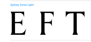
Sydney Serial (All Caps)
JD Combs Sr
Member
Looks a lot like Andalus to me without bolding - [FONT="]BC FOREST[/FONT]
[FONT="]DICOVERY CENTRE
[FONT="]Edit:
Hmmm[FONT="], when I paste[FONT="]d it ito the quick reply window it ha[FONT="]d the andalus font but changed [FONT="]wh[FONT="]en I p[FONT="]osted. Going to advanced I see why, th[FONT="]at fo[FONT="]nt is not available on line. Looks like a perfect match in word th[FONT="]ough.[/FONT][/FONT][/FONT][/FONT][/FONT][/FONT][/FONT][/FONT][/FONT][/FONT]
[/FONT]
Last edited:
duncsuss
Member
duncsuss
Member
Again -- the T is wrong.Looks a lot like Andalus to me without bolding - [FONT="]BC FOREST[/FONT]
[FONT="]DICOVERY CENTRE[/FONT]
JD Combs Sr
Member
Again -- the T is wrong.Looks a lot like Andalus to me without bolding - [FONT="]BC FOREST[/FONT]
[FONT="]DICOVERY CENTRE[/FONT]
Yep, I see that now, shame to the others look real close.
mbroberg
IAP Activities Manager, Emeritus
Sydney Serial (All Caps)
Sorry, not Sydney Serial. Key differences on the serifs of the E F and T.
View attachment 134739
Yep, you're right.
duncsuss
Member
Again -- the T is wrong.Looks a lot like Andalus to me without bolding - [FONT="]BC FOREST[/FONT]
[FONT="]DICOVERY CENTRE[/FONT]
Yep, I see that now, shame to the others look real close.
I've been involved with typesetting systems for about 35 years now, and you have to believe me when I say it was a whole lot easier when there were only a handful of photo-type foundries (Linotype-Merganthaler, Monotype, Compugraphic, AM-Varityper, Itek, Autologic, Berthold, and perhaps a couple more.)
Now it seems like there are hundreds of new type foundries every year, and telling the faces apart is harder and harder.
On the plus side -- there are hundreds of beautiful new faces to choose from every month, there should never be a need to settle for something that doesn't work perfectly (if you have time enough to find it, of course!)
ChrisN
Member
Try Baker Signet Regular. I'm 90% sure that's what it is.
Well done, Chris -- there are two versions (Adobe and Bitstream) that seem to have very slight differences, but they are both excellent matches for the sample. Just a touch of additional letterspacing and it'll look great.
Thanks! :biggrin: I used FontEdge. It's really quite cool, and can even identify script fonts.
lorbay
Member
Try Baker Signet Regular. I'm 90% sure that's what it is.[/QUOTE
Yes that is it thank you all so much for your help.
Lin.


