
You are using an out of date browser. It may not display this or other websites correctly.
You should upgrade or use an alternative browser.
You should upgrade or use an alternative browser.
New Logo
- Thread starter DozerMite
- Start date
Signed-In Members Don't See This Ad

Signed-In Members Don't See This Ad
Scott
Member
I like it. Almost over the top on the frilly stuff, but not quite, which means it's quite nice and respectable. Do I win something? ;-)
Scott.
Scott.
Don Gaiser
Member
Hi DozerMite,
It's ok, but not great. Anyone just looking at it is not going to have any idea what the flourish is. Also the design just lacks balance. I hope I am not being too presumptuous, but I took the liberty to redesign your logo. You may use it as you wish.
It's ok, but not great. Anyone just looking at it is not going to have any idea what the flourish is. Also the design just lacks balance. I hope I am not being too presumptuous, but I took the liberty to redesign your logo. You may use it as you wish.
Attachments
Don, thanks for the effort, but I don't want an actual feather. Those can be found anywhere. I'm going for an image that is recognized as mine and can stand alone...like the Apple image. It is quickly recognized by most.
My design isn't yet finished. I just threw it together as an example to see it on paper, as to say. The image isn't going to be used for just pens...it's going to cover all of what I do. And as I posted in the other thread, the image has nothing to do with pens, it is a symbol of something more meaningful...to me.
My design isn't yet finished. I just threw it together as an example to see it on paper, as to say. The image isn't going to be used for just pens...it's going to cover all of what I do. And as I posted in the other thread, the image has nothing to do with pens, it is a symbol of something more meaningful...to me.
G1Pens
Member
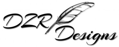
I like it. My only comment would be that the word "Design" seems to float on its own. It doesn't seem as connected to rest of the log. You need to close up the white space between the top of the word and your flourish.
ctubbs
Member
Gary is right about "Design", it feels as though it is falling out of the image. The word actually appears to be drooping on the end. Otherwise I like the over all design.
My $0.02 worth today.
Charles
My $0.02 worth today.
Charles
Don Gaiser
Member
My intent was show you balance... to me it does not feel right the way it is.... maybe the flourish is just too big or something... either that or "designs" is too small...
Don, thanks for the effort, but I don't want an actual feather. Those can be found anywhere. I'm going for an image that is recognized as mine and can stand alone...like the Apple image. It is quickly recognized by most.
My design isn't yet finished. I just threw it together as an example to see it on paper, as to say. The image isn't going to be used for just pens...it's going to cover all of what I do. And as I posted in the other thread, the image has nothing to do with pens, it is a symbol of something more meaningful...to me.
Last edited:
Nick
Member
Looks far to light weight.Perhaps this one will be liked a little better. Not sure if I'm done yet.
Don Gaiser
Member
Much better!!
Perhaps this one will be liked a little better. Not sure if I'm done yet.