Sylvanite
Member
There are several problems with getting a photograph to look good on the Web. One of the big ones is that no two monitors look exactly the same. I regularly use three separate displays and pictures appear distinctly different on each. One has good color rendition and contrast. Another always looks a bit oversaturated. The third (and the one I use most often) is a little dull and dark. There's no way to make a photo that looks its best on all three. Even if all monitors were the same, the way we perceive colors changes with ambient light. I've even noticed that I see colors slightly differently in each eye.
Therefore, it's simply not worth trying to get a web photo perfect. The best that we can do is shoot for an image that looks good to the widest possible audience. This tip contains the simplest mechanism I've found for standardizing a photo for that purpose.
I'm going to start, however, with a seemingly different discussion - exposure and lighting. Here are three different shots of the same pen. One is slightly overexposed, one a little underexposed, and one correct.
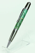
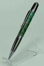
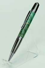
Notice in the first photo that the highlights are a little blown out. The second one looks dark, or "muddy". The third is correctly exposed, but is a little lacking in dynamic range. That is, the whites aren't totally white, and the blacks aren't completely black. Such a photo could be characterized as "dull". I see this problem most often with insufficient light, or when using a light tent. When we diffuse light to cut harsh shadows, we often rob the photo of dynamic range as well.
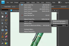
If you have trouble judging correct exposure just by looking, you can load the photograph in Photoshop (I'm using Photoshop Elements version 8 in this example), and click "Enhance -> Adjust Lighting -> Levels"
This will bring up a histogram (which is a graph that shows how much of a photo is how bright). Assuming an even tonal balance in the subject, an underexposed photo's histogram will show lots of dark, and little to no light areas. An overexposed photo will show a spike on the far right with little to the left. The histogram for a correct exposure will not have gaps on either end, or at least the gaps will be even.
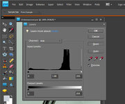
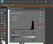
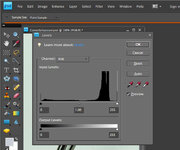
High values on both ends of indicates that the subject has higher dynamic range than the camera could capture. Gaps at the ends is a sign of low dynamic range. It means that the photo has middle tones, but lacks extreme dark and light areas. There are ways of handling excessive dynamic range by merging multiple photos, but I rarely see that problem in pen photography. Low dynamic range is far more common.
The solution is very simple. In the Levels dialog, click <Auto>. Photoshop will expand the range of each color channel, yielding brighter highlights and darker shadows, without losing the detail in either. This almost always produces an image that is more lively, and will display better on a wider variety of monitors. If you like the result, click <OK>. If not, click <Cancel> or <Reset>. You can also adjust the sliders, or input values for greater or lesser effects. The same effect can be achieved from the main menu by clicking "Enhance -> Auto Levels". Here is the result:

"Auto Levels" is typically one of the first adjustments I do on a photograph.
I hope that helps,
Eric
Therefore, it's simply not worth trying to get a web photo perfect. The best that we can do is shoot for an image that looks good to the widest possible audience. This tip contains the simplest mechanism I've found for standardizing a photo for that purpose.
I'm going to start, however, with a seemingly different discussion - exposure and lighting. Here are three different shots of the same pen. One is slightly overexposed, one a little underexposed, and one correct.


Notice in the first photo that the highlights are a little blown out. The second one looks dark, or "muddy". The third is correctly exposed, but is a little lacking in dynamic range. That is, the whites aren't totally white, and the blacks aren't completely black. Such a photo could be characterized as "dull". I see this problem most often with insufficient light, or when using a light tent. When we diffuse light to cut harsh shadows, we often rob the photo of dynamic range as well.
If you have trouble judging correct exposure just by looking, you can load the photograph in Photoshop (I'm using Photoshop Elements version 8 in this example), and click "Enhance -> Adjust Lighting -> Levels"

This will bring up a histogram (which is a graph that shows how much of a photo is how bright). Assuming an even tonal balance in the subject, an underexposed photo's histogram will show lots of dark, and little to no light areas. An overexposed photo will show a spike on the far right with little to the left. The histogram for a correct exposure will not have gaps on either end, or at least the gaps will be even.


High values on both ends of indicates that the subject has higher dynamic range than the camera could capture. Gaps at the ends is a sign of low dynamic range. It means that the photo has middle tones, but lacks extreme dark and light areas. There are ways of handling excessive dynamic range by merging multiple photos, but I rarely see that problem in pen photography. Low dynamic range is far more common.
The solution is very simple. In the Levels dialog, click <Auto>. Photoshop will expand the range of each color channel, yielding brighter highlights and darker shadows, without losing the detail in either. This almost always produces an image that is more lively, and will display better on a wider variety of monitors. If you like the result, click <OK>. If not, click <Cancel> or <Reset>. You can also adjust the sliders, or input values for greater or lesser effects. The same effect can be achieved from the main menu by clicking "Enhance -> Auto Levels". Here is the result:

"Auto Levels" is typically one of the first adjustments I do on a photograph.
I hope that helps,
Eric
