A Baron & Sedona Rollerballs

Signed-In Members Don't See This Ad
See more from Mack C.

Mack C.

Passed Away Sep 29, 2018
In Memoriam
Joined
May 4, 2008
Messages
2,019
Location
Brooklin, ON Canada
I must admit to thinking similar to "boxerman" in his thread "won't post my work anymore".

After much cogitation with myself as well as reading all the posts in his thread, I have come to the conclusion, that my thinking was somewhat skewed in the wrong direction.

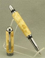
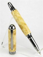
So here for your critiques and comments are 2 of my latest pens.

attachment.php

attachment.php


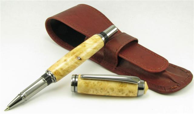
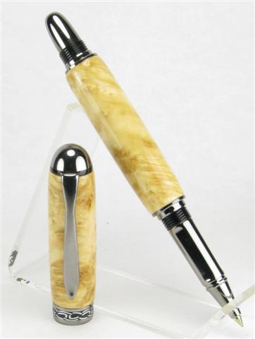
The pens have been turned from a slab of Manitoba Maple Burl that was sent to me from a friend.

Both pens are finished with 12 coats of CA, sanded lightly with 600 grit after the 1st 6 coats. They were then wet mm'd ( with a few drops of liquid dish detergent added to the water) from 1500 grit to 4000 grit.

Buffing with Formax Buffing Compound (Extra-Fine 515-6165) followed by a buffing of Carnuba Wax.

Any and all comments/critiques will be appreciated. Any comments and/or tips you may have with respect to posing of pens would be greatly appreciated as well.
 

Attachments

  • 538 (Small).jpg
    538 (Small).jpg
    30.4 KB · Views: 420
  • 537 (Small).jpg
    537 (Small).jpg
    23.5 KB · Views: 429
Signed-In Members Don't See This Ad
I, for one, like seeing what you are doing Mac! :smile:

I like that you made the custom finial on the first one. Next time maybe you will replace the black ring on the centerband too! :wink:
 
Mack it would be a shame if you quit posting your work. It shows us less experienced turners what is possible and gives us something to aspire to. I may not compliment all the time but like all your postings.
 
I, for one, like seeing what you are doing Mac! :smile:

I like that you made the custom finial on the first one.
Hi Lenny; Where I generally post the most, they would not have let me away without the custom finial. It's called a MacFinial by some!
Next time maybe you will replace the black ring on the centerband too! :wink:
I have no idea how to possibly do that!:confused:I have visions of one pen kit being ruined.

Your comments are much appreciated!
 
Mac

You know me Mac so I am saying this as a friend, continue posting and sharing both your pens and ideas. Stop worrying about view counts or post counts. Some people are just too vain. :smile:

I am guilty of it too but i just don't have the time to post to all pens shown and answer all threads. I do try to stay in contact somewhat.

Your work speaks volumes and is always a pleasure to look at. Now as far as the photos go it is amazing how a blank with light colored features gets so lost in a white background. Dark colored blanks get lost in a black background. Unless you have the perfect lighting setup then you maybe able to pull it off. I would say safely to show the light colored pen you need a darker background. That is why I chose grey these days because it is like a middle of the road look.

The timber used on this pen is fantastic and really needs to be seen in a better light. I would not change the centerband because it breaks up the blank well. So that is my 2¢.
 
Two very good looking pens. Really like the custom final on the Baron. And love the creamy butter look of the wood on the Sedona.
 
Is this a better pic?

Mac

You know me Mac so I am saying this as a friend, continue posting and sharing both your pens and ideas. Stop worrying about view counts or post counts. Some people are just too vain. :smile:

I am guilty of it too but i just don't have the time to post to all pens shown and answer all threads. I do try to stay in contact somewhat.

Your work speaks volumes and is always a pleasure to look at. Now as far as the photos go it is amazing how a blank with light colored features gets so lost in a white background. Dark colored blanks get lost in a black background. Unless you have the perfect lighting setup then you maybe able to pull it off. I would say safely to show the light colored pen you need a darker background. That is why I chose grey these days because it is like a middle of the road look.

The timber used on this pen is fantastic and really needs to be seen in a better light. I would not change the centerband because it breaks up the blank well. So that is my 2¢.

attachment.php


How many like this pic better than the 1st one?
 

Attachments

  • 540 (6) (Small).jpg
    540 (6) (Small).jpg
    32.5 KB · Views: 357
Great looking pens Mack. I always enjoy seeing your work.
I think that the pen pops out at you in the first pic and I prefer that.
 
Great looking pens. Nice choice of pen kits to compliment the wood. Why the soap in the water? I do a wet sanding on the MM too but no soap.
 
Great looking pens. Nice choice of pen kits to compliment the wood.
Why the soap in the water? I do a wet sanding on the MM too but no soap.
Hi Tom; I really have no idea!:laugh:I'm certain someone on IAP mentioned using it at one time. I thought I'd try it, and have been using it ever since. Lubrication, maybe!
 
Great looking pens. I would have probably gone with gold hardware, but after seeing these, the silver (black titanium??) really looks great! Good choice
 
I am no fan of the threads on the Sedona pen but I do like the looks of it and I love the look of Maple on yours. Maple looks like boring every day wood until you put some CA on it, then (at least to me) it explodes with character. Nice pen. :O)
 
Great looking pens. I would have probably gone with gold hardware, but after seeing these, the silver (black titanium??) really looks great! Good choice
Hi David; When I had the Sedona finished I went to get my Gold Ti. kit to put on it, and discovered I only had Blk. Ti. & one Chrome kit. So, it's the Blk. Ti. that I used!
 
Back
Top Bottom