Charoite

Signed-In Members Don't See This Ad
See more from wizard

wizard

Member
Joined
Aug 27, 2009
Messages
3,582
Location
Houston, Texas
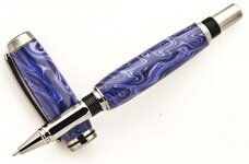
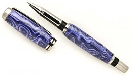
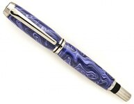
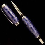
Made it this morning. It's Charoite Tru-Stone on a Black Titanium Navigator.
I thought the Charoite Tru-Stone was one of the prettier Tru-Stones I have turned. Pen seems prettier than the pictures. A little tougher material to turn. Comments welcome but most of all thanks for looking. Doc:smile:
 

Attachments

  • Charoite Navigator_2.jpg
    Charoite Navigator_2.jpg
    38.6 KB · Views: 236
  • Charoite Navigator_1.jpg
    Charoite Navigator_1.jpg
    29.7 KB · Views: 280
  • Charoite Navigator.jpg
    Charoite Navigator.jpg
    32.3 KB · Views: 234
Signed-In Members Don't See This Ad
looks amazing Doc! I love how you were able to capture the colors (i couldn't get mine to do that as well). I didn't find it difficult to turn but I was using a carbide tool to do it soooo....:rolleyes: 
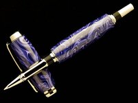
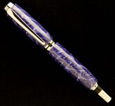
Now they need to replicate that look in many different colors bc it is a very pretty blank.
 
OK guys, I admit it...I do turn at weird hours LOL. I do find it more relaxing to turn than tossing and turning in bed at times. I do get up each morning at around 4:30 AM to look through my patient's charts for that day, exercise, and then take some time to turn. :smile:

On another subject, I wanted to ask for an opinion. I took the same pictures with a lighter (white) background and would like some feedback on comparing the dark background with the white. A professional photographer felt that the dark background enhanced the look of the pen...but the white background looks good to me too. I have gotten a comment that my pictures would look better with a white background. What do you think? After a while of looking at them and comparing, I kind of felt like it was, to some extent, dependent on the color of the pen. I'm at the point..you might know the feeling.. after a while... you just want to post the pen with whatever picture and go turn another pen:rolleyes:. Doc:smile:
 

Attachments

  • Charoite Navigator WB_2.jpg
    Charoite Navigator WB_2.jpg
    35.4 KB · Views: 172
  • Charoite Navigator WB_1.jpg
    Charoite Navigator WB_1.jpg
    33.3 KB · Views: 172
  • Charoite Navigator WB.jpg
    Charoite Navigator WB.jpg
    31.6 KB · Views: 193
I think you are right about the color of the pen dictating background color. I also think the Black Ti stands out better on darker backdround. It looks more chrome on white to me. Nice combination and great looking pen.
 
Doc- You are one of the turners I regularly stop to read posts from. The pens are always top-notch. If I can get this hobby to start paying for itself and start turning more ambitious pens, I will be looking to stuff like this for a sense of direction. I will probably end up occupying a totally different corner of the penturning universe, but this was the food for thought.
 
Boy you figured your camera settings out might quick there. The white to me is the better of the 2 but still would like to see it on a grey or blue. Like I said I think white is too sterile and black is too morbid. Need something in the middle.
 
I am not a professional photographer, but I do consider myself semi-professional. I know the pen pics I have posted may not reflect that, but at this point I have not taken the time to really set up and shoot my pens....anyway....I think the black/white background thing depends on several things. 1) The pen color 2) the metal on the pen 3) your lighting and 4) the "feel" you want.

This particular pen I think shows up better on the white background. With the colors in the pen it looks good on either background, however, with your lighting, it shows up better on the white. If you look at the edges of the pen in the body and at both ends, you will see that the dark areas of the pen disappear on the black and pen actually loses some of its shape. Your lighting style favors this pen on the white. Often chrome/titanium disappears on white because of reflections. In you case it actually stands out better on the white.

John brings up a valid point as well. There are other colors to try besides black and white.

If you really want the best picture of any pen, I would suggest shooting it on both black and white and maybe a couple other colors and then choose the one that YOU feel makes your pen pop. It really doesn't matter what I say or a professional says. Photography is very subjective. You shoule use the picture that you like.

The one thing I will say...you do have the lighting down. Don't change what you did there.
 
Last edited:
hey Doc! Once again you amaze the masses! both backgrounds look great, however, I'm leaning towards the black. Have you ever tried using a color wheel and finding complementary colors for each pen so that it stands out better?http://shop.hobbylobby.com/products/artists-color-wheel-and-mixing-guide-22350/

This is what I have, It makes sense, however I have yet to test it. photographing pens can be time consuming and when i'm in a rush to get the pen to the customer, it can be tempting to pass it up. This is partly because I have to set up and break down the booth everytime. LOML kinda frowns on that thing hanging out on the kitchen table for very long after I'm done. :-(
 
Congratulations, Doc on getting the white background to come out correctly. Most people trying to get a white background end up with dirty gray. Your photos are outstanding, what ever background you chose to use. Seamus stole my thunder with the color wheel idea. That will give you the most/best color contrast for any color blank you chose to use. There are essentially two ways to chose a color with the wheel, the opposite color or the complementary color.
Of the two colors you have chosen, I think the black makes the color of the blank display best while the white shows the edges of the pen the best. On the black, the edges reflect the dark and fade out. I still like the black the best of the two.
Oh, by the way, gorgeous pen, as usual. Did you ever think of posting one of mine so it would make you look human? My best would look like your abject failure.
Charles
 
Wow, what a great looking pen!! I've considered turning charoite, but always thought that it looked kind of boring, this pen certainly proves me wrong! I'm going to have to get some and give it a whirl!

Thanks for posting!
 
Great pen Doc. But at 4:30 I wouldn't be able to FIND the lathe let alone turn.
 
Back
Top Bottom