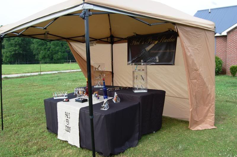
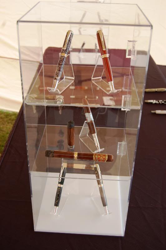
I have to agree with Seamus. The first thing I noticed was how wrinkled the sign was in the front of the display. You are trying to look like a professional pen maker, and a wrinkled cloth like that says that you store your sign under the picnic basket over the winter! Actually, the sign you have in the rear of your display is so much more professional, that I wonder if you considered putting that on the front of the display, and removing the white sign altogether?
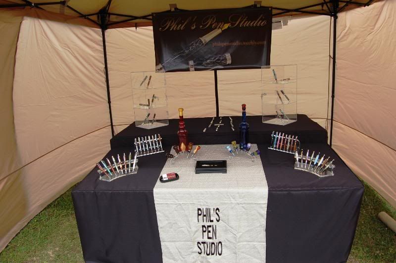
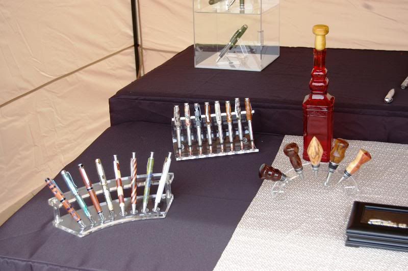
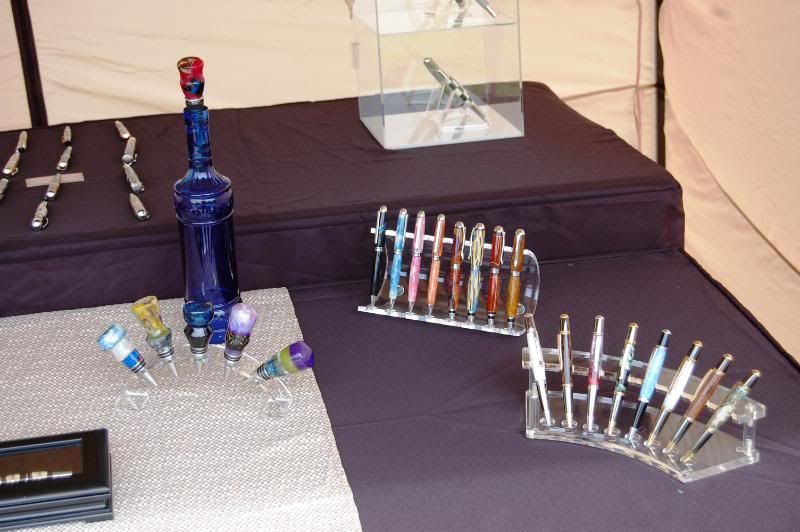
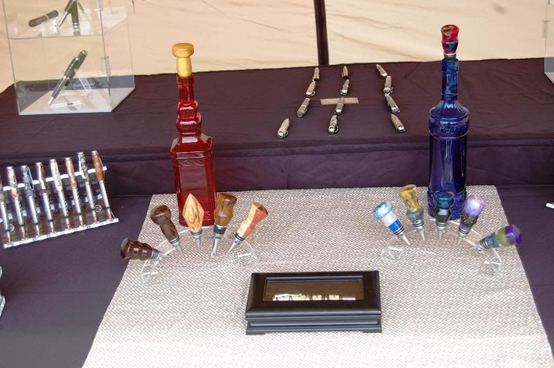
I like the nice, clean look to your layout. You will soon know if you have enough inventory or not. I especially like the way you set up your bottle stoppers. It should be easy enough for people to see exactly what they are, in case they don't know beforehand.
I hope this helps you strike it rich!

 :biggrin: