
You are using an out of date browser. It may not display this or other websites correctly.
You should upgrade or use an alternative browser.
You should upgrade or use an alternative browser.
New pen for the new year
- Thread starter Animyzo
- Start date
Signed-In Members Don't See This Ad
See more from Animyzo

Signed-In Members Don't See This Ad
1080Wayne
Member
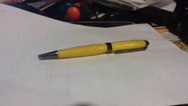
Shape looks good . Can`t tell much more because of out of focus picture . Osage orange ?
OZturner
Member
Dustin, from what I can see, based on the reflection from the Blank, it looks that the Finish is fine, and the Fit at the junction of the Nib end looks good.
It would help if you could get the Photograph a little closer, and in focus, also if the depth of field could cover the entire pen, or shoot the pen side on.
Pleased to see you spreading your wings, Keep it up.
Brian.
It would help if you could get the Photograph a little closer, and in focus, also if the depth of field could cover the entire pen, or shoot the pen side on.
Pleased to see you spreading your wings, Keep it up.
Brian.
Animyzo
Member
sorry was a quick snapshot last night. Here is a picture of it, with two others i made.
The one in front is an opps. The lower barrel split and was ruined, until i realized i had a barrel from a slim-line where the same thing happened. Married oak and purple heart...
anyways C&C always welcome
The one in front is an opps. The lower barrel split and was ruined, until i realized i had a barrel from a slim-line where the same thing happened. Married oak and purple heart...
anyways C&C always welcome
Attachments
![20140106_132733[1].jpg](/data/attachments/94/94036-11b74c9ede643519b80355029a8aaa13.jpg)
OZturner
Member
Dustin, Thanks I can see a lot better with your second Photograph,
The back Pen looks great,
The Osage Orange looks fine Good Fit and Finish
The OOps combinations, doesn't do anything for me, the Bulbous Body isn't my scene, I prefer a straighter line or slight curve.
The Purple Heart Cap looks fine, but just doesn't go with the Oak Body.
These comments are just my thoughts and should be taken as so, others may rightly, strongly disagree.
Beauty is in the Eye of the Beholder.
Keep them coming,
Brian.