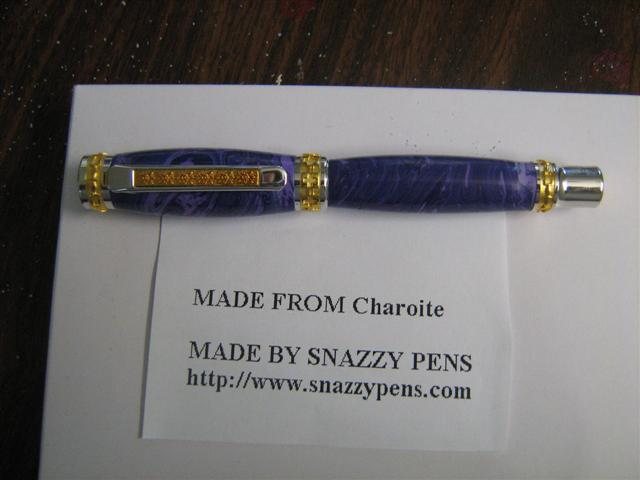
JR Emperor in Charodite

Signed-In Members Don't See This Ad
See more from Snazzypens

Status
Not open for further replies.

Snazzypens

Member
Joined
Apr 19, 2006
Messages
389
Location
Australia
This is my first pen that I made since receiving the pens from R and B Craft this is my pen.
love to know your thoughts
bye Toni


200792772332_charodite%20Junior%20Emperor.jpg
 
Signed-In Members Don't See This Ad
Joined
Aug 9, 2004
Messages
2,195
Location
Oakville, Ontario, Canada.
Hi Toni,

I think you have done a few things very well here. One challenge I see many people have is getting the right colour/material to work with hardware. You need to know the way the two can work together. I love the blue with the gold combinations and the blank is not too busy to take away from the over all look, just the opposite, it adds to the look on this pen.

I will make a comment on the shape that you can accept or not, I think this hardware needs a B2B turning. The strong horizontal lines in the hardware, especially the cap make it look better that way in my mind. I have turned one like yours and after reflection I knocked the pen apart and turned it down in the centre to level the body. I also know that the strong clip needs a straight body to make contact as well[:)]

I hope my thoughts are constructive for you....beautiful combination, but I think the shape needs some thoughts.

[:D] Go make another one and see if you can compare them... you're on a good path Toni[:)]
 

les-smith

Member
Joined
Oct 2, 2006
Messages
1,158
Location
Oklahoma
Dang, That's a nice one. I like the shape. You don't see to many Jr. Emperors that aren't B2B. The colors really compliment one another as well. Good job. The Jr. Emporer is the next pen on my to do list.
 

Snazzypens

Member
Joined
Apr 19, 2006
Messages
389
Location
Australia
JIm taking in the vein. I love both your feedback both encouraging but yet very informative in the same token thank you for honesty and your willing to share. much appreciated

LEs thank You
Toni
 

skiprat

Passed Away Mar 22, 2022
In Memoriam
Joined
Oct 19, 2006
Messages
7,812
Location
In a Skip in Wales
Looks good to me[:D] However is it charoite or charodite[;)]

I just googled it as I had never heard of either before;

Charoite; stone of courage.

I like the colour, is it a truestone or the real stuff?
 

Johnathan

Member
Joined
Feb 3, 2006
Messages
1,512
Location
Vacaville, California, USA.
Tony,

Nice work with the turning. I also agree with Jim as to the shape and finish. The color of the blank is very nice, I think that the purple would look much nicer on the black tit. kit. I would also go with a straight turning, with no curve to the pen.
 

emtmike

Member
Joined
Jan 21, 2006
Messages
269
Location
bucksport, maine, USA.
Nice pen……for a girl. That , by the way was meant to be a complement. I think the B2B turning is a “cut and dry†shape. I find us guys tend to like the long, straight barrel look. Could mean something, but maybe not. I think you have made a guys pen into something a lady, a market I tend to sometimes overlook, would like to carry. I like it. JMHO
 
Joined
Aug 9, 2004
Messages
2,195
Location
Oakville, Ontario, Canada.
Originally posted by aussie_chick
<br />JIm taking in the vein. I love both your feedback both encouraging but yet very informative in the same token thank you for honesty and your willing to share. much appreciated

LEs thank You
Toni

Thank You Toni, for accepting my comments with grace......sharing thoughts on design is not always something that people accept without some degree of heartburn, but with open eyes you often see more and get better, some here have done that for me over the years and I am forever gratful to them......I have always enjoyed seeing your fine work.[:)]

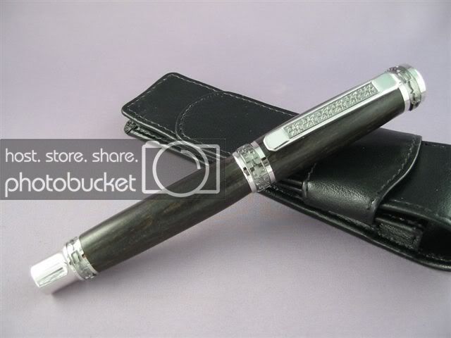
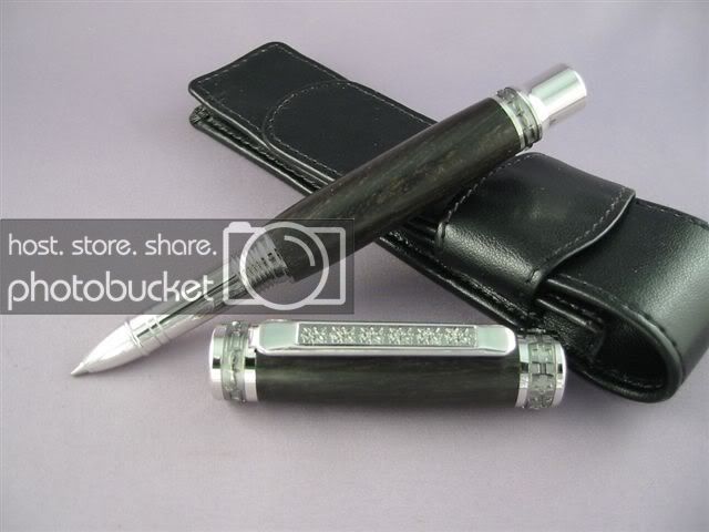
Not meant to hyjack your post, but to offer a picture to my thoughts. This is a Jr Emp I made my wife in Gabon ebony...just for another look on the hardware design, hope it helps
IMG_7432.jpg


IMG_7437.jpg
 
Status
Not open for further replies.
Top Bottom