You can call me...

Signed-In Members Don't See This Ad

In the "real world", we should call ourselves: (will be on membership card, too)

  • IAP

    Votes: 51 41.8%
  • International Association of Penturners

    Votes: 65 53.3%
  • Jeff's loyal serfs

    Votes: 3 2.5%
  • Penturners.org

    Votes: 3 2.5%

  • Total voters
    122
  • Poll closed .

ed4copies

Local Chapter Manager
Joined
Mar 25, 2005
Messages
24,687
Location
Racine, WI, USA.
IAP
or
Penturners.org
or
International Association of Penturners
or
Jeff's loyal serf

IF we are going to set up a presence in the communities we represent, we need to try to be consistent.

Jeff suggested a thread to discuss what we want to be called. Let's call this the PRELIMINARY advisory referendum. (So, results don't mean spit) but it might give us some direction, so Jeff can make a decision.

WEIGH IN, it won't cost you a thing.

 
Signed-In Members Don't See This Ad
Being known by initials gives an organization an extra little something. We just have to be prepared to spell it out when we get blank stares (at least until we are better known). Look at the logo on the home page - Big Bold Initials & full name in a smaller font. I vote INITIALS
 
I would expect both the logo and the spelled out name on a membership card - which will go in the drawer where I keep all the others. As has been said before me - I don't care what you call me as long as you don't call me late for dinner.

Marc
 
I am never late for dinner, my waist line proves it. Logo and Name on the card with the web address at the bottom. I also would like to be called young, which I am not, Handsome, not a chance, Grandpa, which I am is perfect.
 
Those who have strong feelings about the card, feel free to design and send to me.

I have no preconception of how it should appear.
 
I voted International Association of Penturners, mostly because IAP doesn't indicate what the group entails. If it's to go on an official card, it should say the full title, in my mind...

Referring, informally to the group, however, I call it the IAP....

Andrew
 
Use the IAP initials and have International Penturners Association along the bottom. Maintain the colors as it is presently known in the woodworking communities.

On the back of the card have the name of the local organization such as Georgia Penturners, proud member of the IAP, local contact website address.

Then have the individual members name displayed in the center.

Maybe a little blurb about what we stand for, etc.

Put Woodcraft, Rockler, and others logo's as they come to support the organization in their own way(s).

As far as clean-up after a meeting - that SHOULD be a mandatory rule of each clubs membership and not deligated to one poor soul left behind to do it all. :eek:
 
I was originally thinking just the initials, but voted for the full name. Obviously the logo will be on the card. I wouldn't mind contributing, once a set guide line for what information would be included on the card. Maybe I'll see what I can come up with.
 
I think the full logo (with as on the site) needs to appear just as it appears.

Beyond, that.... I'm open to whatever... Especially if it gets a discount.
 
I voted for the full name. But, I have wondered if local chapters could have a version of the logo with the chapter name under the logo and name sort of like the version that says "member" at the bottom. Also, a decision needs to be made if local chapters can use the logo with the possible local chapter name to produce appareal such as a hat with "Southwest Missouri Chapter" on the logo. Opens up a whole can of worms doesn't it!:biggrin:
 
Cav ... Anything is possible these days what with Photoshop and other graphics programs to use.

I just would like to see consistency with the use of IAP logo and then maybe have guidelines for any local chapters to follow as far as design and layout goes for their particular "chapters.".
 
How about the logo and name as it apears on the top of this page. Then maybe a picture of one of Egale's Pens on either side and the web address on the bottom. Our name ane local chapter could be on the back.
 
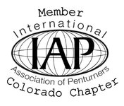
For simplicity use the curent log as is. It looks great anyway. For chapters allow use of the an additional "rocker" below the logo with the chapter name. Additional rockers or cap could be used to signify membership and or chapter/Parent organization office. This is similar to the way motorcyle club colors or the Harley Owners Group patches are displayed. I've attached a very crude sample.....
 
Try the attachment again...
 

Attachments

  • LogoSuggestionLRes.jpg
    LogoSuggestionLRes.jpg
    49.2 KB · Views: 141
Nice Vic! I too would drop the "member" at the top. The only thing that would improve this is if you would change the "Colorado" to "Southwest Missouri.":biggrin::biggrin:
 
What Vic shows is pretty much what I was picturing. I agree drop the Member and straighten out the Colorado Chapter. Size the whole thing for at least two lines of text below the logo for names like Southwest Missouri Chapter. Finally if you look at that example on a credit card size card you have room either left or right of the Logo for additional stuff. Name or whatever.
 
Let me know if you need help adding your chapter name. I've learned so much from you guys, I'd be happy to help. I sent several and I'm getting faster at it. Just let me know and allow a little time incase I get busy. dennis
 
Back
Top Bottom