You are using an out of date browser. It may not display this or other websites correctly.
You should upgrade or use an alternative browser.
You should upgrade or use an alternative browser.
Who wants to slam my web site?
- Thread starter alamocdc
- Start date
Signed-In Members Don't See This Ad
- Status
- Not open for further replies.
Signed-In Members Don't See This Ad
jkoehler
Member
i like it.
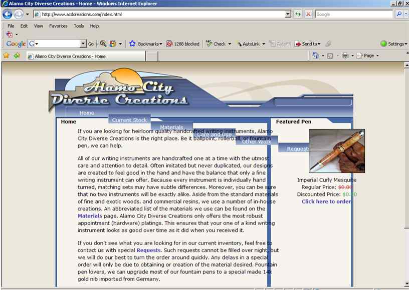
i was wondering how many of those pens you have in stock.
for that price, i would like to order a bunch.[ ]
]
i was wondering how many of those pens you have in stock.
for that price, i would like to order a bunch.[
broitblat
Member
It looks nice and professional. My only comment is that I didn't see a way to get a larger picture of the featured pen.
Skye
Member
No ripoff of the AC/DC logo? Terrible... just terrible. How about AC DC with a pen with a lightning bolt inside it between them?
Dario
Member
I'll wait until there is more to slam [ ][
][ ]
]
Actually it looks neat. Clean and loads fast (as far as I can tell). If ever, that same issue is the only negative for me right now...I think you have to add a bit more color but that is purely my taste (and I don't trust it myself LOL)
Actually it looks neat. Clean and loads fast (as far as I can tell). If ever, that same issue is the only negative for me right now...I think you have to add a bit more color but that is purely my taste (and I don't trust it myself LOL)
penhead
Local Chapter Leader
You don't have to send the pen...the mesquite blank will do..nice price..[ ]
]
Imperial Curly Mesquite
Regular Price: $0.00
Discounted Price: $0.00
Imperial Curly Mesquite
Regular Price: $0.00
Discounted Price: $0.00
vick
Member
I do not know if it is a resolution problem or browser version problem but htings do not line up for me. Your menu boxes go down like stairs and the pen picture is not in the box.
 <br />
I am on IE7 resolution 1024x768
I am on IE7 resolution 1024x768
TheHeretic
Member
I too like the site as well. But as someone else suggested I wouldnt mind seein a background behind everything. Nothing to elaborate. I just dont like the plain background.
Dean
Columbus OH
Dean
Columbus OH
gerryr
Member
I think it looks good and I'll take one of those Imperials too.[ ]
]
Mike, I think the problem is IE7.0. My screen is set to 1024x768 also and everything lines up fine for me. I'm using IE6.0
Mike, I think the problem is IE7.0. My screen is set to 1024x768 also and everything lines up fine for me. I'm using IE6.0
ed4copies
Local Chapter Manager
AFter seeing Vick's problem, I went to see if my monitor would do the same.
No problems, here!!!
Site looks well organized, nice start!
No problems, here!!!
Site looks well organized, nice start!
vick
Member
Originally posted by ed4copies
<br />AFter seeing Vick's problem, I went to see if my monitor would do the same.
Hey this is Billy's problem not mine [
alamocdc
Member
Thanks for pointing that out, Mike. We haven't tested it on IE7 and it looks like that's the problem. I'm not sure what they could have changed that would cause that though. It's all done with css, js and html.
Billy - Here's a free analysis of your home page. The problem is severe enough that you are unlikely to be picked up by the search bots.
This information should be helpful for your webmaster in fixing things. One of the "good" things about IE7 is that standards are now being followed.
I was not able to extract a character encoding labeling from any of the valid sources for such information. Without encoding information it is impossible to reliably validate the document. I'm falling back to the "UTF-8" encoding and will attempt to perform the validation, but this is likely to fail for all non-trivial documents.
The sources I tried to find encoding information include:
The HTTP Content-Type field.
The XML Declaration.
The HTML "META" element.
And I even tried to autodetect it using the algorithm defined in Appendix F of the XML 1.0 Recommendation.
Since none of these sources yielded any usable information, I will not be able to reliably validate this document. Sorry. Please make sure you specify the character encoding in use.
Specifying a character encoding is typically done by the web server configuration, by the scripts that put together pages, and inside the document itself. IANA maintains the list of official names for character encodings (called charsets in this context). You can choose from a number of encodings, though we recommend UTF-8 as particularly useful.
This information should be helpful for your webmaster in fixing things. One of the "good" things about IE7 is that standards are now being followed.
fritzmccorkle
Member
my favorite part of people's websites is often the "about the artist" page. i think you should put a pic of yourself on there. or better yet a pic of someone else. hahahaha really, i do think you should include a pic of yourself on your "about" page.
Snazzypens
Member
Mine goes down like Vicks too.
Toni
Toni
alamocdc
Member
First let me say that the site is just a fledgling for now. Secondly, this is exactly the kind of feedback I was after, so a big thank you to all who were kind enough to take the time to respond. I personally have yet to examine the code to see what it needs or what it lacks. I also know that the youngman I had design the layout knows very little, if anything, about meta tags so I knew I would have to insert them myself. DreamWeaver is a nice piece of software, but it will only function at the level commensurate to that of the author. He simply fed it the content I gave him. The part I am happiest about is the overall layout and of the pages and the logo he designed for me. This little bit of work took him about two months working at home in his spare time. He works for me 20 hours/week at the office and is a full time Computer Engineering student and this certainly isn't his area of expertise. Don't get me wrong, I'm not adding this to defend him as I feel he needs no defense. I simply wanted to share with you what I feel is great accomplishment for him.
It may well take me another few weeks to get everything right, but at first blush, it's everything I was hoping for. Okay, now if you'll excuse me, I have to go work on my web site. [ ]
]
It may well take me another few weeks to get everything right, but at first blush, it's everything I was hoping for. Okay, now if you'll excuse me, I have to go work on my web site. [
mrplace
Member
I get the menu buttons stepping down across the page.
Ron in Drums PA
Member
Billy, you got a good start on your site.
----
Mike
The best way to fix IE7 problems is to install FireFox
----
Mike
The best way to fix IE7 problems is to install FireFox
Chuck Key
Member
Yes, great looking page.
I would dump the http://www.acdcreations.com/images/ listing ability either through Apache or possibly html.
Chuckie
I would dump the http://www.acdcreations.com/images/ listing ability either through Apache or possibly html.
Chuckie
alamocdc
Member
Okay, I made some initial changes.
Lou or mrplace, is the menu still stairstepped?
Chuckie, did that do it?
Thanks!
Lou or mrplace, is the menu still stairstepped?
Chuckie, did that do it?
Thanks!
Chuck Key
Member
TellicoTurning
Member
Didn't line up on my monitor either... the text ran over the line .. the picture shifted right outside the column..
1080Wayne
Member
Billy Maybe it`s just me , but I find the style of the e`s in Diverse Creations make it a bit hard to read . Wayne Richardson
GBusardo
Member
I really like the page navagation, nice and easy to move around. To second someone else's suggestion, I think your feature pen needs to be the focal point of the page. More pictures and less print.
To be honest, I really do not like the logo. I know my eyes aren't the best, but it took me a while to figure out the "Diverse" word. All and all, as a comsumer who buys a lot off the web, I think the site has a ton of potential.
One thing I have been wondering about though. Is it possible that there are just too many choices? I would assume that most people buying a pen would not know what any of the styles look like and each style would have to be checked out. Is that a plus? Or a minus? Not sure.
The last observation I would think that Handcrafted Writing Instruments" a more prominant place on your home page.
Good luck and I think you are on your way to an awesome website.
Pipes
Member
Hey I never slam a site ! mine is built with front page and we my wife and I make a very good living from it !! and some techno wennies don't like it our customers well MOST love it so who cares do your thing dude [ ]
]
http://affordablepipes.com/
http://affordablepipes.com/
- Status
- Not open for further replies.
